Introduction
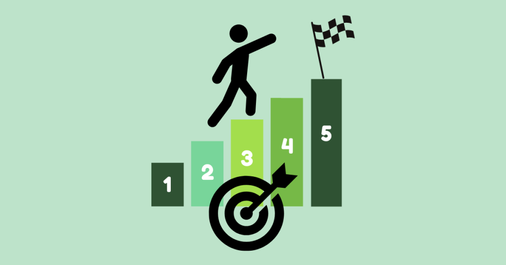
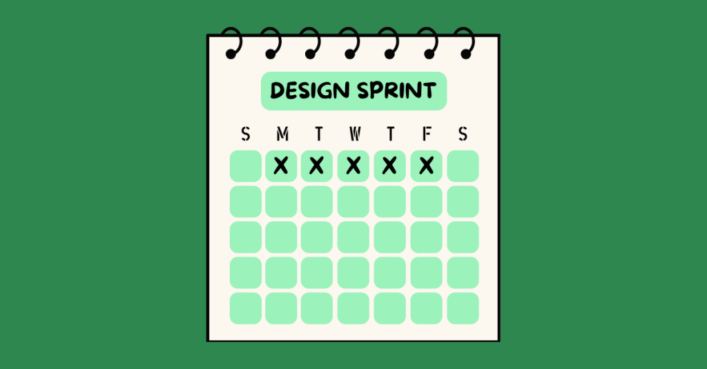
WalletWize is a financial education app designed to help Gen Z users understand and manage their personal finances. The goal of the app is to create a seamless and engaging user experience that makes learning about money feel intuitive, approachable, and empowering. To create WalletWize, our group followed the Design Sprint method developed at Google Ventures. This method is a five-day process that rapidly takes a product from idea to prototype to user testing.
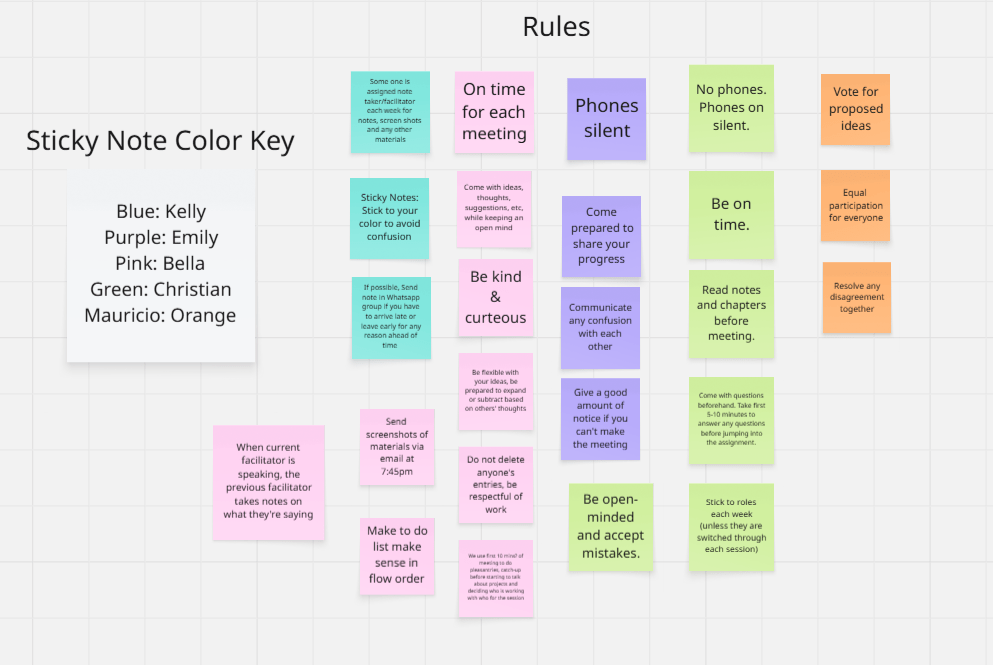
For our project, we stretched the five-day Sprint into a five-week format, dedicating one week to each phase of the process. Our team collaborated virtually via Zoom and used Miro for digital whiteboarding and collaboration. What resulted was not just a prototype, but a deeper understanding of teamwork, design thinking, and problem-solving.
Design Sprint Overview
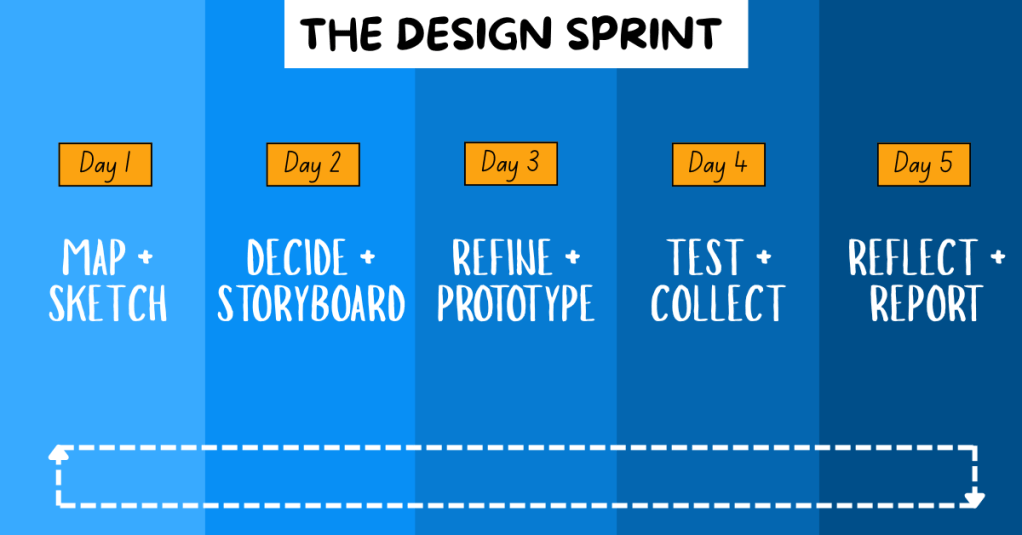
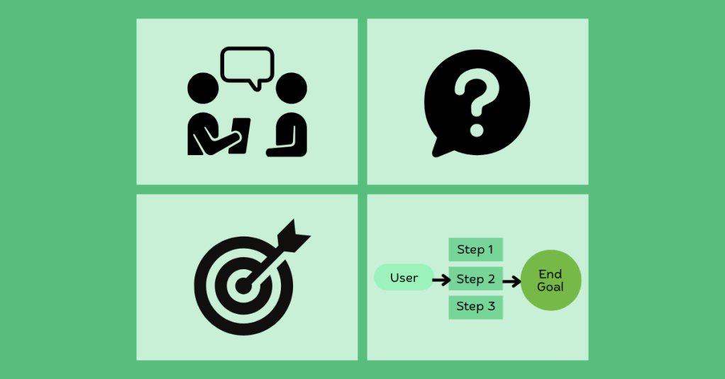
The Design Sprint is broken into five phases:
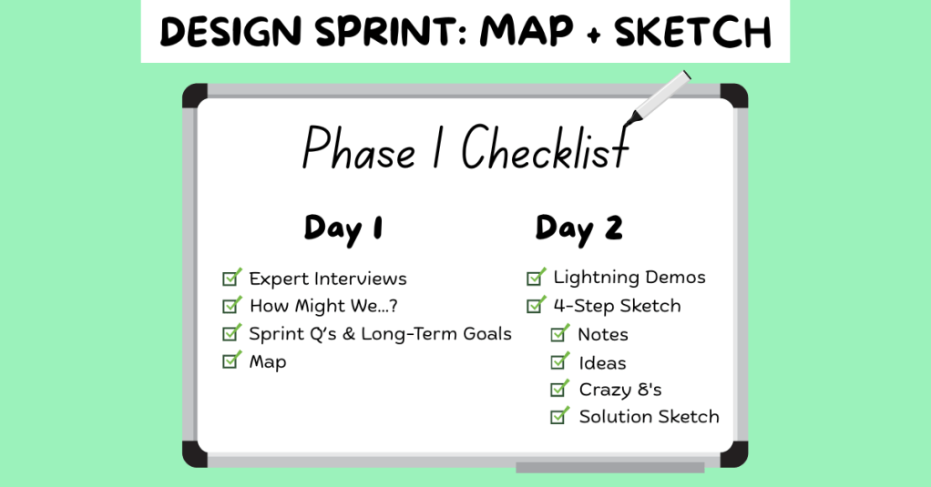
1. Map + Sketch: We defined our problem, conducted research on our target audience, set goals, and sketched potential solutions.
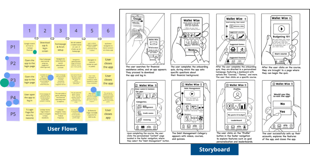
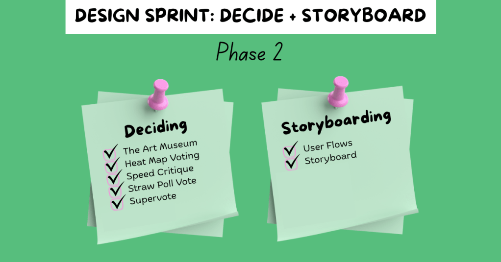
2. Decide + Storyboard: We used a series of voting techniques to narrow down our best ideas. From these, we created user flows and a storyboard.
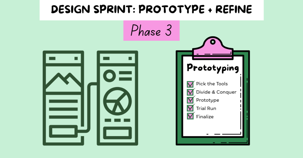
3. Refine + Prototype: With our finalized storyboard, we divided tasks based on our individual strengths and built a functional prototype.
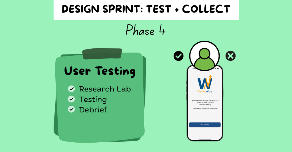
4. Test + Collect: We conducted remote user testing sessions with Gen Z participants. We gathered feedback on functionality, visual design, and user experience to determine what worked well and what could be improved.
5. Reflect + Report: We compiled our findings and insights into a final Design Sprint report and individual case studies, summarizing the project and sharing key takeaways.
Problem Statement and Research
The problem we focused on was the lack of accessible, engaging financial management tools for Gen Z. To guide our ideation process, we created the following “How Might We” questions:
- How might we engage Gen Z so they stay on our app instead of switching to another one?
- How might we make learning about money feel as addictive as scrolling through social media?
- How might we simplify complex financial concepts to make them easier and more engaging to learn?
- How might we encourage users to return and build lasting financial habits?
We also defined a long-term goal: In two years, WalletWize should help Gen Z form consistent money habits by making the app a daily or weekly routine.
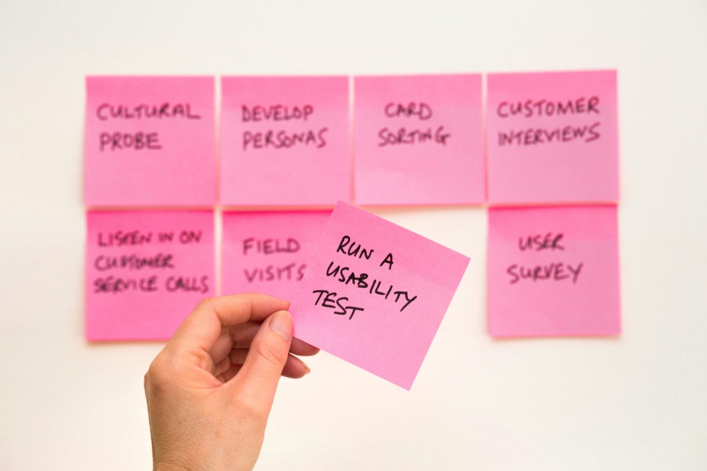
To better understand our target audience, we conducted background research. We found that Gen Z:
- Relies heavily on parents for financial advice
- Consumes most content on mobile devices
- Faces increasing financial challenges including student debt and housing costs
- Spends a significant amount of time on social media
These insights shaped both our design decisions and our content strategy.
Sprint Activities
Phase 1: Map + Sketch
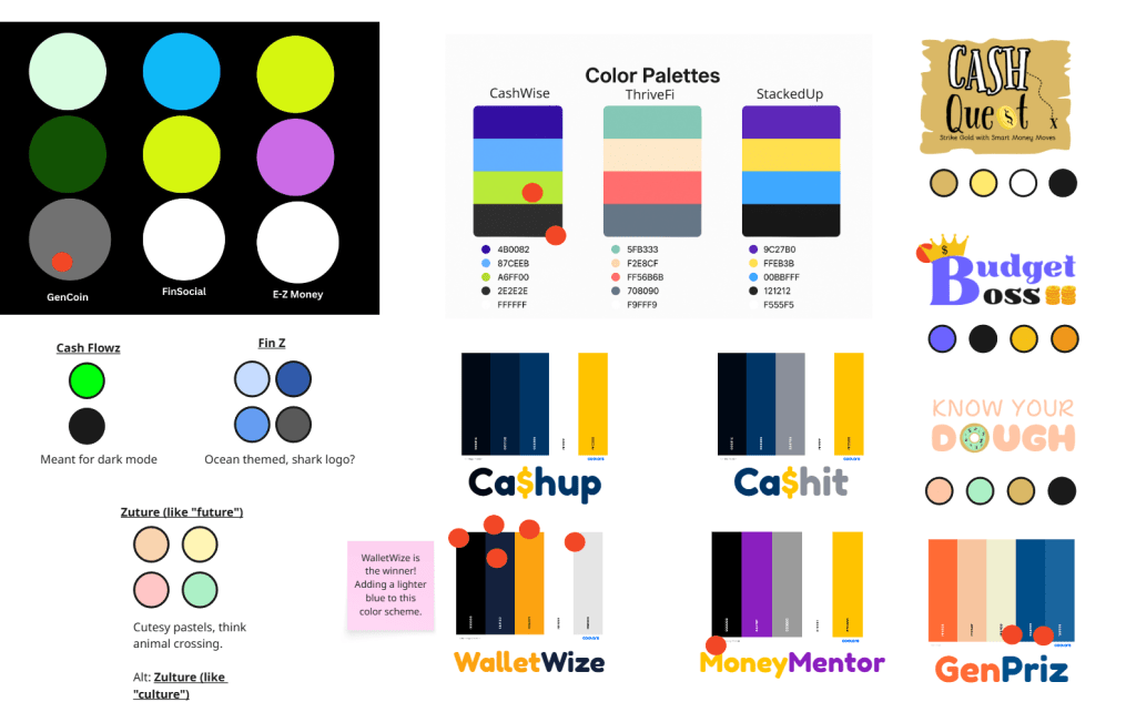
We began by naming the app and selecting a color scheme through voting with red dots. We chose “WalletWize” as our final name and adjusted our palette to include a bold royal blue and bright orange to appeal to Gen Z.
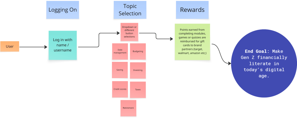
Next, we created a map that began with app onboarding and ended with our goal. The steps in between represented the key features and actions users would take to reach that goal, including navigating through course content, selecting topics, and engaging with rewards.
We then conducted Lightning Demos. Each team member analyzed apps related to finance and education, collecting visual inspiration and discussing which features we might borrow or adapt.
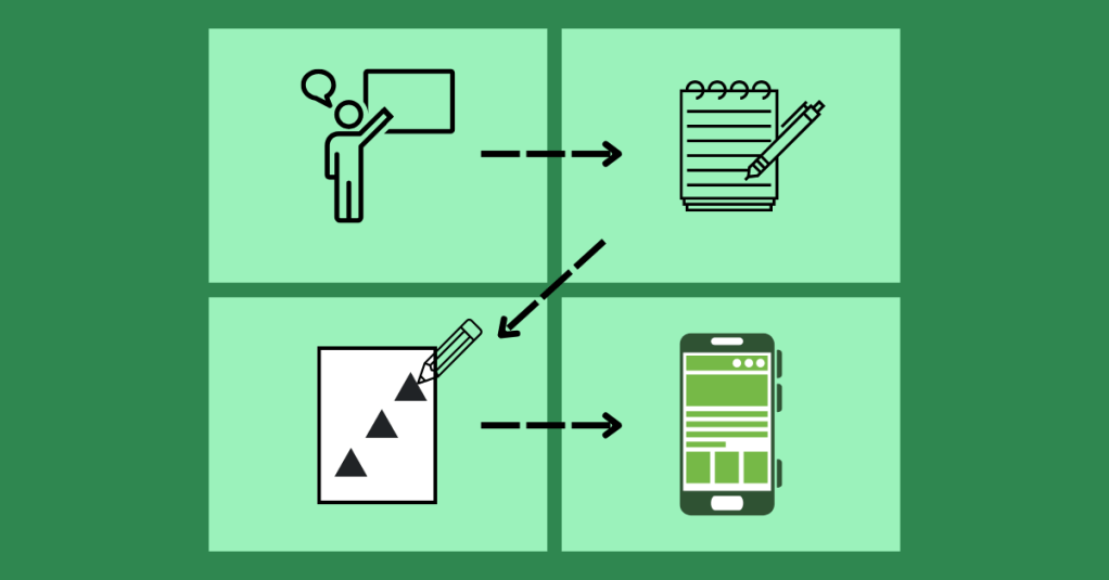
Finally, we worked through the 4-Step Sketch process individually:
- Capturing notes and inspiration
- Generating quick ideas
- Exploring variations in Crazy 8s
- Creating refined solution sketches


Phase 2: Decide + Storyboard
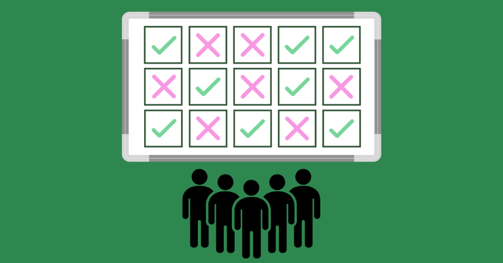
To narrow down ideas, we used Heat Map Voting to highlight the best elements of our sketches. Then we used Straw Poll and Supervote techniques to select our top concepts.
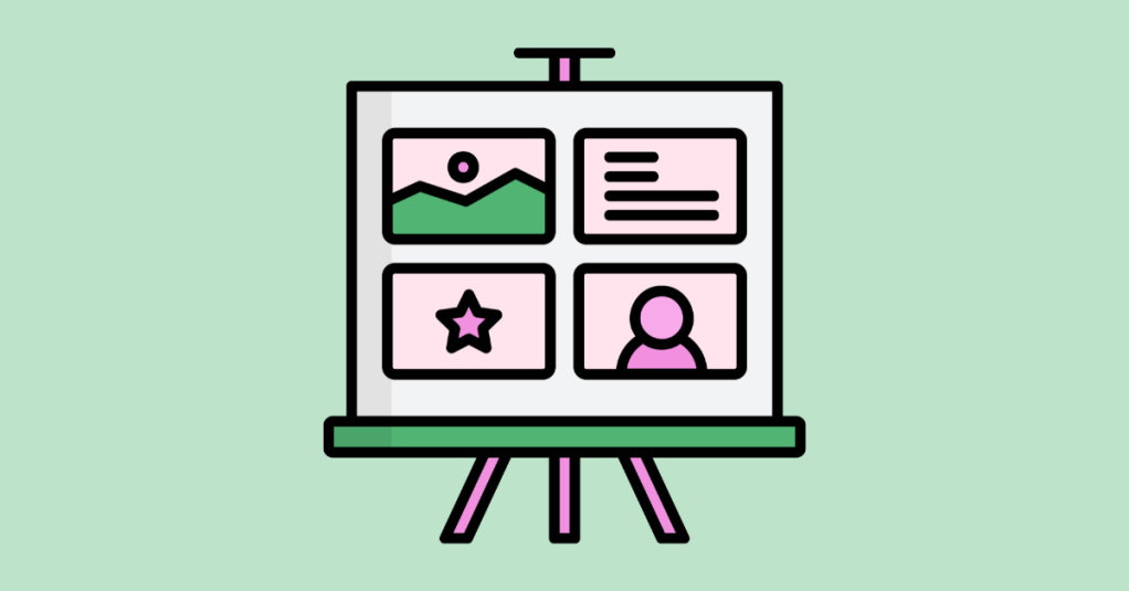
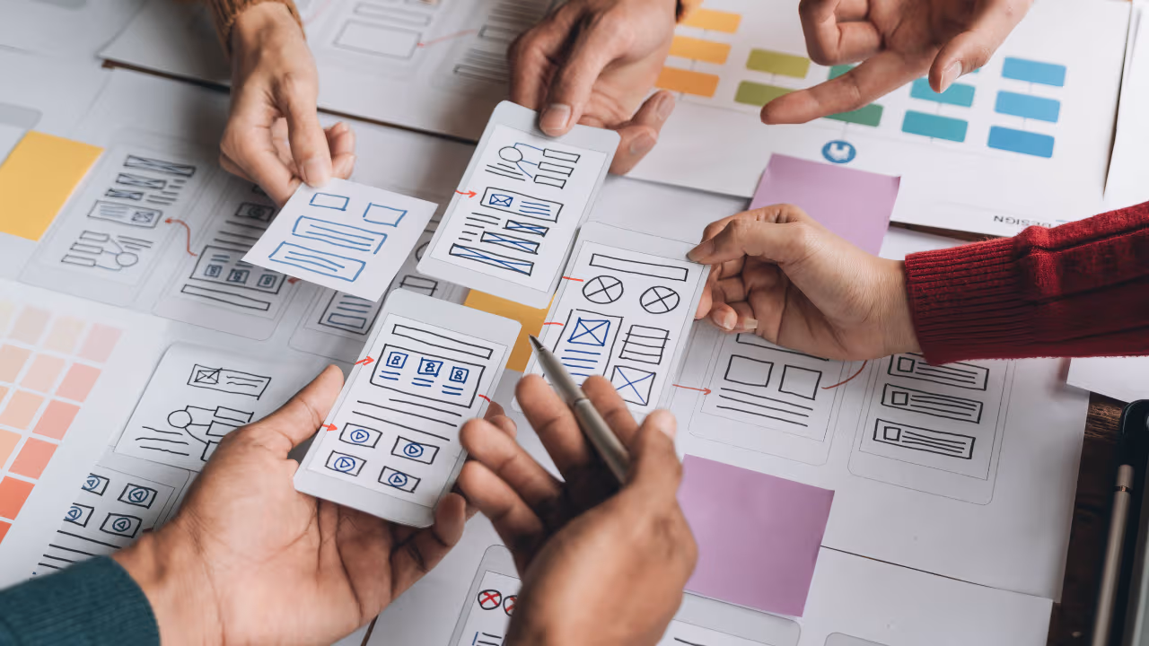
Each group member created a six-step user flow. We voted on the most promising user journey and then expanded it into an eight-step storyboard that showed the elements of each screen.
Phase 3: Refine + Prototype
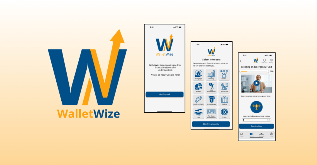
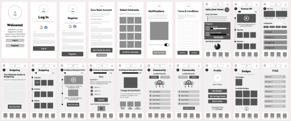
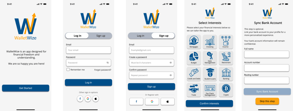
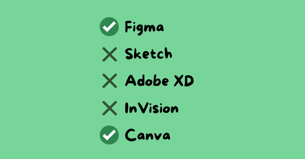
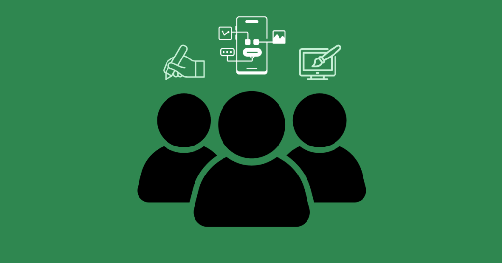
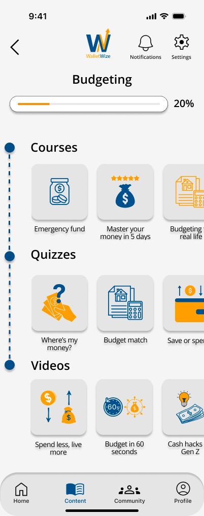
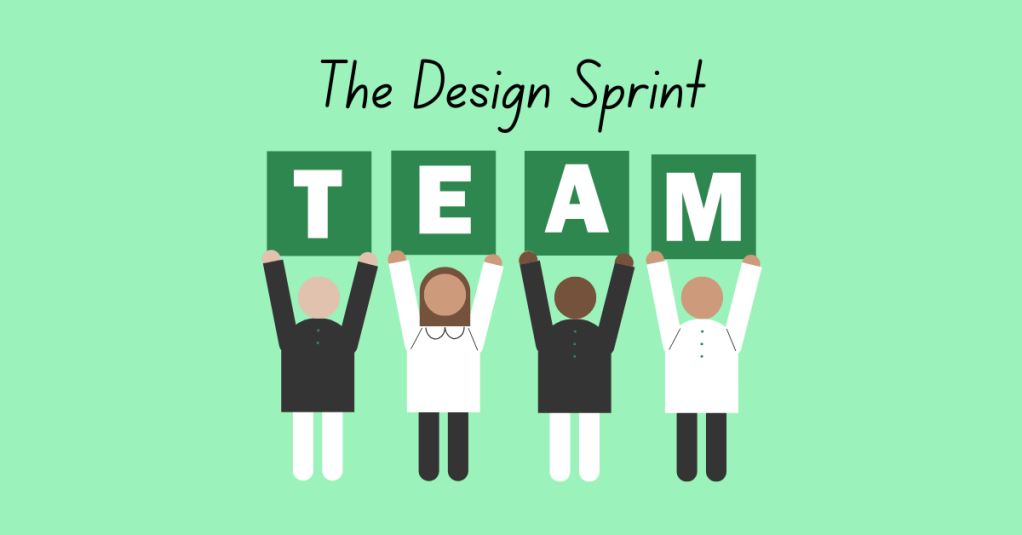
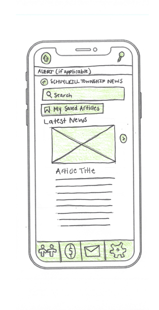
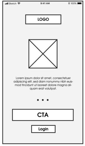
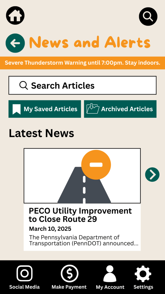
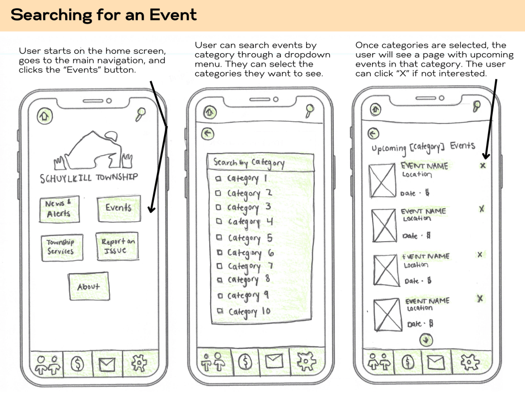
We divided responsibilities based on skillsets. Some focused on wireframes in Canva, while others built out high-fidelity prototypes in Figma. Our illustrator created visual assets, and our Stitcher ensured consistency and flow across the prototype. The prototype included interactive screens for onboarding, budgeting lessons, quizzes, and progress tracking.
Phase 4: Test + Collect
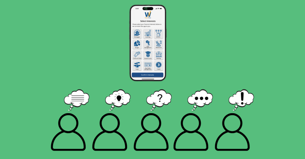
We prepared a script and conducted five remote user interviews. The sessions were recorded via Zoom. One person led the interview while others took notes.
We created pre- and post-surveys to collect demographic and usability feedback. The pre-survey gathered background information, while the post-survey measured user satisfaction and experience.
Phase 5: Reflect + Report
In our final week, we divided responsibilities to create our final Design Sprint report and individual case studies. We reflected on our learning, analyzed our data, and finalized our deliverables.
To view our group’s final report, click here.
Results and Outcomes
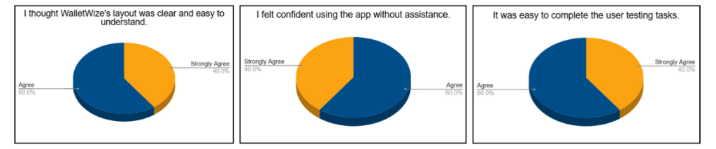
Our final clickable prototype of WalletWize received positive feedback from users. Participants appreciated the modern design, friendly illustrations, clear navigation, and overall user experience.
One area for improvement identified during testing was the content tab. Several users were unsure how to navigate it. A suggestion to add a FAQ button to the home screen was also noted and would be implemented in future iterations.
Overall, user feedback affirmed that our design choices were intuitive and engaging. The app met its primary goal of helping Gen Z users feel more confident in managing their money.
Learnings and Reflection
The Design Sprint was an exciting challenge. It taught us how to work quickly, think strategically, and communicate clearly. We learned how to facilitate discussions, manage tasks virtually, and design with the user in mind.
Each member of our group brought unique strengths to the project, and we built a workflow that allowed us to support one another and stay organized. Conducting the Sprint virtually had its challenges, but we navigated them well using tools like Miro and Zoom.
Beyond the technical skills, we learned how to stay adaptable. Whether it was a user who couldn’t complete a task or a design that needed to be reworked, we stayed open to change and focused on improvement.
Conclusion and Next Steps
The Design Sprint was more than just a framework; it was a powerful learning experience. From problem definition to user testing, we moved through each phase with purpose and creativity. WalletWize is the result of thoughtful collaboration, honest feedback, and user-centered design.
As we look to the future, we are excited about the potential of WalletWize. With further development, we hope it becomes a trusted tool for Gen Z users who want to improve their financial literacy. The lessons we learned in this Sprint will continue to inform our approach to product design and collaboration in our future careers.


 Christian Schaaf's Blog + Portfolio