Author: cschaaf933

  • Bringing Ideas to Life: The Power of High-Fidelity Prototyping

    Bringing Ideas to Life: The Power of High-Fidelity Prototyping

    Low- and high-fidelity prototyping from The Product Manager.

    Have you ever looked at a mobile app and thought, “How did someone design this?” Behind every polished interface is a long journey of research, ideation, testing, and lots of prototyping. During my recent experience designing a companion app for Schuylkill Township’s website, I discovered how high-fidelity prototyping transforms concepts into tangible, testable designs. Let’s walk through what I learned and why fidelity in prototyping matters more than you might think.

    Understanding Prototype Fidelity: Low vs. High

    Not all prototypes serve the same purpose. When I first started this project, I didn’t realize that “prototyping” could look so different depending on the stage of design. In her article Low-Fidelity vs. High-Fidelity Prototyping: Key Differences Explained, Iulia Sorodoc describes that fidelity in prototyping is measured across three levels: low, medium, and high.

    Low-Fidelity Prototypes

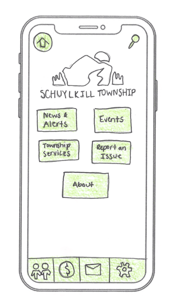
    Low-fidelity prototypes are simple, often hand-drawn sketches. They focus on layout and flow rather than visuals or interactivity, making them perfect for early-stage brainstorming. Low-fidelity prototypes are quick and inexpensive to produce, making them ideal for early-stage design. However, they have some drawbacks: they offer limited interactivity, don’t closely resemble the final product, and can make it harder to gather meaningful user feedback.
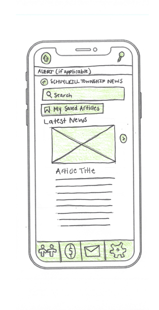
    An example of low-fidelity prototyping from my project.

    Medium-Fidelity Prototypes

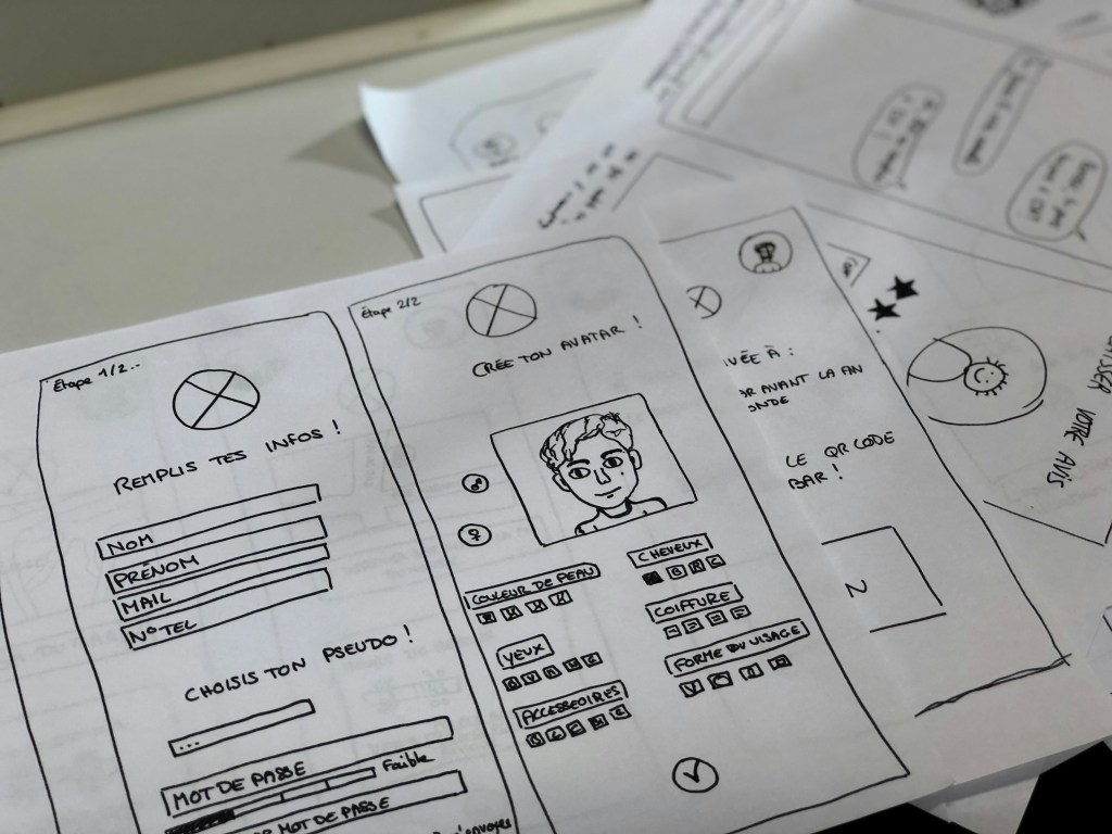
    Medium-fidelity prototypes offer more accurate layouts, include some user interface (UI) elements, and may have basic interactive components. They strike a balance between realism and flexibility.
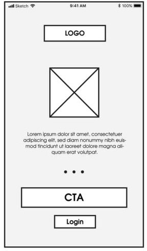
    An example of medium-fidelity prototyping from mentormate.

    High-Fidelity Prototypes

    High-fidelity prototypes, on the other hand, are polished and realistic. They replicate the final product as closely as possible with detailed visuals, real content, and full interactivity. They take longer to build, but the payoff is in their ability to simulate the real user experience.
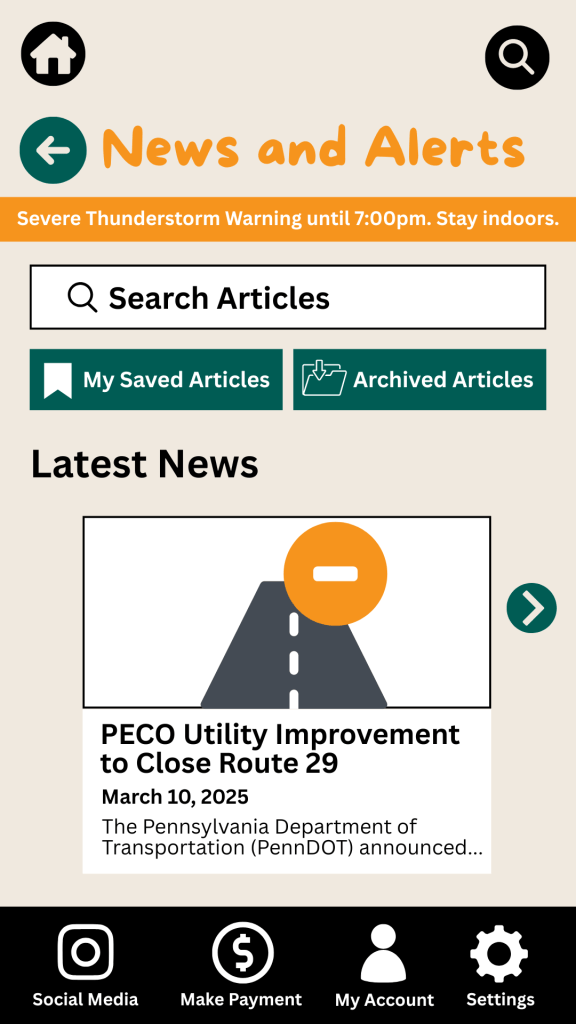
    An example of a high-fidelity prototype from my project.

    The level of fidelity you choose depends on where you are in the process and what kind of feedback you’re looking for. In the early stages, rough sketches suffice. But as you move closer to development, a more refined prototype is key to gathering accurate user feedback.

    Prototyping Tools for UX Designers

    When it comes to choosing the right prototyping tool, there’s no one-size-fits-all answer. As Fahim Bin Omar outlines in his article Best Prototyping Tools for UI/UX Designers – How to Choose The Right One?, your ideal tool depends on a few important factors, including your design goals, the complexity of the project, the level of fidelity you need, how well the tool supports collaboration and feedback, its compatibility with other software you use, and device support and accessibility.

    Popular Prototyping Tools to Consider

    There are many programs that UX/UI designers use to create interactive prototypes. Some of the best include:

    • Figma: A cloud-based favorite among teams for its real-time collaboration features and comprehensive prototyping tools.
    • Marvel App: Known for its user-friendly interface and ease of turning static designs into interactive prototypes.
    • Adobe XD: Great for those already in the Adobe ecosystem, offering seamless integration with other Creative Cloud tools.
    • Sketch: A powerful Mac-based design tool with an intuitive interface and a wide range of plugins.
    • Proto.io: Lets you create realistic, code-free prototypes right in your browser with a simple drag-and-drop interface.
    • Webflow: A unique option for those who want to build responsive web prototypes with real HTML, CSS, and JavaScript output.

    Whatever you choose, make sure it aligns with your needs. Remember: The user always comes first. The right tool should help you design for clarity, accessibility, and ease of use.

    My High-Fidelity Prototypes

    For this project, I used Adobe Creative Suite to design the visual elements of my prototype and then brought it to life interactively using the Marvel App. Since I already had a subscription to Adobe and was familiar with both tools, I was able to focus more on creating a seamless and user-centered experience.

    While I explored several platforms, Adobe and Marvel gave me the flexibility and control I needed to produce a highly usable and visually engaging prototype. View the video below as I walk through each prototype I created for the Schuylkill Hub app.

    Changes from Low- to High-Fidelity Prototypes

    Once I began user testing last week, it became clear that a few areas of my prototypes needed improvement. One of the most notable pieces of feedback was confusion between the “Contact” and “Township Services” sections. Users weren’t sure where to go for help.

    To fix this, I combined both into a single, clearly labeled section: Contact Township. This new layout provides an easy-to-navigate overview of township services along with direct contact options for each department, improving both clarity and accessibility.

    I also made several updates to the footer navigation based on additional user feedback:

    • Added “My Account” and “Settings” so users could access personal information and preferences quickly.
    • Included labels beneath icons to make navigation more intuitive.

    In the News & Alerts section, I implemented several new features:

    • A top bar for urgent alerts.
    • A personalized “Suggested for You” section.
    • An “Archived Articles” button for past content.

    To make the prototype feel authentic to the township, I included local events and headlines, and built out supporting features such as a search bar, an ‘About’ section, and a ‘My Account’ page.

    Click here to view each step of the process of creating the Schuylkill Hub app.

    Reflection

    If there’s one thing I’ve learned from this project, it’s that prototyping is where ideas truly start to take shape. From low-fidelity sketches to interactive high-fidelity designs, each version helped me refine my app’s user experience through iteration and feedback.

    In the early stages, my low-fidelity prototypes were just simple outlines that mapped out the app’s basic structure and flow. These were invaluable for quick brainstorming and helped me think through how users would navigate the app. Because they were easy to change, I could revise layouts based on feedback without feeling too attached to one idea.

    As I moved into medium- and high-fidelity prototypes, the process became more detailed and intentional. Visual hierarchy, color palette, typography, and real content began to shape a more complete picture of the app.

    Looking back, I now see prototyping as a form of communication — a way to translate abstract ideas into something tangible, testable, and ultimately user-centered. It’s not just about making things look good; it’s about making things work well for the people who use them.

    I’m walking away from this project with a much deeper appreciation for prototyping as an essential part of the UX design process. The experience has taught me to approach every project with curiosity, openness to feedback, and a commitment to designing with the user in mind.
  • User and Usability Testing in Action: When Feedback Meets Design

    User and Usability Testing in Action: When Feedback Meets Design

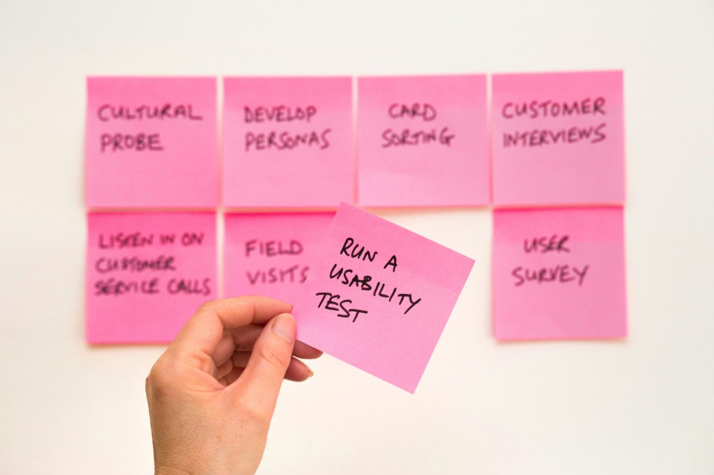
    An image of a sticky note reading “Run a Usability Test” from Unsplash

    What better way to get feedback on your design than from the people who’ll actually use it?

    When I first started designing paper prototypes for a township app, I thought I had considered everything. Clean design? Check. Clear navigation? Of course. Useful features? Absolutely. It wasn’t until I sat down – virtually – with my sister and mom that I realized how much more I had to learn. The way users interact with your product can be eye-opening, informative, and one of the most exciting parts of the design process.

    This post is a deep dive into my own experience conducting user and usability testing: what these terms mean, how to prepare for testing, and what I learned when I watched real people click through my proposed app.

    What are User and Usability Testing?

    At first glance, “user testing” and “usability testing” sound interchangeable, but they have distinct goals.

    User testing is a process where real users interact with a product while designers observe and analyze their behavior. It is about understanding people: their needs, expectations, and behaviors. It helps you figure out if your product concept makes sense to your audience. Usability testing, on the other hand, is a specific type of user testing. It evaluates how easily users can navigate your product and accomplish key tasks (Strba, 2024). This will help designers identify hidden opportunities and generate new ideas in a quick and easy fashion.

    Both forms of testing are essential. Together, they offer a full picture of what’s working, what’s not, and what could be better.

    Tips for Testing Paper Prototypes

    An image of testing and comparing paper prototypes from Interaction Design.

    When you ask someone to review your prototypes, you’re not just asking them to test your design – you’re inviting them into a conversation.

    To make that conversation effective, users need context. In “User Testing Your Paper Prototypes,” Andrew Smyk emphasizes that users must understand the tasks they’re expected to complete. That clarity helps eliminate unnecessary confusion and ensures that any struggles they encounter are due to the design and not a lack of explanation.

    One tip that stuck with me is to avoid vague labels and features. If something is labeled “Category 1” or “Button A,” users won’t know what it means. That confusion clouds the testing results.

    It’s also worth being mindful of user behavior beyond words. Long pauses, puzzled expressions, or hesitant mouse movements can reveal uncertainty even when users say, “Yeah, I think I get it.”

    And lastly, don’t wait until your product is polished to test it. The earlier you gather feedback, the more room you have to fix issues without derailing the whole design process.

    Writing Effective Task Scenarios

    If usability testing is about watching users complete tasks, then writing those tasks well is key to receiving meaningful feedback.

    In “Writing Good Task Scenarios for Usability Testing,” Teng states that scenarios should be written like real-life goals, not instructions. Task scenarios help participants focus on what they need to accomplish, not how to do it. It’s the difference between saying “Find the registration form for your child’s summer camp” versus “Click the registration button.” The former helps users act naturally and reveal how intuitive your design really is.

    I tried to follow these principles by using familiar language, staying concise, and giving each scenario a bit of personality so users could imagine themselves in the situation.

    Good task scenarios aren’t just technical – they’re human. They give users a reason to care and something to solve.

    My User Testing Experience

    My design of the home screen for the Schuylkill Township companion app.

    In preparation for my user testing experience, I used the Prototyping on Paper (POP) app by Marvel to make my designs interactive and share them with the users.

    To test my paper prototypes for a companion app for Schuylkill Township, I wanted participants who would find the content relevant. I chose two family members: my sister and my mom. They both represent two different age groups of residents who currently live or have lived in Schuylkill Township. Selecting family members could have drawbacks, such as bias in feedback, but I told them to provide honest, constructive suggestions for my designs.

    We conducted our sessions over Zoom. I asked a few warm-up questions to get a sense of how they typically use technology and then guided them through a series of four tasks using screen share. After each task completion, I asked for feedback. This gave me the opportunity to receive suggestions in real-time.

    The results? They gave me a lot to think about!

    User 1: My Sister

    A video of the full user testing experience with my sister.

    As a tech-savvy user, it was important to test the app with someone in my sister’s age category to ensure it resonated with a younger audience. View the video above to watch my sister navigate through each proposed task.

    User 2: My Mom

    A video of the full user testing experience with my mom.

    As someone who doesn’t use their phone or technology often, it was essential to test my app with someone like my mom to guarantee that other users who might struggle with technology could successfully and effectively use the app. View the video above to watch my mom navigate through each task.

    My Insights from Testing

    This was a beneficial experience highlighting both positive design elements and areas of improvement. One unexpected issue? The prototype images I uploaded into POP still had a phone case design around them. When viewed on a real phone, it looked like a phone inside a phone. This threw off both users, and I’ll definitely avoid that visual redundancy next time.

    Task 1: Search for, Register, and Pay for an Event

    Both participants easily located the “Events” button on the homepage, which was a great sign that the navigation is intuitive. My sister moved through the process quickly – she found the event listings, clicked “Buy Tickets,” completed the payment process, and returned to the home screen with no issues. Her one suggestion was to replace placeholder labels like “Category 1” and “Category 2” with actual event category names to provide better clarity when searching for an event.

    My mom also found the “Events” section without issue but got a bit confused when it came to registering. In the task scenario, I had used the word “register” instead of “book,” which led her to hesitate at the “Book Tickets” button. This was a valuable reminder that word choice matters in task descriptions. It’s important to align the language in the scenario with what’s reflected in the interface to avoid confusion.

    Task 2: Search for an Article and Download It

    My sister again moved through this task seamlessly. She located an article, downloaded it, and suggested a helpful feature idea: adding an “Archives” section alongside “My Saved Articles” so users can revisit older content more easily.

    My mom completed the task as well, but paused when she reached the icons for downloading and bookmarking. She wasn’t familiar with what the download or bookmark symbols meant and asked for clarification. This feedback made me realize that relying solely on icons may not be accessible to all users. Moving forward, I may consider adding text labels next to the icons or using tooltips to provide context.

    Task 3: Sign Up for an Account and Report a Pothole

    This task was structured as “Sign Up for an Account and Report a Pothole.” This may have unintentionally confused my sister and mom because users are prompted to sign up/login after clicking the “Report an Issue” button, not before. They both first looked for a “Sign Up” button before clicking “Report an Issue.” In the future, I’ll adjust the task description, or possibly the app flow itself, to better match user expectations.

    That said, both participants successfully navigated to the “Report an Issue” section. My sister completed the steps quickly and suggested adding confirmation text after submission to let users know their request was received and that updates would be provided. My mom took a little longer at the dropdown menu used to categorize the issue, but once she oriented herself, she was able to complete the task as well. The overall takeaway? The flow works, but clarity and reassurance can make the experience smoother.

    Task 4: Contact the Police Department

    This was the task where both users stumbled, and as a result, it became one of the most valuable tests. I had intended for users to click the envelope icon in the footer navigation, which represents the “Contact Us” section. However, both users initially went a different route.

    My sister clicked on “Township Services,” expecting to find police contact information there. When it wasn’t what she expected, she found her way to the envelope icon and completed the task. My mom followed a similar pattern: first trying “Township Services,” then checking “Report an Issue,” and then eventually locating the “Contact Us” section.

    This consistent behavior pointed to a larger design issue: the “Contact Us” option isn’t as visible or intuitive as it needs to be. A clearer label or more prominent placement could make all the difference. I’m considering merging “Township Services” and “Contact Us” into a single section, or at least renaming them to better reflect the types of content each one holds. Small changes like these can significantly improve the user experience.

    Final Thoughts

    Design is a conversation, not a monologue. No matter how good your product looks or how clearly you think you’ve labeled everything, you won’t really know how it works until someone else tries it.

    User and usability testing opened my eyes to how people interpret, navigate, and occasionally struggle with a design. It reminded me that great design isn’t just about what we create – it’s about how people experience it.

    If you’re working on a prototype, test it early, test it often, and most importantly – listen. Your users will give you valuable feedback to improve your app and enhance each user’s experience.

  • Back to Basics: Exploring Paper Prototyping for Mobile Design

    Back to Basics: Exploring Paper Prototyping for Mobile Design

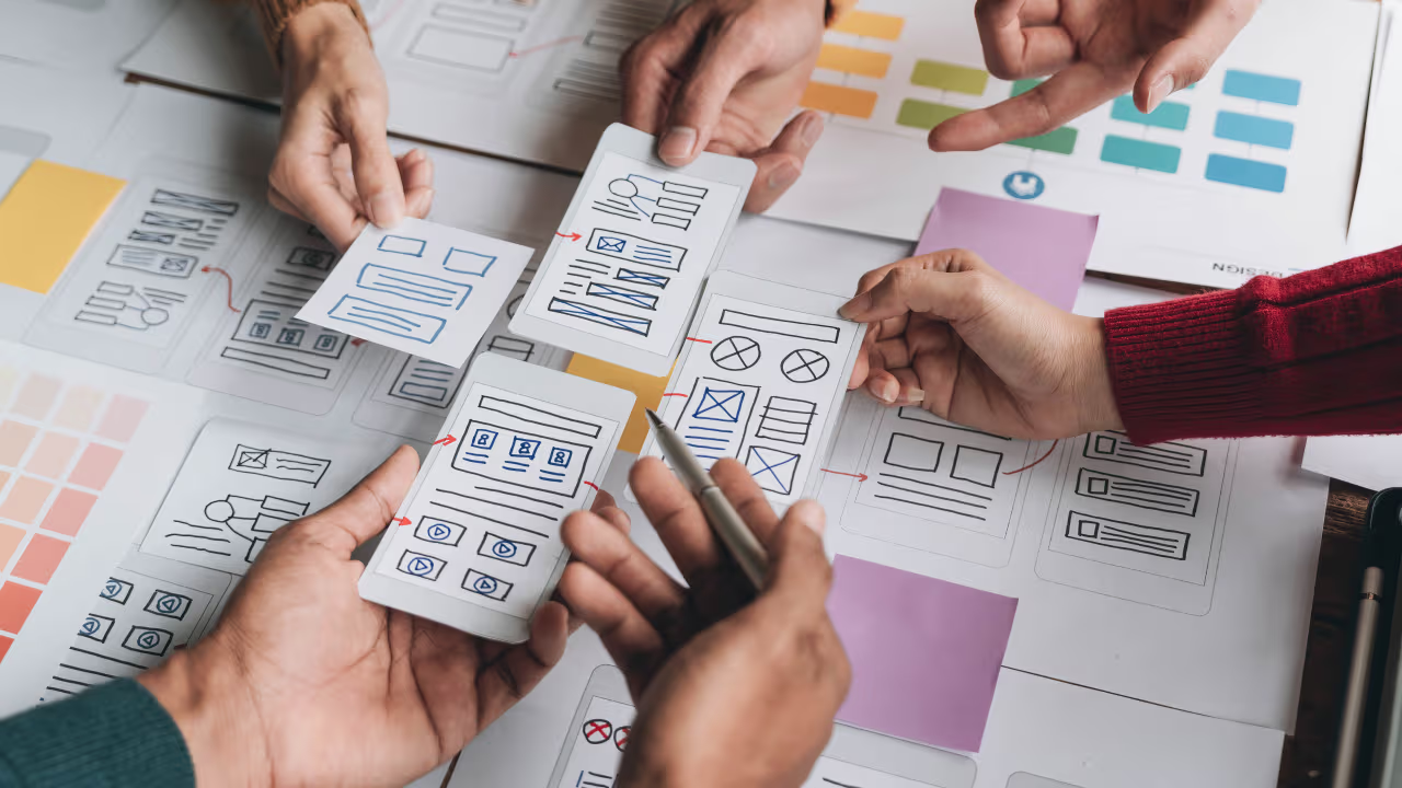
    An image of paper prototyping from unsplash.com.

    In a world dominated by cutting-edge tools, sleek interfaces, and ever-evolving technology, it might sound odd to say this – but sometimes, the best ideas start with nothing more than a pencil and a piece of paper. Before Figma and Adobe XD, before clickable mockups and developer handoff tools, designers relied on sketching to bring their visions to life. And even now, when the digital world changes at the speed of light, there’s something refreshing, even powerful, about going back to the basics.

    That’s where paper prototyping comes in. It’s low-tech, low-cost, and surprisingly high-impact. Whether you’re a seasoned designer or someone exploring UX for the first time, paper prototyping can help you unlock creative ideas and map out user experiences – without ever touching a screen.


    What is Paper Prototyping?

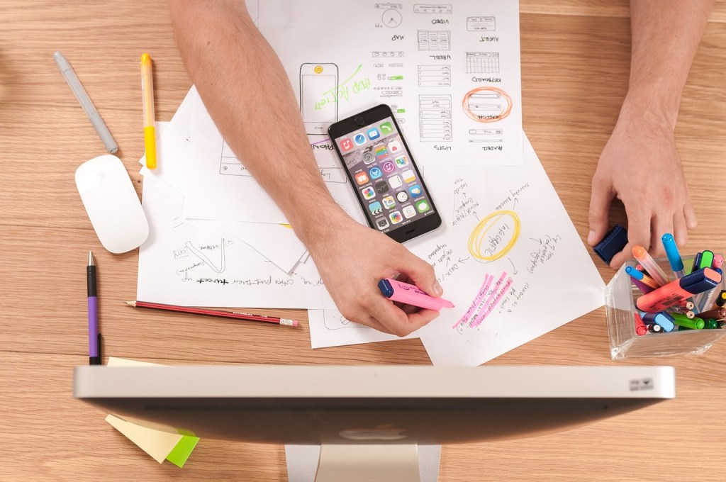
    An image of a designer creating prototypes from pixabay.com.

    “Paper Prototyping: The 10-Minute Practical Guide” offers a great introduction to the concept. At its core, paper prototyping is the process of sketching out user interfaces and workflows by hand, often using simple materials like printer paper, sticky notes, and markers. Each sketch represents a screen or interaction in your digital project, giving you a clear, tangible way to map out how a user might move through your app or website.

    These prototypes are considered low fidelity, meaning they aren’t functional or polished. But that’s the beauty of it – they’re fast, flexible, and easy to change. A single screen might take just five to ten minutes to draw, making it easy to explore different layouts or user flows without committing to any one direction too early. They’re also cost-effective, spark creativity, and come with a minimal learning curve, making them accessible to anyone, not just seasoned designers.

    Ultimately, paper prototypes help you plan before you build. And the more solid your plan, the faster and more effectively you can move on to wireframes, digital mockups, and functional prototypes.


    How to Prototype on Paper

    Getting started is simple. All you need are a few household materials – paper, pens, markers, sticky notes, scissors – and your imagination.

    Begin by sketching your key screens. These could include your home page, menu, or contact form. Each piece of paper becomes a screen, and you can arrange them in sequence to visualize the user journey. Think about how someone would move from screen to screen, and simulate that flow by swapping one sketch for the next, just as a user would tap through an app.

    Ben Coleman’s “How to Make Paper Prototypes” suggests thinking intentionally about a few key areas:

    Devices

    Before sketching, identify what device you’re designing for. For my project, I focused on smartphones, which meant my sketches had a portrait orientation and dimensions that mimicked a mobile screen. It’s important to design within the constraints of your chosen device to ensure your prototypes feel realistic.

    Elements

    Think about how users interact with your screen elements – buttons, links, search bars, etc. In my prototypes, I highlighted all interactive elements in green colored pencil. This made it easy to identify what was tappable and where users might go next, even if the prototype wasn’t interactive in the digital sense.

    Messages and Pop-up Boxes

    Sometimes, your app might show a confirmation message or a pop-up. Sticky notes work great here and can be easily added or removed based on user actions. For example, when simulating a report submission, you could use a sticky note that reads “Thank you! Your issue has been submitted,” which you could place over the screen to represent the interaction.


    Mobile Navigation Techniques

    An example of mobile navigation from dribbble.com.

    When designing for mobile, navigation is everything. It’s not just about helping users move from one page to another; it’s about making that movement feel intuitive. According to “Mobile Navigation: Patterns and Examples,” great navigation reduces friction and helps users find what they need without feeling lost.

    Here are some common mobile navigation approaches:

    • Top-Level Navigation: This includes hamburger menus (those three horizontal lines hiding a larger menu), floating action buttons, or tab menus at the top or bottom of the screen. Tabs are great for organizing equally important sections of your app. Top tabs are typically used for swiping between sections, while bottom tabs are often fixed and include icons for quick access.
    • Card-Based Navigation: Cards display main content areas right on the home screen. They’re touch-friendly and help prioritize information visually.
    • Sub-navigation: This includes dropdowns or sequential menus. When a user selects a main category, they see a submenu in its place. Good sub-navigation includes clearly labeled buttons, consistent iconography, and an easily accessible “back” option. Legible fonts and thoughtful spacing also make a big difference in usability.

    All of these patterns aim to strike the right balance between simplicity and functionality, getting users where they want to go without overwhelming them.


    My Project: Designing for Schuylkill Township

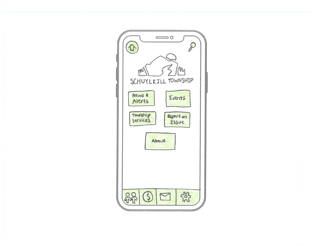
    My paper prototype for the home screen of Schuylkill Township’s app.

    For the past few weeks, I’ve been developing a companion mobile app for Schuylkill Township’s website. The goal? Make township information and services easier to access for residents on the go.

    I began by creating a site map to define the app’s structure, which I updated weekly based on feedback and user needs. From there, I mapped user flows – how a person might go from opening the app to reporting a streetlight outage, checking upcoming events, or finding township contact info.

    Paper prototyping was my next step. As I started sketching, I considered how users would navigate through the app and chose the following strategies:

    • At the top of every screen, I included a navigation bar with two options: Home and Search. These appear consistently to help users reset or find content at any time.
    • The main card-based navigation includes five core buttons: News & Alerts, Events, Township Services, Report an Issue, and About. These act as the backbone of the app, giving users direct access to essential information.
    • A footer navigation offers quick access to social media, online payments, contact details, and settings.

    To bring it all together, I identified four common tasks a user might complete in the app, and then created full sets of screens to show how each task unfolds – from start to finish – using nothing but pencil, paper, and a little green colored pencil.

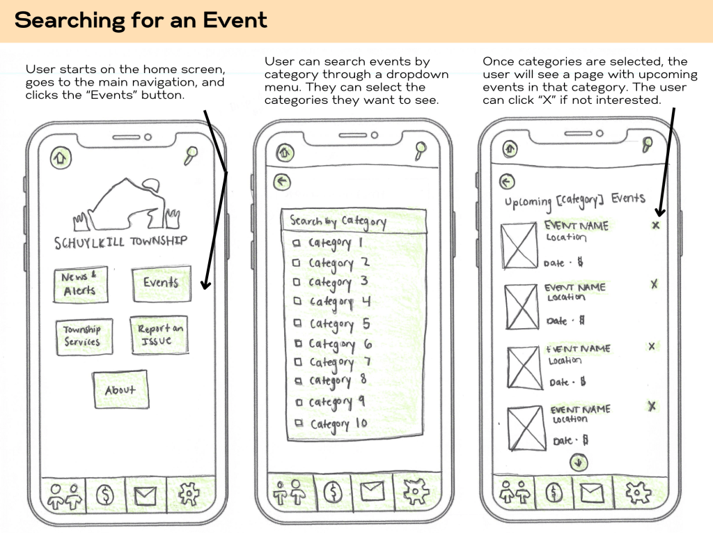
    Here’s an example of three screens for a user wanting to search for an upcoming event:

    Prototypes representing the first three steps of searching for an event.

    You can view my full set of paper prototypes here.


    Final Thoughts

    Paper prototyping may seem simple, but its power lies in that simplicity. It allows you to think deeply about user experience without the distractions of pixel-perfect design or technical constraints. By mapping out screens and interactions on paper, you’re building the foundation for a thoughtful, user-first app experience.

    So, if you’ve got an idea brewing, don’t wait for the perfect tool or software update. Grab a pencil, some paper, and just start sketching. It’s easy, fun, and one of the most effective ways to bring your ideas to life.

  • Navigating the Flow: The Art of Crafting User Flowcharts

    Navigating the Flow: The Art of Crafting User Flowcharts

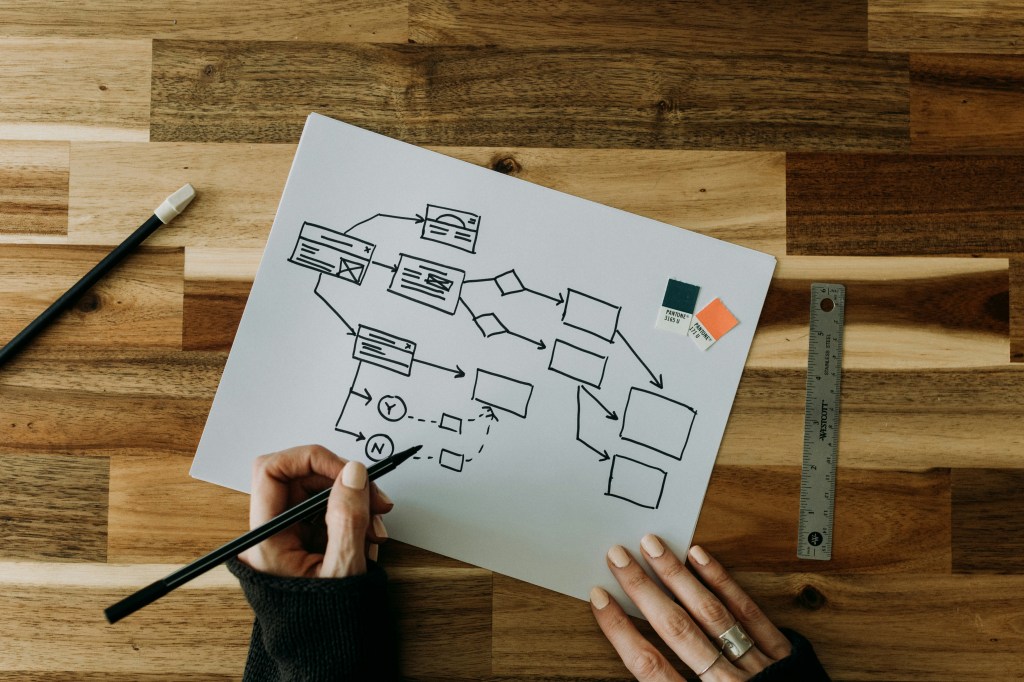
    An example of a visual roadmap from Kelly Sikkema on unsplash.com.

    Have you ever opened an app with a specific goal in mind, only to find yourself lost in a maze of menus and options? Imagine needing to quickly pay a bill through your bank’s mobile app. You expect a straightforward process, but instead, you’re met with unclear labels, hidden menus, and redundant steps. Frustrated, you either spend more time than anticipated or abandon the task altogether. Such experiences are not uncommon and highlight the critical importance of intuitive design in digital products.​

    These moments of frustration underscore the significance of user flowcharts in the design process. By thoughtfully designing these flows, we can create seamless experiences that guide users effortlessly toward their goals.

    What Is a User Flowchart?

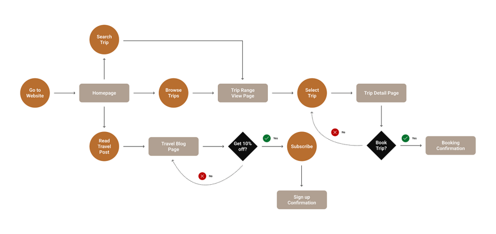
    An example of a user flowchart from uxdesign.com.

    A user flowchart is a diagram that illustrates the path a user follows to accomplish a specific task within a system. It outlines each step and decision point, providing a clear picture of the user’s journey. This tool is invaluable for designers aiming to create intuitive and efficient user experiences.

    Steps to Create an Effective User Flowchart

    Drawing inspiration from Camren Browne’s “How to Create a User Flow: A Step-by-Step Guide,” these are key steps to consider when creating a user flowchart:

    Understand Your User

    To design an effective user flow, you must first deeply understand your users. Ask questions like:

    • What are the users’ needs and goals?
    • What challenges do they face?
    • Which features are most important to them?
    • What initial questions will they have about the product?
    • What is the most important information that you can provide so the user can easily interact with your product?

    By answering these questions, you can identify key pathways that guide the user through your site or app in the most direct manner. Pinpointing these pathways will create user flow seamlessly.

    Outline the User Flow

    Browne suggests breaking the flowchart into three main stages:

    • Entry Point: An entry point is where the user accesses the product initially. Websites often have multiple entry points while apps usually have limited entry points.
    • Steps to Completion: Steps to completion encompasses a majority of the flow chart. These steps include login or signup screens, a home screen, and any other screen that the user passes through to complete their intended task. The goal is to keep it simple (Browne, 2022). It is important to only outline the steps needed for the user to achieve their goal.
    • Final Step: This step signifies the completion of the user’s task.​

    Keeping this structure simple ensures clarity and ease of navigation.​

    Define Flowchart Elements

    When creating flowcharts, designers should use different shapes and colors to represent various interface elements (Browne, 2022). Each shape illustrates an interaction and provides the reader with more information about what each step entails. Some of the most common shapes include:

    • Rectangles: Rectangles usually represent a page or display screen.
    • Circles: Circles are usually used for displaying an action.
    • Diamonds: Coined as a “decision diamond,” this shape asks a question where the user needs to make a decision.
    • Arrows: Lines with arrows indicate the direction of the user’s journey.

    Refine the Outline

    The strategy for designing an interface is similar to designing a UX flowchart. Browne (2022) suggests to make labels meaningful. Labels will accurately and efficiently describe exactly what the user is doing in each step of the user flow. Other tips include avoiding the use of capital letters to maintain readability and to carefully select colors for each step of the user flowchart. Color should be used as a coding system rather than for styling. Including a key or legend helps in understanding the symbols used in a user flowchart (Browne, 2022).​

    Applying User Flowcharts: A Practical Example

    Recently, I worked on developing a companion app for Schuylkill Township’s website, aiming to centralize township information and services. After creating a site map for the website and companion app, I further explored the companion app, identifying the purpose, functions, target audience, and designing the app’s user flowcharts.

    Schuylkill Hub Overview

    The Schuylkill Township Logo

    Purpose

    The purpose of the Schuylkill Hub companion app is to provide residents with easy access to township news, events, and services, fostering community engagement.​ The goal is to create a space where the Schuylkill Township community can connect and find easily accessible information on the go.

    Functions

    The functions of the Schuylkill Hub app include:

    • Make online payments​.
    • View the township’s most recent and past news stories​.
    • Check and RSVP to upcoming events​.
    • Request township services​.
    • Report issues​.
    • Access a directory of township contacts.​
    • Connect with other residents via social media.​

    Target Audience

    The target audience for this app is residents of Schuylkill Township, particularly those frequently visiting the township’s website. This app will offer them easy access to important township-related information.​ The demographic data of Schuylkill Township residents are as follows as outlined by the Census Reporter:

    • About 8,800 residents.
    • The median age is 42, with the most populated age groups of 50-59 (19%) and 10-19 (17%).
    • 51% Female and 49% Male.
    • 90% White.

    This app will meet the needs of its users because Schuylkill Township residents will be more informed about township events, feel more connected with their community and township leadership, access township-related information in an easily accessible and user-friendly way, make payments efficiently, and receive help when needed.

    User Example Scenarios

    Using the demographic information above, I crafted four user scenarios of potential Schuylkill Township residents that could use this app for different purposes.

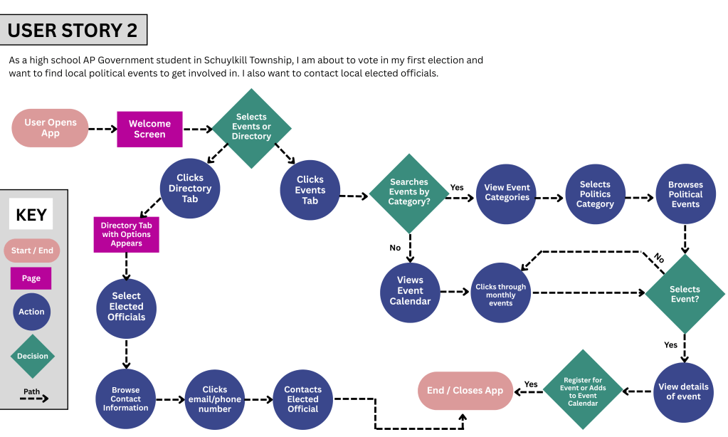
    To view all four scenarios with their respective user flowcharts, click here. Below is an example of one user scenario.

    Emma’s Story and Scenario

    An image of a student in a library from unsplash.com.

    User Story

    As a high school AP Government student in Schuylkill Township, I am about to vote in my first election and want to find local political events to get involved in. I also want to contact local elected officials.

    User Scenario

    Emma, 18, is a high school senior who recently enrolled in AP Government and Politics. This class has piqued her interest in politics, and she wants to learn more and become involved in her local political landscape. Yearning to gain knowledge before participating in her first election, she wants to get information about Schuylkill Township’s upcoming political events and also reach out to elected officials to establish connections. She wants to make a positive impact in her community.

    Use Cases

    Option 1

    1. Emma opens the Schuylkill Hub app.​
    2. The welcome screen displays options like “Events” and “Directory.”​
    3. She selects “Directory.”​
    4. The Directory Tab appears with options.
    5. Within the directory, she chooses “Elected Officials.”​
    6. Emma browses the list and finds contact information.​
    7. She uses the provided details to reach out to an official.​
    8. Satisfied, Emma closes the app.​

    Option 2

    1. Emma opens the Schuylkill Hub app.​
    2. The welcome screen displays options like “Events” and “Directory.”​
    3. Emma selects the “Events” tab from the welcome screen.​
    4. She filters events by category and chooses “Politics.”​
    5. Emma browses upcoming political events.​
    6. She selects an event.
    7. She views the event details.
    8. She registers for an event of interest.​
    9. Emma closes the app, having achieved her goal.​

    Option 3

    1. Emma opens the Schuylkill Hub app.​
    2. The welcome screen displays options.​
    3. Emma selects the “Events” tab.
    4. She does not filter events and looks through the events calendar manually.
    5. Emma clicks through monthly events.
    6. She selects an event.
    7. She views the event details.
    8. She registers for an event of interest.​
    9. Emma closes the app, achieving her goal.​

    This structured approach ensures that Emma’s experience is straightforward and aligns with her objectives.​

    User Flowchart

    The above flowchart depicts Emma’s journey to achieving her desired goals of attending upcoming political events and contacting local elected officials. Following Browne’s suggestions, I used these elements throughout my flowchart.

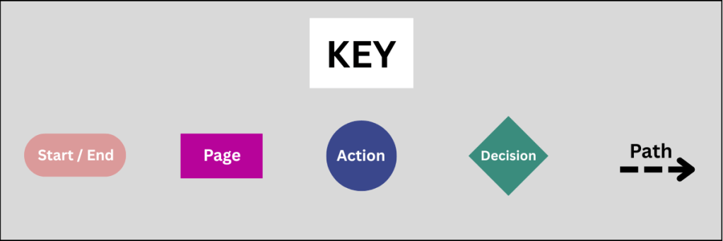
    • Rounded Rectangle: Start / End
    • Rectangle: Page
    • Circle: Action
    • Diamond: Decision
    • Dotted line with arrow to show direction.

    Final Thoughts

    Creating user flowcharts is more than just plotting paths on a diagram; it’s about stepping into the user’s shoes and understanding their journey. By focusing on the user’s perspective, designers can craft experiences that are not only functional but also engaging and intuitive.​

    Reflecting on this process, I realized the importance of empathy in design. When we prioritize the user’s needs and anticipate their actions, we create pathways that feel natural and effortless. This not only enhances user satisfaction but also fosters trust and loyalty.​ Designing with clear user flows ensures that our digital products offer meaningful and seamless experiences.

  • Designing a Companion App: Putting User Experience First

    Designing a Companion App: Putting User Experience First

    Background Image of Pickering Valley Golf Course

    How many apps do you use per day? Now, think about the ones you use most often. Why do you keep coming back to them? Chances are, they’re intuitive, easy to navigate, and provide the information you need without frustration. On the flip side, if an app is cluttered, confusing, or just plain frustrating, you probably close it and move on.

    Designing an app isn’t just about making something look good – it’s about creating a user-centric experience where every feature and piece of content is carefully chosen. That was my challenge this week: designing a companion app for the Schuylkill Township website that balances functionality, accessibility, and ease of use.

    Choosing the Right Content for an App

    Not all website content needs to be included in an app. In fact, trying to squeeze too much information into an app can backfire, making navigation overwhelming. So, I started by asking myself two key questions:

    1. Should all website content be available on the app?
      No. Overloading an app with too much content can create clutter and unnecessary complexity.
    2. What information would be most useful to users?
      As I researched municipal apps and user behavior, I found that residents primarily use these apps to stay informed and access services quickly. The most sought-after features include news and alerts, event updates, service requests, and contact information (civiclive.com; civicplus.com; townweb.com). My goal was to strike a balance between offering essential information and keeping navigation streamlined.

    Key Features of the Companion App

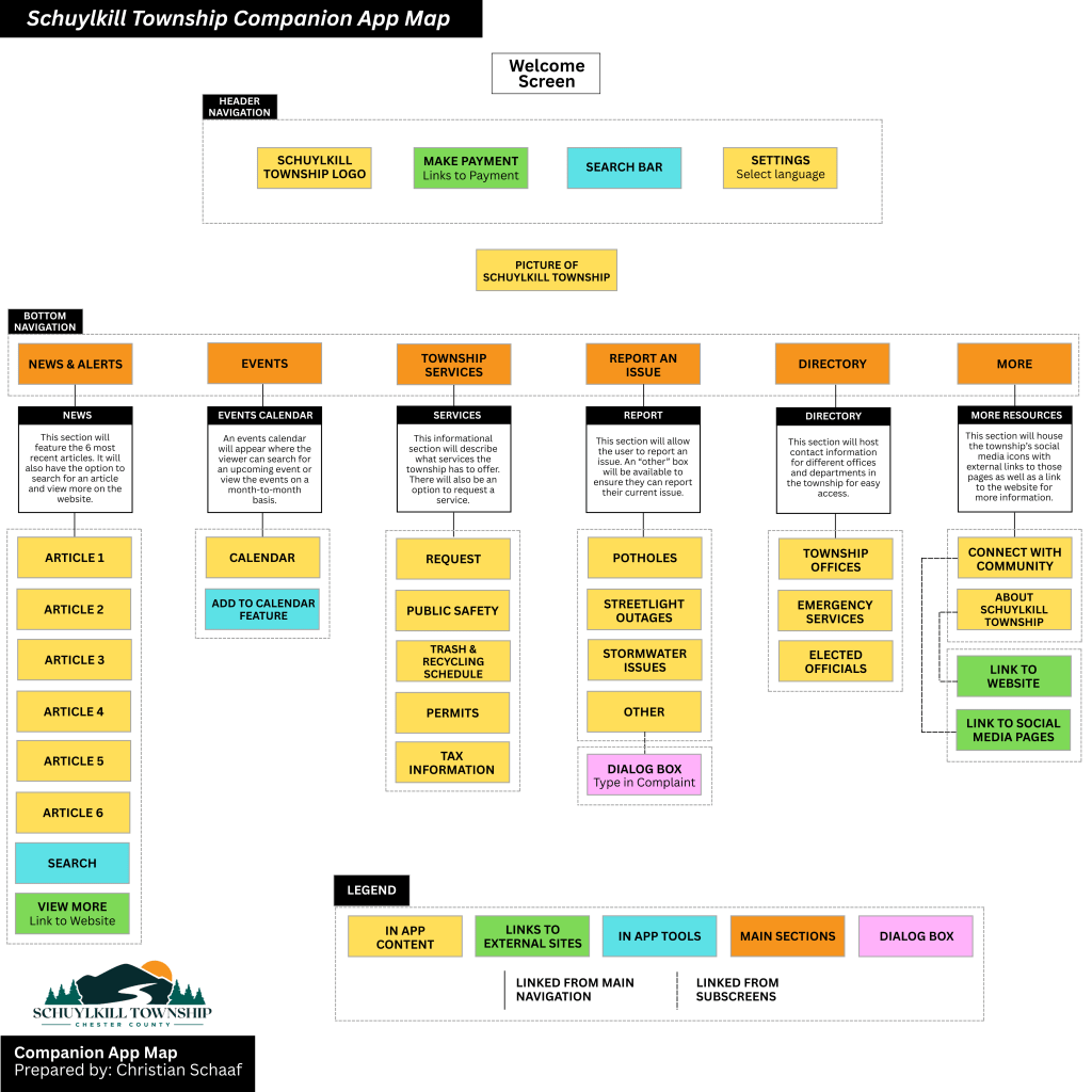
    After considering these factors, I structured the app around a home screen and five main sections, each designed to improve user experience and efficiency:

    1. Home Screen

    The home screen serves as the app’s hub, featuring:

    • A header with the township logo, search bar, settings for language preferences, and a ‘Make a Payment’ button.
    • A background image of the township for a welcoming, familiar touch.

    2. News & Alerts

    • Displays recent news articles and important alerts.
    • A search function to find specific articles.
    • A ‘Read More’ option linking to the full website for further details.

    3. Events

    • A calendar view of upcoming township events.
    • Ability to filter events by category (e.g., community meetings, recreational activities).
    • Option to set reminders or add events to a personal calendar.

    4. Township Services

    This section provides quick access to essential services:

    • Public Safety (police, fire department, emergency contacts).
    • Trash & Recycling Schedule.
    • Permits & Licensing.
    • Tax Information.

    5. Report an Issue

    • Residents can report problems like potholes, streetlight outages, or stormwater issues.
    • A category for “Other” issues, where users can write about their issue and upload an optional photo.

    6. Township Directory

    • Contact details for township offices, emergency services, and elected officials.

    7. More

    • Links to the township’s website and social media pages to encourage community engagement.

    My proposed companion app for Schuylkill Township.

    Click here to read more about my companion app creation.

    Bridging the Gap Between Website & App

    This companion app isn’t meant to replace the website – it’s designed to complement it. The website remains the primary source for comprehensive township information, while the app focuses on real-time updates and quick access to services. By strategically selecting what content to include, I ensured that the app remains lightweight, user-friendly, and functional.

    Lessons Learned in App Information Architecture

    This project reinforced some important lessons in mobile UX design and information architecture:

    1. Simplicity is key – Overloading an app with content leads to confusion; prioritization is crucial.
    2. User behavior should guide design – Understanding why residents visit municipal sites helped shape the app’s structure.
    3. Navigation should be effortless – A clear, well-organized layout enhances usability and efficiency.
    4. Consistency between web and app experiences matters – While the app offers streamlined content, it still aligns with the website’s overall branding and structure.

    Final Thoughts

    Creating this app was a fascinating dive into the balance between accessibility, usability, and design. It challenged me to think critically about how users interact with information and how to optimize their experience. By focusing on essential content, intuitive navigation, and quick access to vital services, this app aims to make township information more accessible than ever.

  • Building a Website is Like Building a House: The Role of Information Architecture

    Building a Website is Like Building a House: The Role of Information Architecture

    Image of a floor plan from pixabay.com

    Imagine building a home. You carefully plan the rooms, decide how they connect, and ensure the layout makes sense. A strong foundation is key – without it, the house won’t function properly. The same applies to websites and apps. Behind every intuitive digital experience lies a well-structured system known as information architecture (IA), the backbone that keeps everything organized and accessible.

    What is Information Architecture?

    Information architecture is an evolving and ever-changing field that focuses on structuring and organizing content effectively within a website or app. Dan Brown, in his article 8 Principles of Information Architecture, describes key IA concepts:

    • Objects: Objects on a site have discrete sets of behaviors. The content on a site is living with a recognizable structure.
    • Choices: It is important to offer meaningful choices to users.
    • Disclosure: Since the human brain can only process so much information at once, it is essential to practice progressive disclosure, a user interface technique that only shows the needed information first and reveals more as the user interacts with the page.
    • Exemplars: Show examples of content in categories.
    • Front Doors: It is important to understand that 50 perfect of site visitors will come through a different page than the home page. Take the user where they want to go but also show other related content found on the site.
    • Multiple Classification: Utilize classification schemes to label site content. Don’t provide too many classifications, which can easily overwhelm the user.
    • Focused Navigation: Use different navigation bars to structure content on a site, including topic navigation, timely navigation, sign post navigation, and marketing navigation.
    • Growth: Design a website in anticipation of growth.

    These above principles help create logical, user-friendly experiences.

    At its core, information architecture defines the relationships between all areas of a site. This week, I explored two essential components of IA: site maps and navigation. While they are related, they serve different purposes:

    • Site Maps: A blueprint of a website, listing all pages and their hierarchical structure.
    • Navigation: The links and pathways that guide users from one page to another.

    Going back to the house analogy: a site map is like a blueprint, outlining all rooms and their connections, while navigation is the hallways and doors that allow movement between them. Both are critical for a seamless user experience.

    Analyzing & Reworking a Township Website

    With this knowledge in mind, I analyzed the information architecture of my own township’s website – Schuylkill Township. My goal? To evaluate the current structure, identify areas of improvement, and propose a new, streamlined site map.

    Step 1: Mapping the Current Site

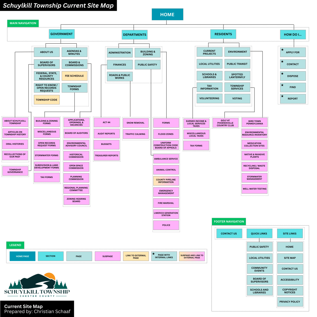
    To start, I explored the main navigation bar, footer, and subpages, taking note of structure, cohesion, and ease of access. I then created a visual site map in Canva, categorizing pages with different colors to denote their role in the hierarchy:

    • Home Page
    • Sections
    • Pages & Subpages
    • External Links
    • Pages with Internal Links

    The current site map for Schuylkill Township, Pennsylvania.

    Step 2: Identifying Strengths & Areas for Improvement

    While analyzing the site, I found aspects that worked well: easily accessible footer links and a secondary navigation bar with quick links.

    However, there were also areas that could enhance the user experience:

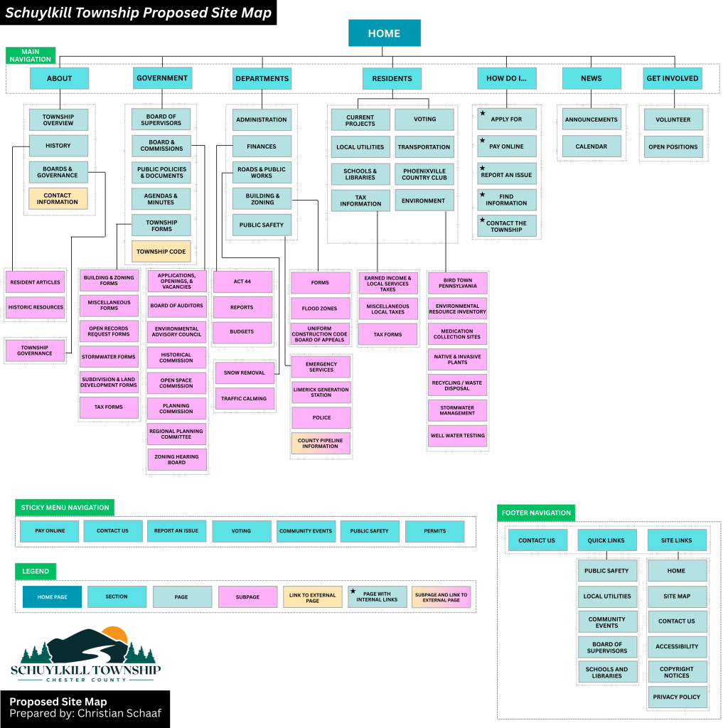
    • Sticky Secondary Navigation Bar: I proposed making the secondary navigation bar a sticky bar, meaning it remains visible as users scroll. This makes important links more accessible without excessive scrolling.
    • Reworking the Government Section: The current “Government” section houses both general information about the township and official government-related content. To reduce clutter, I separated “About” into its own category, making both sections clearer.
    • Adding a “News & Events” Section: Currently, news is located near the bottom of the home page, requiring users to scroll down to see updates. Many other municipal sites include “News & Events” in the main navigation menu, so I followed this best practice to improve visibility.
    • Renaming and Merging Subpages: Some subpages had unclear or overly complex names. For instance, I changed “Recollections of Our Past” to “Historic Resources” to better reflect the page’s content. I also merged pages with minimal content to simplify navigation.

    My proposed site map for Schuylkill Township, Pennsylvania.

    Click here to see the current site map and proposed site map in more depth.

    Lessons Learned from this Experience

    Working on this project gave me a newfound appreciation for the complexity of website structure. At first glance, a website might seem straightforward, but behind the scenes, there are countless decisions shaping how users find and interact with content. Here are some of my key takeaways:

    1. Clear organization enhances usability – A well-structured site helps users find what they need quickly and easily.
    2. Naming matters – Concise, descriptive labels improve navigation and comprehension.
    3. Navigation should be intuitive – If users struggle to find information, the design needs rethinking.
    4. Hierarchy should be logical – Content should be arranged in a way that makes sense, both structurally and contextually.
    5. Adaptability is crucial – As technology and user needs evolve, websites must be flexible enough to grow and change.

    Final Thoughts

    This deep dive into information architecture was both exciting and meticulous. Before this project, I had never closely examined a website’s structure or considered how sections, placement, and navigation impact user experience. By researching various municipal websites and reworking Schuylkill Township’s site map, I gained valuable insight into making digital spaces more accessible, navigable, and clear.

    A well-structured website is like a well-built house – it needs a strong foundation and a layout that makes sense. By applying the principles of information architecture, we can create digital experiences that are not only functional but also intuitive and user-friendly.

  • Unlocking Creativity: Exploring the Ideation Phase in Design Thinking

    Unlocking Creativity: Exploring the Ideation Phase in Design Thinking

    Creating an App: The Beginning Phase

    This week, I was presented with a thought-provoking question: How do you create an app? And where do you start? As part of my graduate class on Ideation, Prototyping, and Testing, I was challenged to explore the beginning stages of app development. Until now, I had never considered creating my own app. Faced with this creative challenge, I wondered: Where do I begin?

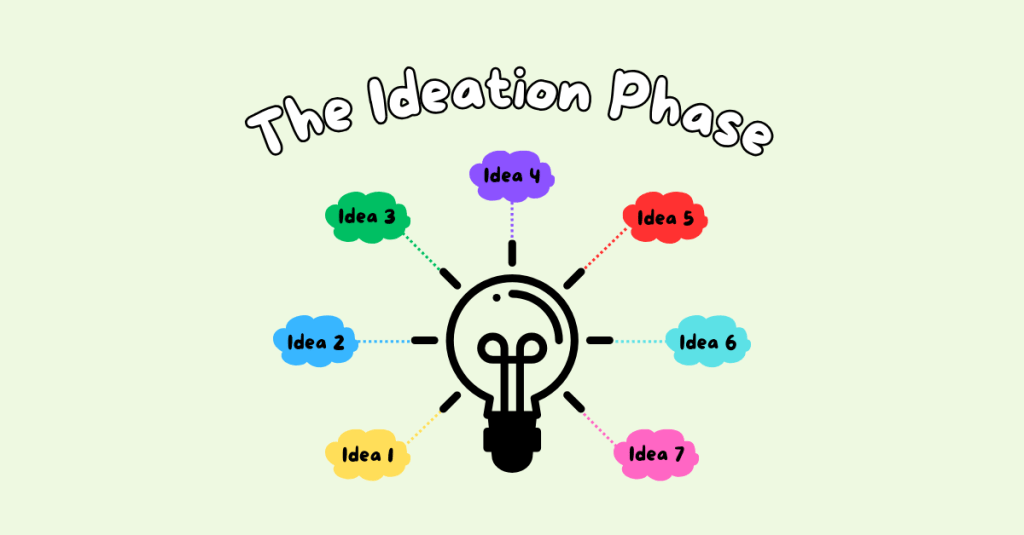
    I started by diving into the Ideation phase of the Design Thinking Process. This stage is all about generating ideas – the good, bad, and everything in between – to identify potential solutions to a problem. Through research, I discovered various Ideation techniques, including Brainstorming to Worst Possible Idea to Mind Mapping, and more. Ultimately, I decided to experiment with three techniques: Braindumping, Mind Mapping, and Sketchstorming. Here’s how each method shaped my app idea.

    My Ideation Phase of Creating an App

    Braindumping: Getting Every Idea on the Table

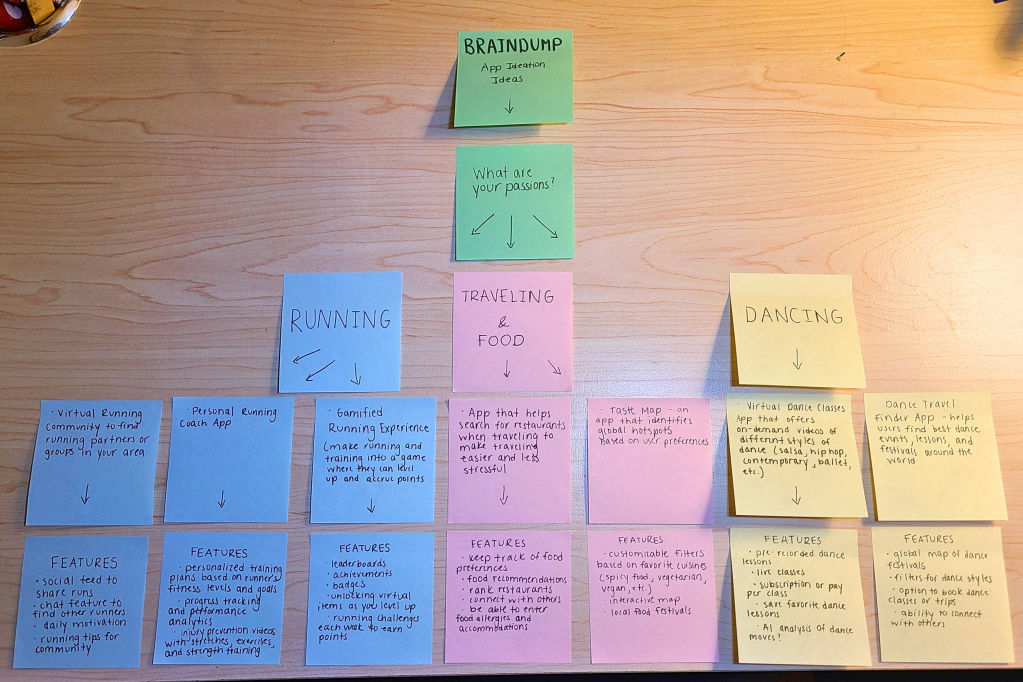
    I began with Braindumping, a technique that involves writing down ideas freely without judgment or filtering. Using sticky notes, I jotted down responses to key questions: What are my interests? What do I look for in an app?

    This exercise helped me identify four core interests: running, traveling, food, and dancing. I then brainstormed potential apps for each category.

    • Running: A platform to connect with local runners or a personal coaching app.
    • Dancing: A virtual dance studio offering live and pre-recorded lessons.
    • Traveling & Food: An app that helps users find restaurants based on dietary preferences and allergies.

    One idea resonated with me the most: an app that combines food and travel to help users find restaurants based on dietary restrictions. This concept stemmed from a personal experience with my mom; she follows a gluten-free diet and often struggles to find suitable dining options. With this in mind, I moved to the next phase: expanding the idea through Mind Mapping.

    Mind Mapping: Structuring the Concept

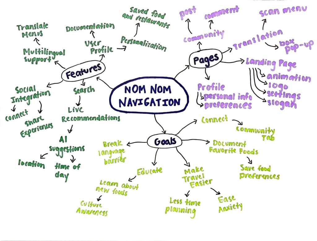
    To further develop my idea, I created a Mind Map, a technique where a central theme branches out into subtopics and related concepts. At the center of my map was the core idea: A restaurant-finding app for dietary preferences. From there, I created branches to explore the app in more detail:

    • App Features
    • Pages/Tabs
    • Goals

    Mind Mapping allowed me to see the app’s potential features at a glance, providing clarity on what to include in some potential mockups. This led me to explore the Sketchstorming technique.

    Sketchstorming: Bringing the Idea to Life

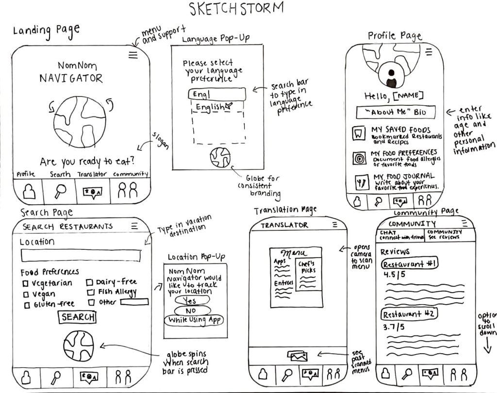
    Sketchstorming involves quick, rough sketches to conceptualize a product’s interface and layout. I began by sketching the app’s landing page and main tabs:

    • Profile: Where users input their dietary restrictions.
    • Search: A customizable restaurant-finding tool.
    • Translation: A language-assist feature for travelers.
    • Community: A space for users to share restaurant recommendations.

    Sketching helped me visualize the user experience, making the app feel more tangible. I realized that combining ideation techniques – starting broad with Braindumping, refining ideas through Mind Mapping, and visualizing them with Sketchstorming – was instrumental in shaping my concept.

    Reflections and Next Steps

    This was my first time formally using the Design Thinking Process, and it was both challenging and rewarding. By exploring multiple ideation techniques, I gained a deeper understanding of how to refine an idea and bring it to life. Moving forward, I’m excited to continue to study the Design Thinking Process.

    Have you ever used an Ideation technique? I’d love to hear how you approach creative problem-solving!

  • Module 7: Advanced Motion

    Module 7: Advanced Motion

    For this last module, I explored advanced animation techniques and worked on the final project for “Motion Across Media.”

    Reading & Writing

    This week, I read Chapter 11, “Show and Tell,” in Liz Blazer’s Animated Storytelling: Simple Steps for Creating Animation & Motion Graphics. This final chapter focuses on strategies for effectively sharing and promoting animation projects. She provides steps to make your project stand out among others. In prior chapters, Blazer described how to tell a story in an animation project, and now it’s time to tell the story of the animation project.

    1.) Package Your Project: Animators must package their project in a professional way. The following steps will ensure that your audience has everything they need to view your project and consider it for awards:

    • Upload a password and share a workable link. The favorite service for uploading videos that are password protected is Vimeo.
    • Design a clean logo for the title of the project paired with a still photo from the film that captures the essence of the project.
    • Write a concise, clear description of the project that is one to two sentences in length. This hook will be used on other publications referring to your project.
    • Create a memorable, eye-catching, thought-provoking tagline to make your film stand out.
    • Write a director’s bio that is short and sweet. This can include what you want to be known as professionally. It should list your professional title and accomplishments that support that role.
    • Write the story of your film: Why did you want to make the film? Why did you feel a need to share this story? What was the process of making this film? Make sure to include both mistakes and triumphs.

    2.) Determine Where to Show Your Film: Head back to your creative brief to remind yourself who the film is intended for, and this will help you select your audience and proper film festival for the film.

    3.) Consider Skipping the Film Festival Route: Blazer suggests that film festivals are not for everyone. Other alternatives include directly releasing the project on platforms like Vimeo. Releasing it online could help get quicker feedback and inspire ideas for your next animation adventure.

    4.) Create Your Network: Having a positive brand on the Internet is essential for filmmakers. Join online communities for designers, filmmakers, and artists. Talk to them. Share your work with them. Be inspired by them. This can form real relationships and help build connections for the future. It is also important to be supportive of other people’s work. Be present and engaged. Be a good audience. Make your brand known, but don’t overdo it. It is important to be selective. Mix up self-promotion and other types of posts. Tease your work, but don’t give away the whole story in the post. This will entice your audience to view your project. Finally, it’s essential to network in person. Establishing these connections are vital for success in the animation/filmmaking industry.

    5.) Share and Repeat: Be as professional as possible when sharing your work. Once you share one project, start with the next. Continue to sketch, storyboard, write, and animate new projects. The sky is the limit!


    As I reflect on this class, I am so happy with what I learned throughout these seven weeks. Coming into this class, I had no prior knowledge or experience with animation. From reading Liz Blazer’s book, I now know the essential steps in creating animation projects, from research and storyboarding to production to editing and packaging the video. It’s amazing what you can learn over seven weeks.

    I learned how to animate in Adobe Photoshop, Animate, and After Effects. I also learned how to design a project in Illustrator and import that project into After Effects. I discovered how to create keyframes in After Effects, create my own animations manipulating the Opacity, Position, Anchor Point, and Scale of an object, and how to import music and sound effects into After Effects.

    I also learned how important it is to plan out the project – the script, the music, the visuals, etc. If you are diligent in the pre-production phase, it makes the production and post-production phases much easier. It’s very interesting how each element of a story – the words, the art, the music – can all work together to create a beautiful piece.

    I am grateful for the knowledge I have gained, and I hope to continue to experiment with these programs in the future. I want to use After Effects when creating promotional videos at my current job to hopefully elevate the quality and creativity of these creations. I hope that animation will be a part of each step of my career.

    Research to Inform

    1.) Chroma Keying

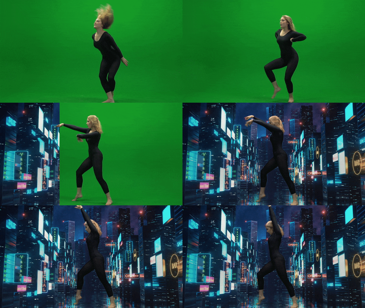
    This is an example of Chroma Keying as the green screen is replaced with an image in the background. I thought this was a good example because the picture chosen for the background is relevant to the movement of the subject. It reminds me of someone dancing on Broadway in New York City.
    2.) Ken Burns Effect

    This YouTube video showcases the Ken Burns effect by adding movement to still photographs of Glacier National Park. I love this effect as it adds realism to the photos. It makes me feel like I am there walking on the trails and hiking the mountains. Adding this movement to still pictures creates a very interesting effect as I feel I am transported to the setting of the photo.

    3.) Motion Tracking

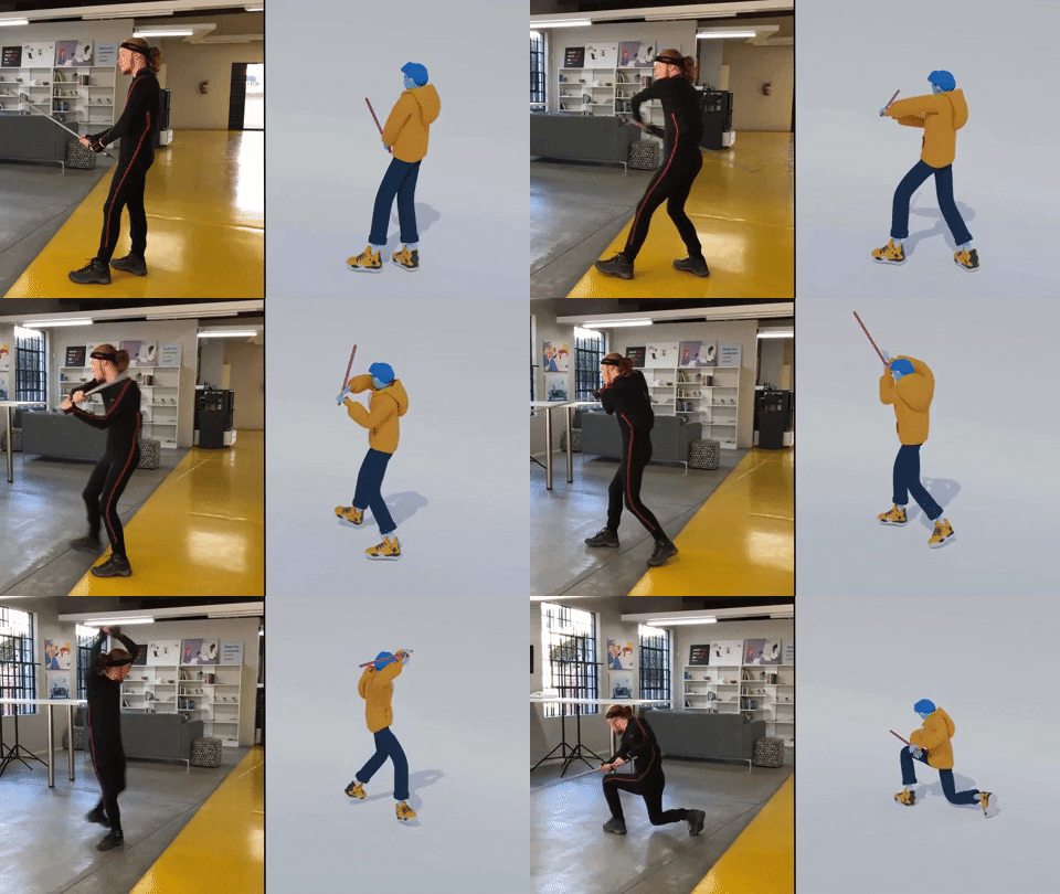
    Motion Tracking refers to digitally recording and following the movement of an object. In this example, the human’s movements on the left are being tracked by technology to create the animated figure on the right. I thought this was a very accurate example of how motion tracking would look. The movement is very realistic and matches well with the actual movement of the person.

    Create

    My Running Journey

    For my final project, I decided to create a video similar to the “Self-Introduction” video format because I really enjoyed creating that project! My goal was to illustrate my running journey from when I started running to the present. In this project, my goal was to incorporate multiple animation techniques that we learned throughout the class, including:

    1.) An Advanced Animation Technique: I chose to try out the “3D in After Effects” technique and manipulate a 2D photo. I chose a photo of my dad and I when I first started running. It was a little tricky to do this technique with that photo because his head is somewhat cut off in the photo, and rotating it too much would have revealed that, but I am happy with how it turned out! I definitely want to experiment more with this technique.

    2.) Creating shapes/lines with the line tool in After Effects. I utilized this strategy to create the “hill” animation when I talked about the hilly cross country course. I also used this when illustrating the length of a 100 meter race on a track. It was fun to experiment with trimming paths to create these animations.

    3.) Classic animations in After Effects, using keyframes to change Opacity, Scale, Rotation, and Position. I feel a lot more comfortable now creating keyframes and working with these animation options.

    4.) Using sound effects and background music. I added a typewriter sound effect at the beginning of the video when I chose the typewriter text animation. I also added a heart beat to the heart animation to further showcase that my love for running was expanding in high school.

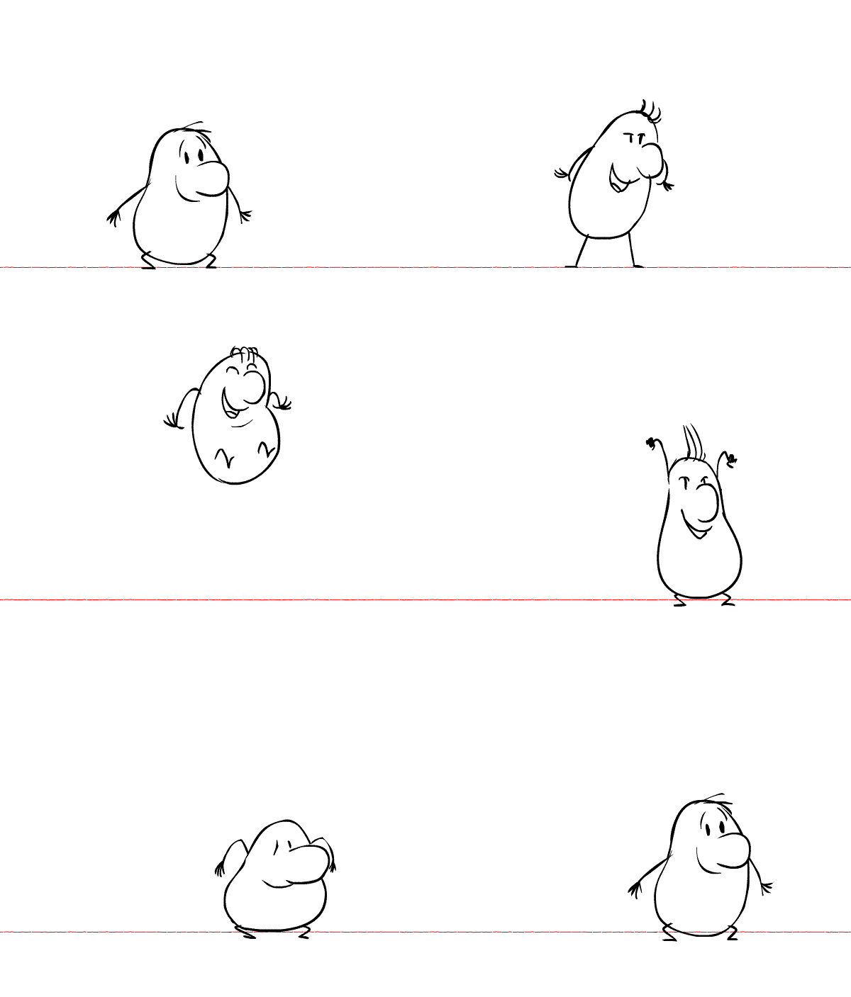
    5.) Using the “squash and stretch” animation principle on the location symbol. I wanted to utilize at least one of the animation principles throughout this project.

    I also wanted to create a consistent color palette throughout the video, so I chose a blue/green color, wrote down the HEX and RGB codes, and used those codes throughout the project. I hoped to create a consistent and coherent video that used the same colors and fonts from start to finish.

    I have thoroughly enjoyed this class. Coming in with no animation experience, I am so grateful for all of the techniques I learned. I’m excited to continue to experiment in these programs and explore more advanced animation techniques in the future.
  • Week 6: User Interface Animation

    Week 6: User Interface Animation

    For Week 6 of Motion Across Media, I am reading about the animation process in Liz Blazer’s Animated Storytelling: Simple Steps for Creating Animation & Motion Graphics.

    Reading & Writing

    Chapter 10: Animate! in Liz Blazer’s Animated Storytelling focuses on bringing a story to life through movement, emphasizing the importance of intentional animation choices. In this chapter, Blazer brings together all the tips that were taught throughout the beginning sections of her book: storyboards, color scripts, soundtracks, and more. Before starting to piece together your animation, she suggests to create a production calendar to track progress and ensure deadlines are met. She states to print out a calendar, fill it in backwards starting with the final delivery date, and then work back through post-production, production, and pre-production. This will help create a realistic timeline for the project. Once this is created, the information can be easily transferred to a digital calendar that can be shared with creative partners.

    Blazer highlights a few more important steps when starting an animation project, including making sure your tech equipment is up-to-date, creating simple file names to stay organized, and backing up your work consistently. Once these steps are complete, she suggests to start with the easy shots to gain confidence with the project. Since animation is a time-consuming endeavor, it is important to strategically plan out all shots before starting to avoid cutting any shots during the production phase.

    Blazer also stresses the importance of strategic movement in animation. She asserts to always anticipate and follow through to help illustrate the physics of gravity on weight and movement. Composing directional movement, such as horizontal, vertical, diagonal, or circular movement, will create consistency throughout an animation. In addition, Blazer offers tips to create a visually compelling animation:

    • Don’t put the subject in the center of the frame too often.
    • Mix up shot lengths. Use a mix of close-up shots, medium shots, and long shots.
    • Mix up shot timing. This will create different paces in your animation.
    • Add blur and grain, grunge, or vignettes.
    • Be flexible with the soundtrack. This could change during the production phase.
    • Mute the soundtrack to check that your animation is expressive without the music or sound effects.

    By reinforcing the idea that animation is storytelling in motion, Blazer guides animators to make thoughtful, impactful choices that enhance their projects.

    Research to Inform

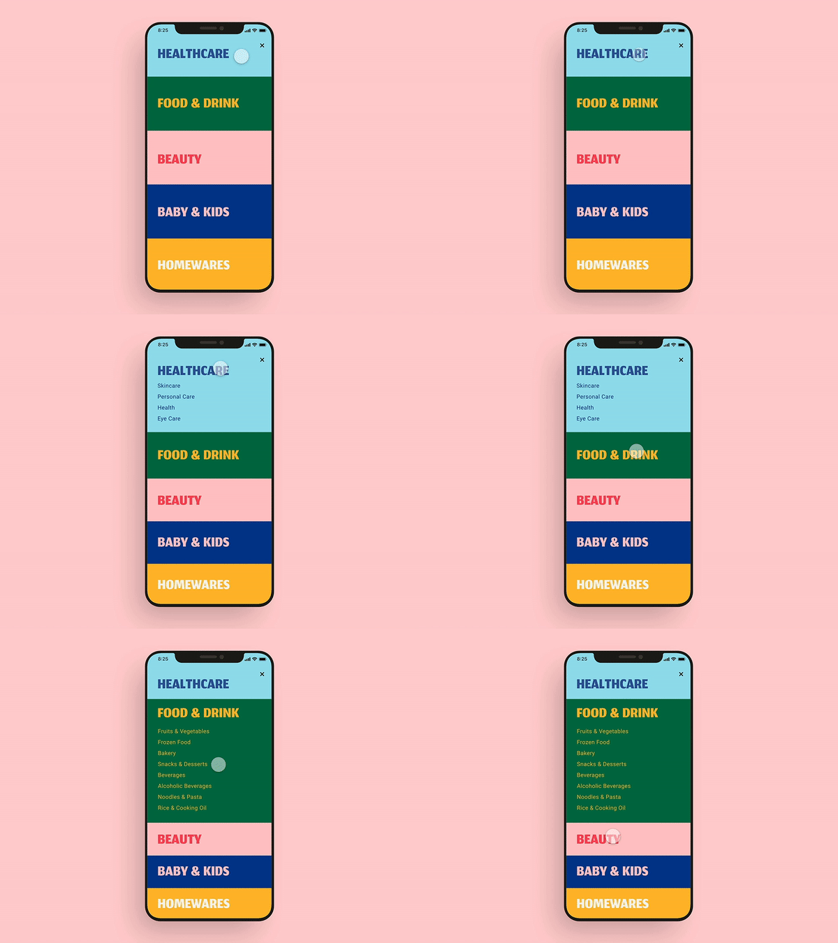
    This UI GIF caught my attention because of the bright colors used in the design. I also think this showcases excellent UI design because as one section opens, the other closes. This allows the user to view the entirety of each section on the screen without scrolling.

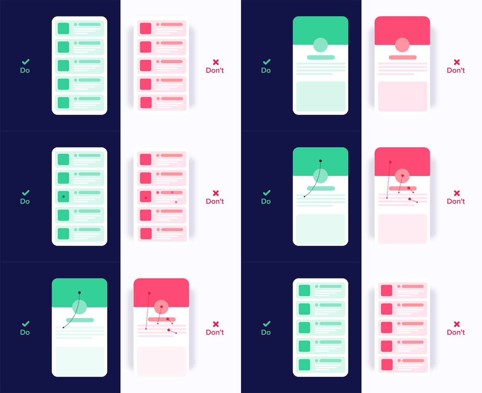
    I liked that this graphic showcases good and bad UI design. Being a beginner in UI design, it was interesting to see how little changes in movement can impact user experience. The panel on the left shows different elements moving in the same direction, while the one on the right depicts movements from many directions. It is important to be consistent in movements and not overcomplicate user interface designs.

    I chose this GIF because I like the switch from blue to black. I also like the simplicity of this design. I also like that the “X” is fully animated when the blue object passes through it. This is a very intentional UI design.

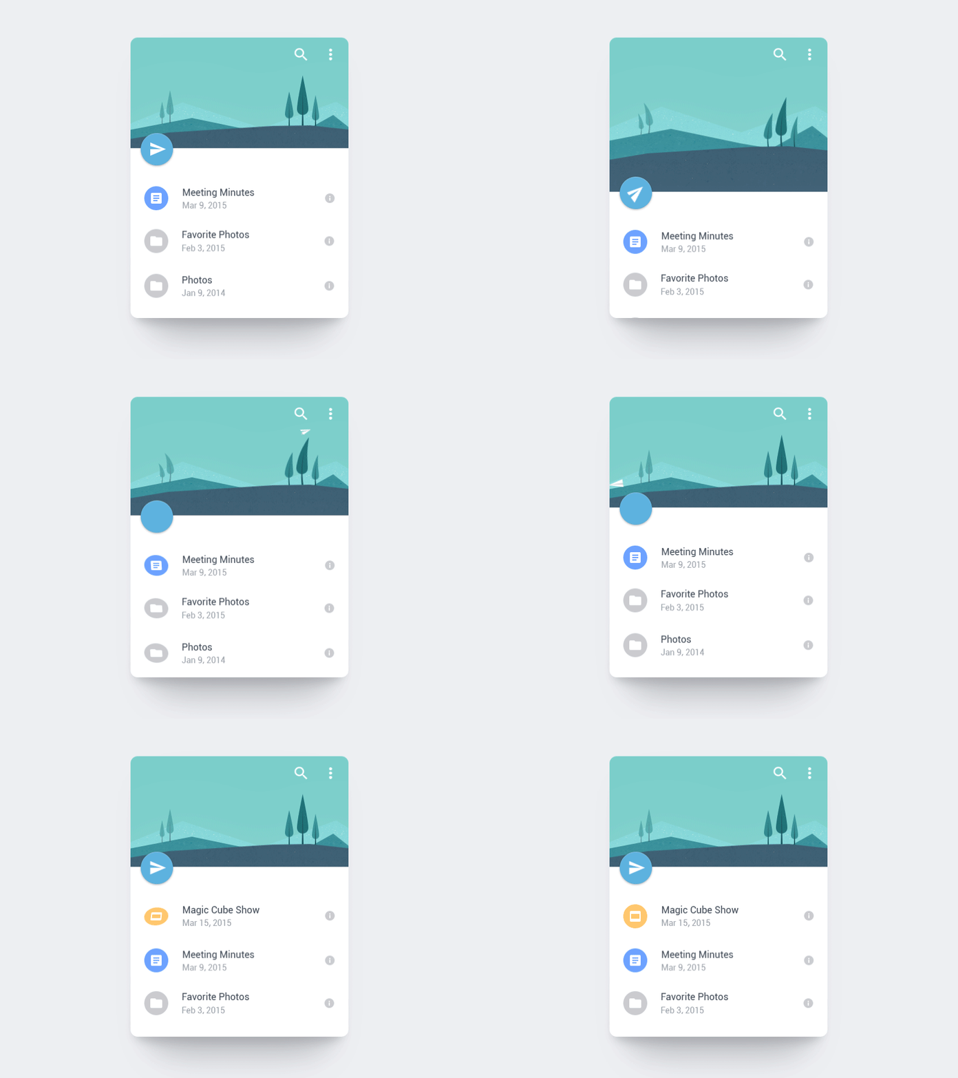
    I love how the paper airplane is shot off into the distance. This animation also uses the “anticipation” principle of animation by the page dragging down and then flinging up to release the paper airplane. I also like the bounce that is created after the paper airplane flies. This adds to the realism of this animation.

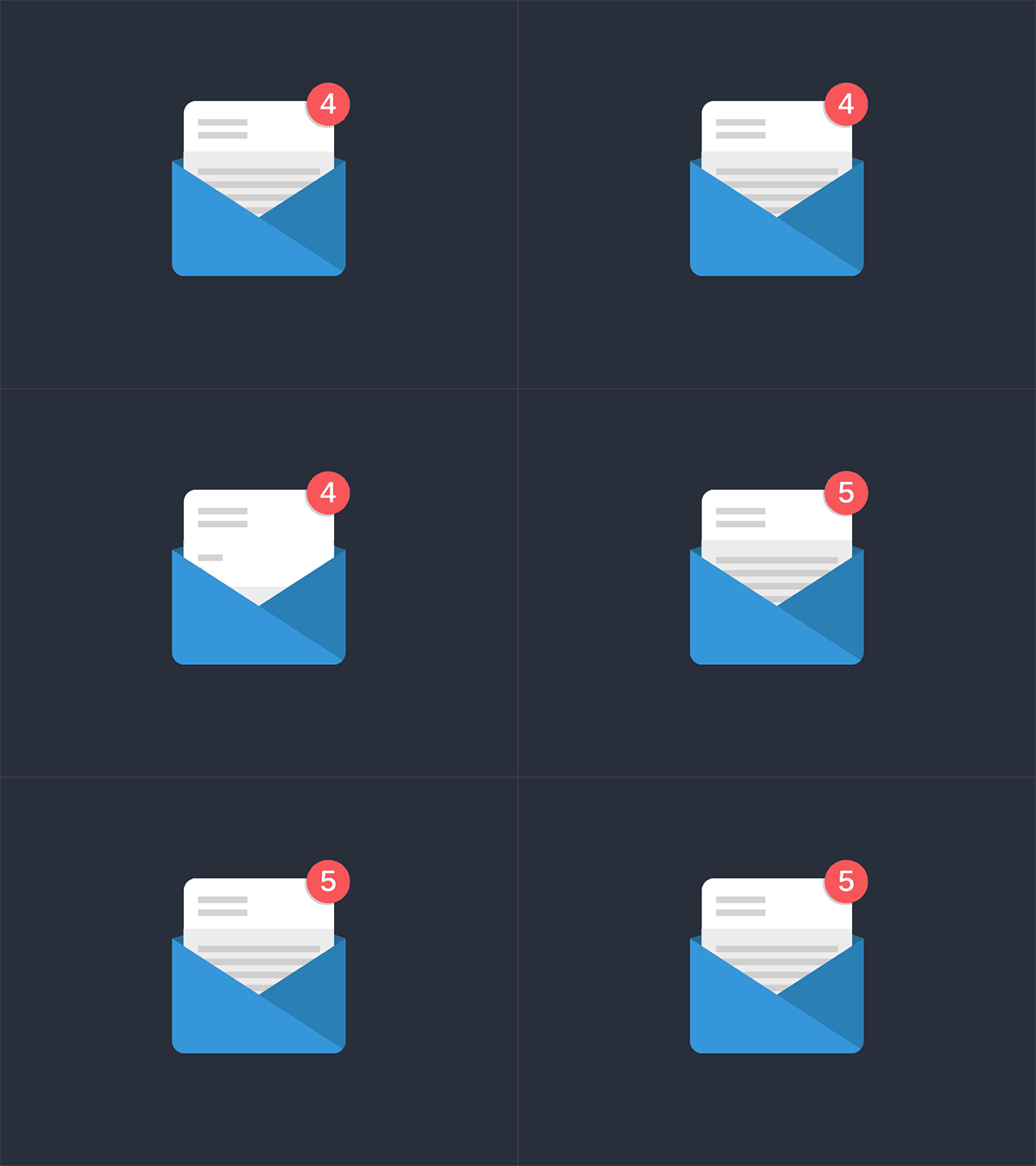
    This animation inspired the one that I created this week. I liked the animation switching from 4 to 5 and how the 5 started upside down until the new page appeared. I also like that the envelope is static. With the paper and number both animating, adding another animation would maybe make this GIF a little too busy. The still envelope contrasts well with the movement in the rest of the GIF.

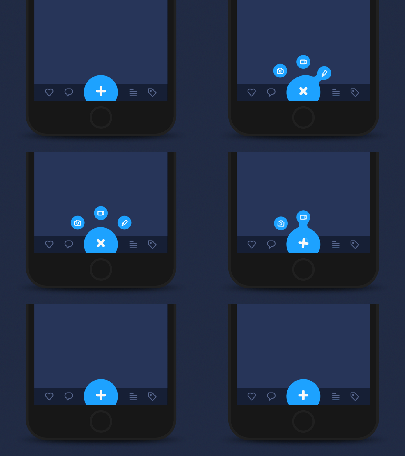
    I love the morphing of the circle in this GIF. It almost creates a water-like animation where droplets of water are breaking off the big circle. I also think using the blue color adds to this effect. I also like that the three smaller circles go back into the larger circle in reverse order. This creates a nice loop in the design.

    This one is definitely a more complex UI design. but I enjoyed the flow from screen to screen. I like how the animations are consistent from screen to screen, creating a cohesive user interface design. I also like the contrast of the still elements with the moving screens.

    I think this UI animation does a great job of capturing a geometric theme. Each animation created in this design morphs into some geometric shape – circles, hexagons, lines, etc. Creating consistency and a theme are both important elements of UI design.

    Create

    User Interface Animation: Notification Bell

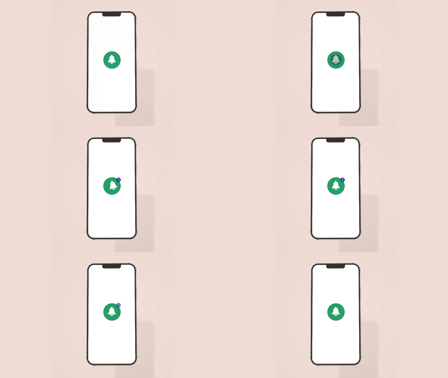
    Above are my User Interface Animation video and GIF. I first started in Adobe Illustrator and used the pen tool to design a bell. I imported the design into Adobe After Effects and then used the ellipse tool to create the circles. I wanted to change the size of the circle for when the person “clicked” on it and used the scale tool to achieve this.

    I then worked on animating the bell, and I moved the Anchor Point to the top of the bell to hopefully create a realistic back-and-forth motion of a bell. When changing the size of the bell with the scale tool, I copied the layer and moved the anchor point to the center of the bell to ensure that the size of it changed from that anchor point. It was a little tricky having two different anchor points, but with some experimentation, I think we figured it out!

    For the blue notification circle, I wanted the “1” to mimic the motion of the bell to create a cohesive design. I matched the angles that the bell was moving with the “1” to achieve this effect. I also wanted to practice creating a mockup, so I grabbed an image from unsplash.com and put the animation on a phone screen.

    In terms of sound effects, I used a click noise to emulate the person clicking on the icon, a ringing bell sound to showcase the bell moving back-and-forth, and a “pop” sound for when the “1” disappears. These sound effects are from pixabay.com. I also added in some happy and higher-energy background music to illustrate the excitement of getting a notification.

    Overall, I thought this was a challenging project. I don’t have any prior experience with UI design, and I think I have to train my mind to think like a UI Designer. The hardest part for me was coming up with an idea for the project. I was inspired to choose this notification animation because I was looking through all the notifications on my phone, and I thought it would be a fun animation to design. I am happy with how it turned out and I’m looking forward to practicing more user interface animations in the future.