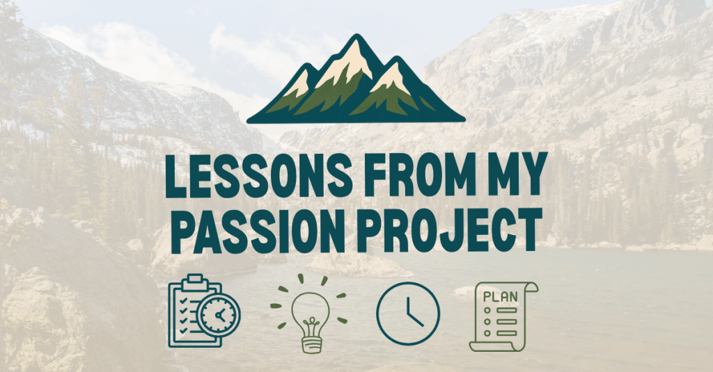
Have you ever had an idea for something you wanted to create, only to realize you weren’t sure where to begin? That’s exactly how I felt when I started working on my first digital product: a running training tracker. I knew I wanted to create something useful for runners like me, but I also knew it would take planning, patience, and learning new tools along the way. This post is all about the first steps of that journey: the planning stage and the beginning of production.
Laying the Groundwork with Planning
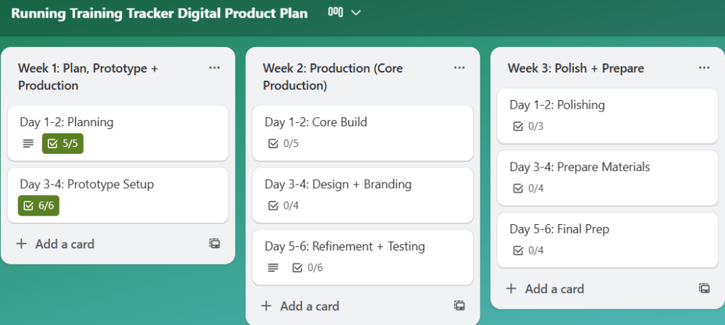
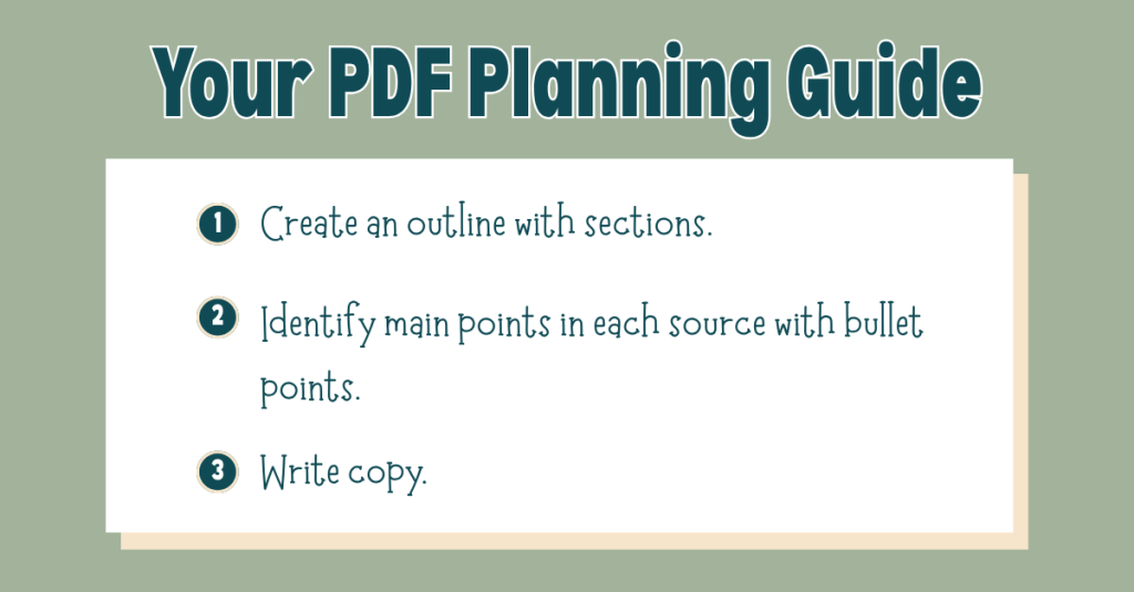
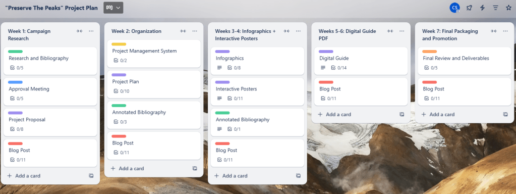
Before I opened a single app, I knew I needed a plan. I created a Trello board to break the project into small, actionable tasks spread over three weeks. This helped me avoid feeling overwhelmed and gave me a roadmap to follow. Each task was sized so that I could chip away at the project consistently rather than trying to tackle everything at once.
I also used Canva to sketch out mockups of the tracker pages. These visual drafts gave me a clearer picture of what I wanted to build before diving into the software itself.
View my Canva mockups here.

Choosing the Right Platform
After researching my options, I decided to build the tracker in Notion. What drew me in was its flexibility: tables, linked databases, and the ability to connect everything in one place. I thought these features would allow me to build something robust while still being user-friendly.
The catch? I had never used Notion before, so my first week was all about learning.
Learning the Tools
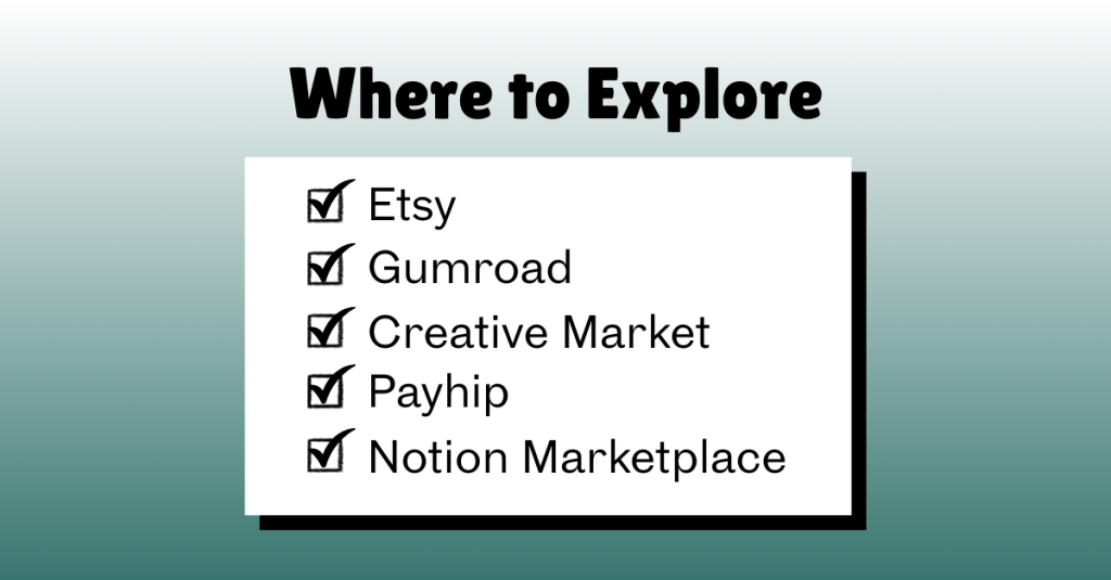
To get up to speed, I leaned heavily on tutorials and resources. Here are a few that helped me the most:
- Notion Guides:
- YouTube Tutorials:
- Inspiration from Other Trackers:
I can’t overstate how important these were. At first, everything felt foreign, but after a few videos and articles, I began to see how the pieces fit together.
Starting to Build
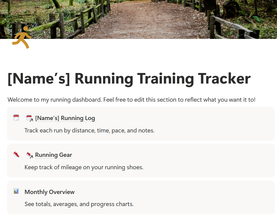
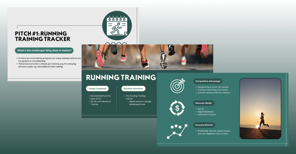
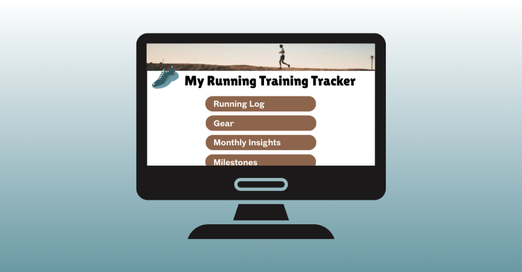
When I felt more confident, I opened Notion and began building the Running Log, which is the core element of the tracker. This is where runners can enter their daily workouts, including distance, time, pace, and notes. I also added a section for Running Gear so runners can log which shoes they wore and see how many miles they’ve put on each pair.
Click here to view the progress I’ve made on my running training tracker in Notion.
The first 30–40% of the build is now complete. The foundation is there; what’s left are refinements, smaller features, and, eventually, testing with real runners.
What Worked and What Didn’t
Some tools felt like second nature. Trello and Canva were smooth sailing since I’ve used them before. Building in Notion was a different story.
The biggest challenge? Coding formulas in Notion. For example, I wanted the tracker to calculate average pace when users enter their distance and time in “hh:mm:ss” format. It sounds simple, but formatting time in a way that Notion understands is complex. I spent a long time testing formulas, reading threads, and watching tutorials. It was frustrating at times, but I learned to be patient and keep trying different approaches until it worked.
Another tricky area was linking databases. I set up a system where the Weekly Log connects to the Running Gear database. That way, each shoe automatically adds up the total miles logged. Getting the databases to connect to each other correctly was a learning curve, but when I figured it out, it became a game-changer.
Reflection
Looking back, I’m proud of the progress I made this week. Taking time to plan with Trello and mockups in Canva made the actual building phase much smoother. I also proved to myself that I could learn a new platform like Notion with enough patience and persistence.
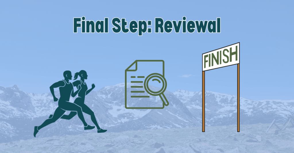
Next week, I’ll continue building by adding sections for PRs and Goals, building out the more simple features like the race-day checklist, refining the design, and preparing for user testing. I plan to test the tracker with family members, teammates, and running club friends to gather feedback from runners of all levels. This will help me ensure the tracker is practical, motivating, and accessible for everyone.
Want to read more about my first week of building this product? Click here to view my production journal.
Next Steps
My plan moving forward is simple:
- Finish building the must-have features of the tracker.
- Start testing with real users.
- Refine and brand the product before the final launch.
This journey is already teaching me so much about building a digital product, but also about staying patient, problem-solving creatively, and breaking down big goals into manageable steps.
And that’s what building your first digital product is really about: trial and error, showing up, learning as you go, and celebrating small wins along the way.
Stay tuned as I continue to build the running training tracker.