Tag: user-flow

  • Building the Blueprint: Deciding and Storyboarding with Your Sprint Team

    Building the Blueprint: Deciding and Storyboarding with Your Sprint Team

    You’ve laced up. You’ve found your pace. Now you’re in a full sprint.

    That’s exactly what Phase 2 of the Design Sprint feels like.

    After assembling your team and navigating the initial steps, this is the part of the Sprint where you have to stay focused, communicate clearly, and trust your teammates. Just like in a relay, everyone’s contribution counts, and collaboration makes all the difference.

    Have you ever heard of the African proverb, “If you want to go fast, go alone; if you want to go far, go together”? This quote applies directly to the Sprint. If your team is aligned and unified, you will achieve great solutions together.

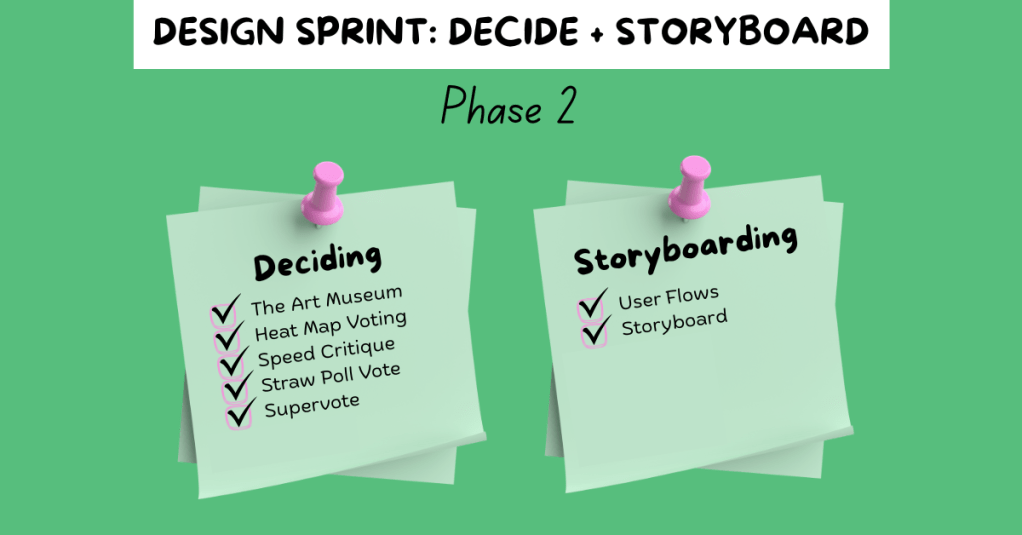
    Phase 2 of the Design Sprint, Decide and Storyboard, is all about making critical choices and beginning to shape your final solution. You evaluate the ideas generated in Phase 1 and decide which ones are worth turning into a prototype. In Sprint: How to Solve Big Problems and Test New Ideas in Just Five Days, Jake Knapp, John Zeratsky, and Braden Kowitz describe the steps of this phase:

    “You’ll critique each solution, and decide which ones have the best chance of achieving your long-term goal…you’ll take the winning scenes from your sketches and weave them into a storyboard: a step-by-step plan for your prototype.

    Jake Knapp, John Zeratsky, and Braden Kowitz

    Let’s break it down.


    Step One: Decide

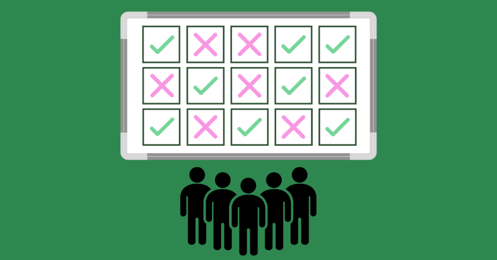
    Everyone has strong ideas, and that could make the idea voting process tricky. Luckily, Pattie Belle Hastings, in The Sprint Handbook: A Step-by-Step Guide to Planning and Running Innovation Sprints, offers a clear, structured path to voting on solutions:

    The Art Museum

    Think of your sketches like artwork on display. Pin your 4-Step Sketches from Phase 1 and observe them silently, just like how you would walk through an art gallery. This will give your team members time to analyze each idea individually before jumping into discussion.

    Heat Map Voting

    Distribute a sheet of red dots to your team members so they can mark parts of the sketches they found promising and interesting. Hastings suggests voting based on:

    • Feasibility
    • Desirability
    • Impact
    • Alignment with project goals

    After voting, it is important to discuss the ideas that received the most votes. Ensure each team member has a chance to speak and share their thoughts.

    Speed Critique

    With a timer set for each idea, have your Facilitator walk the team through each concept and capture key takeaways on three or four sticky notes per idea. This step will allow your group to highlight the strengths and potential concerns of each sketch without going off-track.

    Straw Poll Vote

    Each teammate should then select their favorite concept and write down the reason why they chose that idea. This will help visualize the group’s preferences and concept popularity.

    The Supervote

    The final decision is in the hands of your team’s Decider. This exercise should be given a defined time frame, and the Decider will vote using two dots. The votes can be distributed in a few ways:

    • Both dots on one concept.
    • One dot on a concept, and another dot on a specific feature from another concept.
    • Both dots on two different concepts.

    Step Two: Storyboard

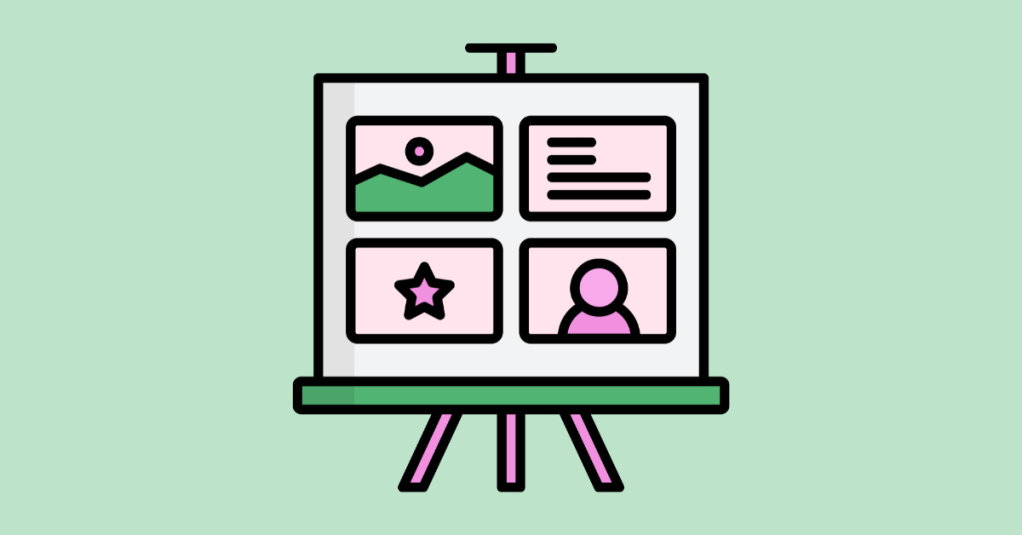
    When the concepts are selected in the Decide stage, it’s time to visualize how your future prototype would function step by step.

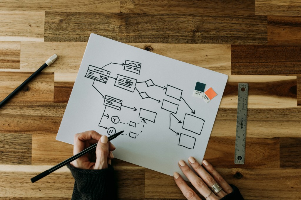
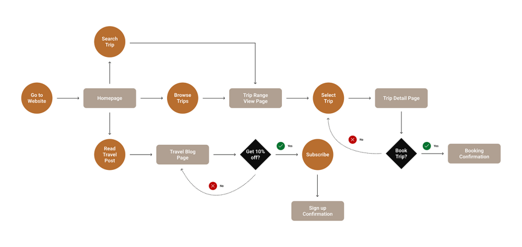
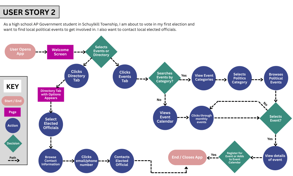
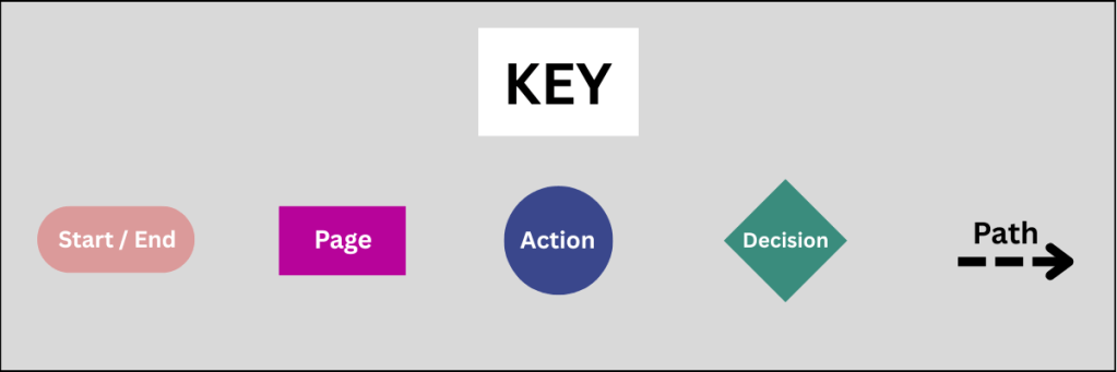
    Hastings, Knapp, Zeratsky, and Kowitz suggest to start with User Flows, a six-step process outlining user actions like taps or clicks. Each team member should create their own user flow by defining the first and finals actions and then filling in the middle steps. The group then votes on the flow that they want to move forward with.

    From there, your team will convert the winning user flow to an 8-screen storyboard, crafting a visual guide to illustrate the user’s journey.

    “Storyboarding is a simple process, with a ton of tiny decisions along the way…Every decision you make now is something you won’t have to think about when you build your prototypes.”

    Jake Knapp, John Zeratsky, and Braden Kowitz

    Along with the visuals, write simple, clear captions beneath each screen describing how the user will interact with your product. This will help your group stay aligned and will be beneficial in the next phase of the Design Sprint.


    Team Reflection: Our Decide and Storyboard Experience

    This week, my team met over Zoom to work through the Decide and Storyboard phase for our Gen Z personal finance app. We came prepared. Everyone completed their user test flows and reviewed each other’s sketches beforehand. This prep made a huge difference and allowed us to use our time together efficiently.

    In the meeting, we:

    • Used the Heat Mapping, Straw Poll Vote, and Supervote exercises to identify our top features.
    • Set timers to keep our discussion focused.
    • Made time for critique, clarification, and team input.
    • Spent time refining our storyboard collaboratively.

    To view my team’s work from this week, click here.


    Final Thoughts

    Pattie Belle Hastings sums up the importance of this phase in the Design Sprint: “This is a pivotal moment in the Sprint that transitions the team from decision-making to prototyping. It’s important to end this day with clarity and focus.”

    The Decide and Storyboard Phase is where your team’s ideas begin to take shape. It’s where rough sketches transform into plans, and where individual creativity blends into shared vision. In terms of our race analogy, this is the mile marker where momentum builds, and the finish line starts to feel real.

    Here are a few takeaways from this phase:

    • Communicate early and often. When ideas aren’t clear, ask questions.
    • Be flexible. If a vote doesn’t go your way, stay open and engaged.
    • Give ideas time to breathe. Sketching, reviewing, and refining takes time, and that’s okay.

    We’re not just running anymore; we’re sprinting with purpose.

    Stay tuned for Phase 3, where we’ll bring our ideas to life in the Prototype stage.

  • Navigating the Flow: The Art of Crafting User Flowcharts

    Navigating the Flow: The Art of Crafting User Flowcharts

    An example of a visual roadmap from Kelly Sikkema on unsplash.com.

    Have you ever opened an app with a specific goal in mind, only to find yourself lost in a maze of menus and options? Imagine needing to quickly pay a bill through your bank’s mobile app. You expect a straightforward process, but instead, you’re met with unclear labels, hidden menus, and redundant steps. Frustrated, you either spend more time than anticipated or abandon the task altogether. Such experiences are not uncommon and highlight the critical importance of intuitive design in digital products.​

    These moments of frustration underscore the significance of user flowcharts in the design process. By thoughtfully designing these flows, we can create seamless experiences that guide users effortlessly toward their goals.

    What Is a User Flowchart?

    An example of a user flowchart from uxdesign.com.

    A user flowchart is a diagram that illustrates the path a user follows to accomplish a specific task within a system. It outlines each step and decision point, providing a clear picture of the user’s journey. This tool is invaluable for designers aiming to create intuitive and efficient user experiences.

    Steps to Create an Effective User Flowchart

    Drawing inspiration from Camren Browne’s “How to Create a User Flow: A Step-by-Step Guide,” these are key steps to consider when creating a user flowchart:

    Understand Your User

    To design an effective user flow, you must first deeply understand your users. Ask questions like:

    • What are the users’ needs and goals?
    • What challenges do they face?
    • Which features are most important to them?
    • What initial questions will they have about the product?
    • What is the most important information that you can provide so the user can easily interact with your product?

    By answering these questions, you can identify key pathways that guide the user through your site or app in the most direct manner. Pinpointing these pathways will create user flow seamlessly.

    Outline the User Flow

    Browne suggests breaking the flowchart into three main stages:

    • Entry Point: An entry point is where the user accesses the product initially. Websites often have multiple entry points while apps usually have limited entry points.
    • Steps to Completion: Steps to completion encompasses a majority of the flow chart. These steps include login or signup screens, a home screen, and any other screen that the user passes through to complete their intended task. The goal is to keep it simple (Browne, 2022). It is important to only outline the steps needed for the user to achieve their goal.
    • Final Step: This step signifies the completion of the user’s task.​

    Keeping this structure simple ensures clarity and ease of navigation.​

    Define Flowchart Elements

    When creating flowcharts, designers should use different shapes and colors to represent various interface elements (Browne, 2022). Each shape illustrates an interaction and provides the reader with more information about what each step entails. Some of the most common shapes include:

    • Rectangles: Rectangles usually represent a page or display screen.
    • Circles: Circles are usually used for displaying an action.
    • Diamonds: Coined as a “decision diamond,” this shape asks a question where the user needs to make a decision.
    • Arrows: Lines with arrows indicate the direction of the user’s journey.

    Refine the Outline

    The strategy for designing an interface is similar to designing a UX flowchart. Browne (2022) suggests to make labels meaningful. Labels will accurately and efficiently describe exactly what the user is doing in each step of the user flow. Other tips include avoiding the use of capital letters to maintain readability and to carefully select colors for each step of the user flowchart. Color should be used as a coding system rather than for styling. Including a key or legend helps in understanding the symbols used in a user flowchart (Browne, 2022).​

    Applying User Flowcharts: A Practical Example

    Recently, I worked on developing a companion app for Schuylkill Township’s website, aiming to centralize township information and services. After creating a site map for the website and companion app, I further explored the companion app, identifying the purpose, functions, target audience, and designing the app’s user flowcharts.

    Schuylkill Hub Overview

    The Schuylkill Township Logo

    Purpose

    The purpose of the Schuylkill Hub companion app is to provide residents with easy access to township news, events, and services, fostering community engagement.​ The goal is to create a space where the Schuylkill Township community can connect and find easily accessible information on the go.

    Functions

    The functions of the Schuylkill Hub app include:

    • Make online payments​.
    • View the township’s most recent and past news stories​.
    • Check and RSVP to upcoming events​.
    • Request township services​.
    • Report issues​.
    • Access a directory of township contacts.​
    • Connect with other residents via social media.​

    Target Audience

    The target audience for this app is residents of Schuylkill Township, particularly those frequently visiting the township’s website. This app will offer them easy access to important township-related information.​ The demographic data of Schuylkill Township residents are as follows as outlined by the Census Reporter:

    • About 8,800 residents.
    • The median age is 42, with the most populated age groups of 50-59 (19%) and 10-19 (17%).
    • 51% Female and 49% Male.
    • 90% White.

    This app will meet the needs of its users because Schuylkill Township residents will be more informed about township events, feel more connected with their community and township leadership, access township-related information in an easily accessible and user-friendly way, make payments efficiently, and receive help when needed.

    User Example Scenarios

    Using the demographic information above, I crafted four user scenarios of potential Schuylkill Township residents that could use this app for different purposes.

    To view all four scenarios with their respective user flowcharts, click here. Below is an example of one user scenario.

    Emma’s Story and Scenario

    An image of a student in a library from unsplash.com.

    User Story

    As a high school AP Government student in Schuylkill Township, I am about to vote in my first election and want to find local political events to get involved in. I also want to contact local elected officials.

    User Scenario

    Emma, 18, is a high school senior who recently enrolled in AP Government and Politics. This class has piqued her interest in politics, and she wants to learn more and become involved in her local political landscape. Yearning to gain knowledge before participating in her first election, she wants to get information about Schuylkill Township’s upcoming political events and also reach out to elected officials to establish connections. She wants to make a positive impact in her community.

    Use Cases

    Option 1

    1. Emma opens the Schuylkill Hub app.​
    2. The welcome screen displays options like “Events” and “Directory.”​
    3. She selects “Directory.”​
    4. The Directory Tab appears with options.
    5. Within the directory, she chooses “Elected Officials.”​
    6. Emma browses the list and finds contact information.​
    7. She uses the provided details to reach out to an official.​
    8. Satisfied, Emma closes the app.​

    Option 2

    1. Emma opens the Schuylkill Hub app.​
    2. The welcome screen displays options like “Events” and “Directory.”​
    3. Emma selects the “Events” tab from the welcome screen.​
    4. She filters events by category and chooses “Politics.”​
    5. Emma browses upcoming political events.​
    6. She selects an event.
    7. She views the event details.
    8. She registers for an event of interest.​
    9. Emma closes the app, having achieved her goal.​

    Option 3

    1. Emma opens the Schuylkill Hub app.​
    2. The welcome screen displays options.​
    3. Emma selects the “Events” tab.
    4. She does not filter events and looks through the events calendar manually.
    5. Emma clicks through monthly events.
    6. She selects an event.
    7. She views the event details.
    8. She registers for an event of interest.​
    9. Emma closes the app, achieving her goal.​

    This structured approach ensures that Emma’s experience is straightforward and aligns with her objectives.​

    User Flowchart

    The above flowchart depicts Emma’s journey to achieving her desired goals of attending upcoming political events and contacting local elected officials. Following Browne’s suggestions, I used these elements throughout my flowchart.

    • Rounded Rectangle: Start / End
    • Rectangle: Page
    • Circle: Action
    • Diamond: Decision
    • Dotted line with arrow to show direction.

    Final Thoughts

    Creating user flowcharts is more than just plotting paths on a diagram; it’s about stepping into the user’s shoes and understanding their journey. By focusing on the user’s perspective, designers can craft experiences that are not only functional but also engaging and intuitive.​

    Reflecting on this process, I realized the importance of empathy in design. When we prioritize the user’s needs and anticipate their actions, we create pathways that feel natural and effortless. This not only enhances user satisfaction but also fosters trust and loyalty.​ Designing with clear user flows ensures that our digital products offer meaningful and seamless experiences.