Tag: site-map

  • Designing a Companion App: Putting User Experience First

    Designing a Companion App: Putting User Experience First

    Background Image of Pickering Valley Golf Course

    How many apps do you use per day? Now, think about the ones you use most often. Why do you keep coming back to them? Chances are, they’re intuitive, easy to navigate, and provide the information you need without frustration. On the flip side, if an app is cluttered, confusing, or just plain frustrating, you probably close it and move on.

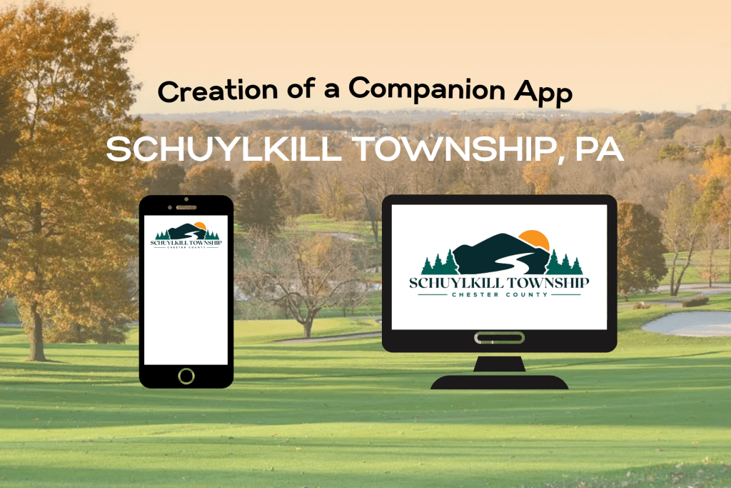
    Designing an app isn’t just about making something look good – it’s about creating a user-centric experience where every feature and piece of content is carefully chosen. That was my challenge this week: designing a companion app for the Schuylkill Township website that balances functionality, accessibility, and ease of use.

    Choosing the Right Content for an App

    Not all website content needs to be included in an app. In fact, trying to squeeze too much information into an app can backfire, making navigation overwhelming. So, I started by asking myself two key questions:

    1. Should all website content be available on the app?
      No. Overloading an app with too much content can create clutter and unnecessary complexity.
    2. What information would be most useful to users?
      As I researched municipal apps and user behavior, I found that residents primarily use these apps to stay informed and access services quickly. The most sought-after features include news and alerts, event updates, service requests, and contact information (civiclive.com; civicplus.com; townweb.com). My goal was to strike a balance between offering essential information and keeping navigation streamlined.

    Key Features of the Companion App

    After considering these factors, I structured the app around a home screen and five main sections, each designed to improve user experience and efficiency:

    1. Home Screen

    The home screen serves as the app’s hub, featuring:

    • A header with the township logo, search bar, settings for language preferences, and a ‘Make a Payment’ button.
    • A background image of the township for a welcoming, familiar touch.

    2. News & Alerts

    • Displays recent news articles and important alerts.
    • A search function to find specific articles.
    • A ‘Read More’ option linking to the full website for further details.

    3. Events

    • A calendar view of upcoming township events.
    • Ability to filter events by category (e.g., community meetings, recreational activities).
    • Option to set reminders or add events to a personal calendar.

    4. Township Services

    This section provides quick access to essential services:

    • Public Safety (police, fire department, emergency contacts).
    • Trash & Recycling Schedule.
    • Permits & Licensing.
    • Tax Information.

    5. Report an Issue

    • Residents can report problems like potholes, streetlight outages, or stormwater issues.
    • A category for “Other” issues, where users can write about their issue and upload an optional photo.

    6. Township Directory

    • Contact details for township offices, emergency services, and elected officials.

    7. More

    • Links to the township’s website and social media pages to encourage community engagement.

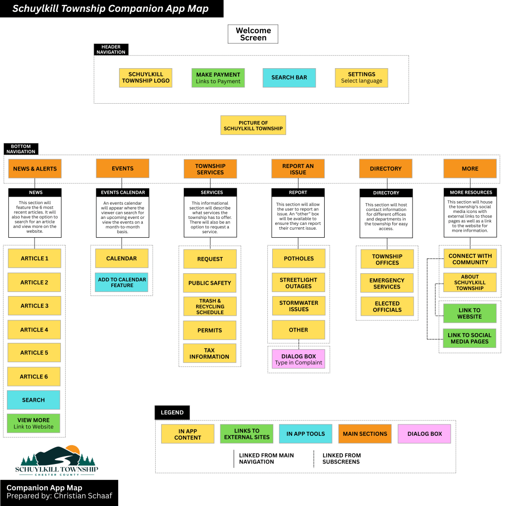
    My proposed companion app for Schuylkill Township.

    Click here to read more about my companion app creation.

    Bridging the Gap Between Website & App

    This companion app isn’t meant to replace the website – it’s designed to complement it. The website remains the primary source for comprehensive township information, while the app focuses on real-time updates and quick access to services. By strategically selecting what content to include, I ensured that the app remains lightweight, user-friendly, and functional.

    Lessons Learned in App Information Architecture

    This project reinforced some important lessons in mobile UX design and information architecture:

    1. Simplicity is key – Overloading an app with content leads to confusion; prioritization is crucial.
    2. User behavior should guide design – Understanding why residents visit municipal sites helped shape the app’s structure.
    3. Navigation should be effortless – A clear, well-organized layout enhances usability and efficiency.
    4. Consistency between web and app experiences matters – While the app offers streamlined content, it still aligns with the website’s overall branding and structure.

    Final Thoughts

    Creating this app was a fascinating dive into the balance between accessibility, usability, and design. It challenged me to think critically about how users interact with information and how to optimize their experience. By focusing on essential content, intuitive navigation, and quick access to vital services, this app aims to make township information more accessible than ever.

  • Building a Website is Like Building a House: The Role of Information Architecture

    Building a Website is Like Building a House: The Role of Information Architecture

    Image of a floor plan from pixabay.com

    Imagine building a home. You carefully plan the rooms, decide how they connect, and ensure the layout makes sense. A strong foundation is key – without it, the house won’t function properly. The same applies to websites and apps. Behind every intuitive digital experience lies a well-structured system known as information architecture (IA), the backbone that keeps everything organized and accessible.

    What is Information Architecture?

    Information architecture is an evolving and ever-changing field that focuses on structuring and organizing content effectively within a website or app. Dan Brown, in his article 8 Principles of Information Architecture, describes key IA concepts:

    • Objects: Objects on a site have discrete sets of behaviors. The content on a site is living with a recognizable structure.
    • Choices: It is important to offer meaningful choices to users.
    • Disclosure: Since the human brain can only process so much information at once, it is essential to practice progressive disclosure, a user interface technique that only shows the needed information first and reveals more as the user interacts with the page.
    • Exemplars: Show examples of content in categories.
    • Front Doors: It is important to understand that 50 perfect of site visitors will come through a different page than the home page. Take the user where they want to go but also show other related content found on the site.
    • Multiple Classification: Utilize classification schemes to label site content. Don’t provide too many classifications, which can easily overwhelm the user.
    • Focused Navigation: Use different navigation bars to structure content on a site, including topic navigation, timely navigation, sign post navigation, and marketing navigation.
    • Growth: Design a website in anticipation of growth.

    These above principles help create logical, user-friendly experiences.

    At its core, information architecture defines the relationships between all areas of a site. This week, I explored two essential components of IA: site maps and navigation. While they are related, they serve different purposes:

    • Site Maps: A blueprint of a website, listing all pages and their hierarchical structure.
    • Navigation: The links and pathways that guide users from one page to another.

    Going back to the house analogy: a site map is like a blueprint, outlining all rooms and their connections, while navigation is the hallways and doors that allow movement between them. Both are critical for a seamless user experience.

    Analyzing & Reworking a Township Website

    With this knowledge in mind, I analyzed the information architecture of my own township’s website – Schuylkill Township. My goal? To evaluate the current structure, identify areas of improvement, and propose a new, streamlined site map.

    Step 1: Mapping the Current Site

    To start, I explored the main navigation bar, footer, and subpages, taking note of structure, cohesion, and ease of access. I then created a visual site map in Canva, categorizing pages with different colors to denote their role in the hierarchy:

    • Home Page
    • Sections
    • Pages & Subpages
    • External Links
    • Pages with Internal Links

    The current site map for Schuylkill Township, Pennsylvania.

    Step 2: Identifying Strengths & Areas for Improvement

    While analyzing the site, I found aspects that worked well: easily accessible footer links and a secondary navigation bar with quick links.

    However, there were also areas that could enhance the user experience:

    • Sticky Secondary Navigation Bar: I proposed making the secondary navigation bar a sticky bar, meaning it remains visible as users scroll. This makes important links more accessible without excessive scrolling.
    • Reworking the Government Section: The current “Government” section houses both general information about the township and official government-related content. To reduce clutter, I separated “About” into its own category, making both sections clearer.
    • Adding a “News & Events” Section: Currently, news is located near the bottom of the home page, requiring users to scroll down to see updates. Many other municipal sites include “News & Events” in the main navigation menu, so I followed this best practice to improve visibility.
    • Renaming and Merging Subpages: Some subpages had unclear or overly complex names. For instance, I changed “Recollections of Our Past” to “Historic Resources” to better reflect the page’s content. I also merged pages with minimal content to simplify navigation.

    My proposed site map for Schuylkill Township, Pennsylvania.

    Click here to see the current site map and proposed site map in more depth.

    Lessons Learned from this Experience

    Working on this project gave me a newfound appreciation for the complexity of website structure. At first glance, a website might seem straightforward, but behind the scenes, there are countless decisions shaping how users find and interact with content. Here are some of my key takeaways:

    1. Clear organization enhances usability – A well-structured site helps users find what they need quickly and easily.
    2. Naming matters – Concise, descriptive labels improve navigation and comprehension.
    3. Navigation should be intuitive – If users struggle to find information, the design needs rethinking.
    4. Hierarchy should be logical – Content should be arranged in a way that makes sense, both structurally and contextually.
    5. Adaptability is crucial – As technology and user needs evolve, websites must be flexible enough to grow and change.

    Final Thoughts

    This deep dive into information architecture was both exciting and meticulous. Before this project, I had never closely examined a website’s structure or considered how sections, placement, and navigation impact user experience. By researching various municipal websites and reworking Schuylkill Township’s site map, I gained valuable insight into making digital spaces more accessible, navigable, and clear.

    A well-structured website is like a well-built house – it needs a strong foundation and a layout that makes sense. By applying the principles of information architecture, we can create digital experiences that are not only functional but also intuitive and user-friendly.