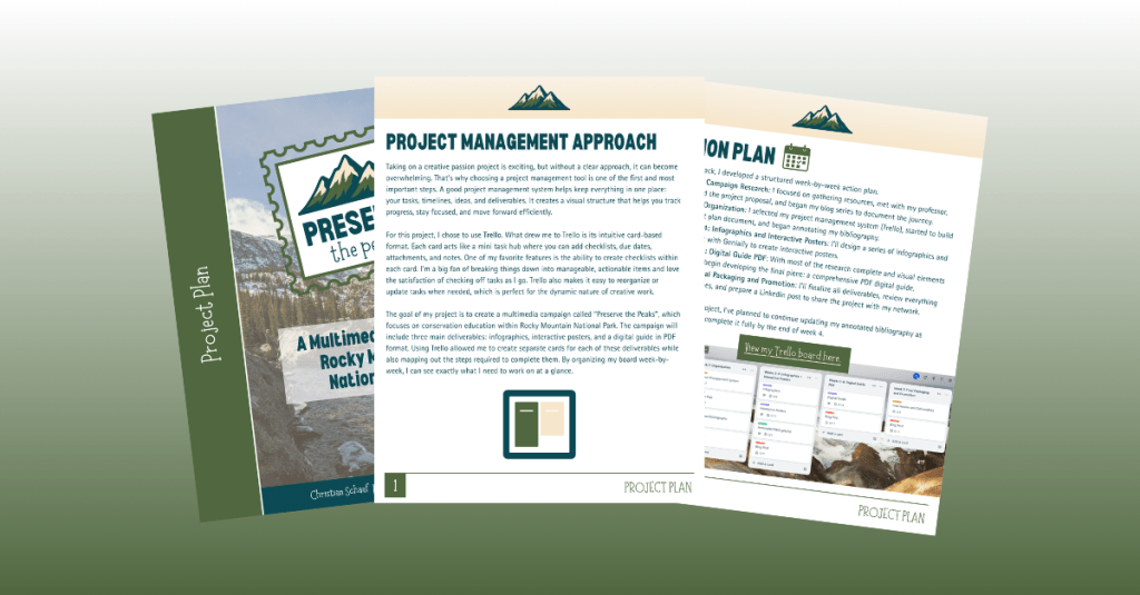
You’ve done the research, built your project management board, and collected your sources. Maybe you used Trello, Asana, or Monday.com to organize every little task. Now you’re staring at your screen thinking, “Okay, now what?” It’s time to roll up your sleeves and start bringing your ideas to life.
Getting Started: Trust the Plan You Already Made
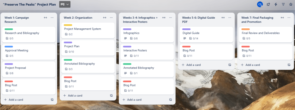
Starting your deliverables can feel overwhelming, but here’s the good news: you’ve already laid the groundwork. If you created a detailed project management plan, you’ve already mapped out what you need to do. That’s exactly what helped me when I began creating my infographics this week. I returned to my Trello board, looked at the tasks under “Week 3,” and followed them step by step: conduct research, outline content, and design the drafts.
Still unsure what to do next? Go back to your board. It’s like a creative GPS for your project.
Let the Process Evolve
Here’s a little secret: the plan doesn’t need to stay perfect.
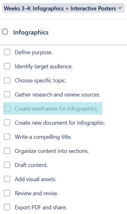
As I moved through my Week 3 checklist, I realized I needed an extra step. Creating wireframes wasn’t originally in my plan, but when I added it, everything clicked into place. These quick sketches helped me visualize the structure of my infographics before I even opened up my design software. So, if you find yourself needing to shift things around, go for it. That’s not a failure; that’s part of the process.
Your project tasks should work for you, not the other way around.
Designing Impactful Infographics: Tips from the Experts
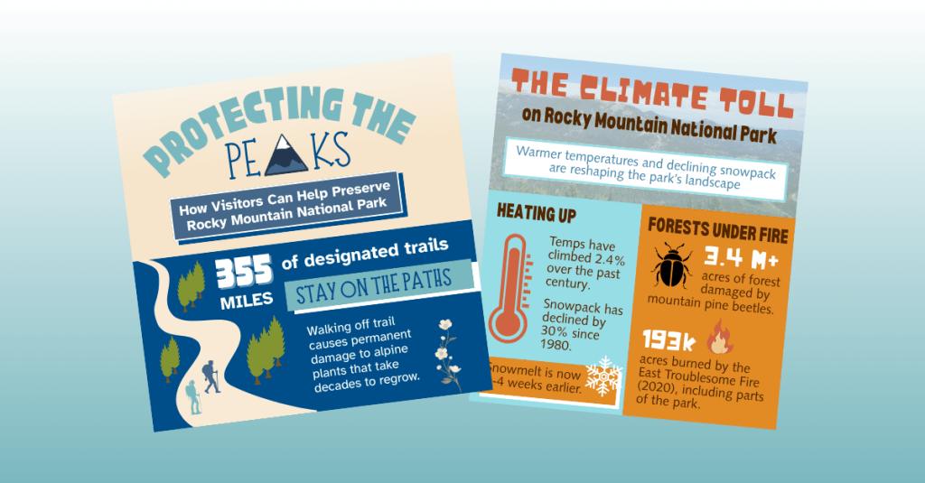
If your project involves creating infographics, you have come to the right place! I began this process by reviewing two fantastic resources that gave me a solid framework and design confidence. In Educator’s Blueprint: A How-To Guide for Creating a High-Quality Infographic, Gottlieb, Ibrahim, Martin, Yilmaz, and Chen break down creating an infographic into six helpful steps:
- Know your audience
- Curate relevant content
- Create a clear structure
- Use strong visual design
- Choose your tools wisely
- Ask for and apply feedback
These tips helped me when creating my infographics this week. In Creating Effective Infographics: Visualizing Data for Impact, Eddy emphasizes balancing text with visuals and making sure data shines without overwhelming the viewer. That advice really stuck with me. I made sure to write my content first, then build visuals that supported and enhanced the message, not the other way around.
When designing your own infographics, don’t forget about:
- Consistent branding
- Thoughtful color choices based on color theory
- Clear typography with limited, legible fonts
These small choices make a big difference.
A Peek Behind the Curtain: My Process
To see my outline, wireframes, and final infographic drafts, click here.
The transition from sketches to polished designs took time, but having a structure in place helped me stay focused. The wireframes acted like a blueprint that made design choices easier.
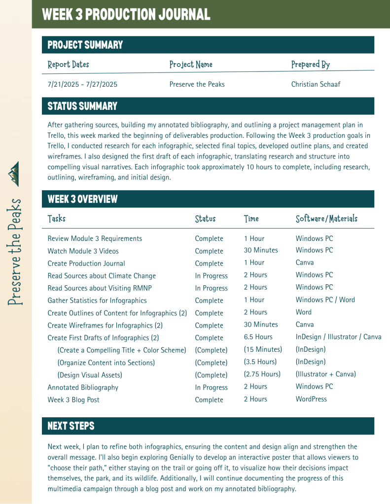
Stay on Track with a Production Journal
Want to keep tabs on your weekly progress? Start a production journal.
I learned this tip from Pattie Belle Hastings, who recommends documenting:
- The tasks you completed
- How long it took
- The current status (in progress or done)
- The tools or software you used
It doesn’t have to be fancy. Just keep it consistent. By the end of your project, you’ll have a clear picture of how your work unfolded and a record you can reference later or include in your portfolio. Here is my production journal:
One Last Thing: Embrace the Process
The most important thing I’ve learned while creating deliverables?
Enjoy the ride.
Creative projects are never perfectly linear. Plans change. Ideas evolve. You’ll make mistakes, try new things, and discover better ways to communicate your message. Let yourself experiment, and have fun with the process.
You’re building something you’re passionate about, so let that excitement show in every step you take.