Before any great video comes to life, there’s a moment of stillness: a pause to plan, to visualize, and to prepare. This week’s focus was all about that pre-production stage: learning the basics of cameras, mastering composition, and framing shots that tell a story before a single line of dialogue is spoken. Through exercises in photography, storyboarding, and scripting, I’ve learned that the magic of video doesn’t just happen in the edit; it starts long before the camera ever records. Planning isn’t just a step in the process; it’s the foundation that makes everything else run smoothly. Let’s dive into how I prepared to bring my video montage to life this week.
Readings and Writings
To get ready for my video montage, I started by reading a few chapters from The Bare Bones Camera Course for Film and Video by Tom Schroeppel and some articles about pre-production and storyboarding. These readings helped me understand that making a great video is all about planning, understanding your camera, and knowing how to tell a story through visuals.
The Bare Bones Camera Course for Film and Video
Chapter 1: Basics
Chapter 1 of The Bare Bones Camera Course for Film and Video explains how a camera works and why it’s important to understand the basics before filming. Schroeppel describes how the camera “sees” through a lens that gathers light reflected off objects. That light passes through the lens and lands on a sensitive surface inside the camera. In digital cameras, this surface is an image sensor, either a CCD (charge-coupled device) or a CMOS (complementary metal oxide semiconductor), which turns light into an electronic image. A key part of this process is exposure, or how much light reaches the sensor. Too much light causes overexposure, making an image too bright, while too little light causes underexposure, making it too dark. Exposure is controlled by three main settings: aperture, shutter speed, and ISO.
Schroeppel explains that aperture is the opening in the lens that lets in light, measured in f/stops like f/2, f/4, or f/8. Think of f/stops like fractions: the smaller the number, the bigger the opening, and the more light comes in. This setting also affects depth of field, or how much of the image is in focus. A low f/stop creates a blurry background, while a high f/stop keeps more of the scene sharp. ISO, which stands for the International Organization for Standardization, controls how sensitive the camera is to light. A low ISO (like 100) works well in bright light, while a high ISO (like 800 or 1600) is better in darker places but can make the image look grainy. Schroeppel also discusses how different lens angles (wide, normal, and telephoto) change how the viewer experiences a shot. Understanding these basics helps filmmakers control how their videos look and tell a story through light, focus, and composition.
Chapter 2: Composition
Chapter 2 of The Bare Bones Camera Course for Film and Video focuses on how to compose and frame a shot to make it visually appealing and balanced. Schroeppel explains that using a tripod keeps your camera steady and helps you focus on the creative side of filming. He introduces the rule of thirds, a simple grid that helps position your subject in a more natural way. He also talks about headroom (the space above a person’s head) and lead room (the space in front of where someone is looking or moving). Getting these right makes a shot feel comfortable to the viewer. Schroeppel also notes that color can affect balance. Bright or bold colors pull attention, so it’s important to use them carefully.
The chapter also explores how angles and backgrounds shape the mood of a shot. Shooting at eye level makes the subject feel equal to the viewer, while a bird’s-eye view can make them seem small and a worm’s-eye view can make them look powerful. Even slightly tilting the camera can add depth and energy. Schroeppel also encourages filmmakers to find frames within the frame, like using a window, doorway, or tree branches to draw attention to the subject. Lastly, he reminds readers that a good background should enhance the shot, not distract from it. Overall, this chapter taught me that thoughtful composition helps turn a simple image into a powerful story.
Chapter 5: Camera Moves
Chapter 5 focuses on how to make camera movement look smooth and purposeful. Schroeppel explains that cameras can move in a few main ways: zooms, pans, and tilts. A zoom-in brings the viewer closer to the subject, while a zoom-out pulls back to reveal more of the scene. A pan is a horizontal movement, turning the camera left or right, and a tilt is a vertical movement, tilting the camera up or down. Each move changes how the viewer experiences a scene, so it’s important to use them with intention.
One of Schroeppel’s biggest tips is to begin and end every move with a steady, well-composed static shot. This helps the movement feel more natural and keeps the viewer grounded. When combining moves, like zooming while panning or tilting, he suggests starting the pan or tilt just a split second before the zoom. This small detail makes the transition feel smoother and more professional. Overall, this chapter highlights that camera movement isn’t just about motion; it’s about control, timing, and knowing when to let the camera stay still.
Chapter 6: Montages
Chapter 6 focuses on the art of creating a montage, which Schroeppel defines as a series of related shots used to condense time or distance, set a mood, or summarize information. Montages are a great way to show progress, change, or emotion without needing long scenes or dialogue. They help the viewer understand a lot in a short amount of time and can add energy or rhythm to a story.
Schroeppel explains that a successful montage depends on variety. Each shot should look clearly different from the one before it to keep the viewer interested. This can be done by changing angles, shot sizes, and perspectives throughout the sequence. Mixing close-ups, wide shots, and medium shots adds visual excitement and helps tell the story more clearly. Overall, this chapter shows that montages aren’t just a collection of random clips; they’re carefully planned sequences that make storytelling faster, smoother, and more visually engaging.
Supplemental Articles
Video Pre-Production Planning Check-List – 11 Steps to a Successful Project
In this article, Jacob Trussell explains that great videos start with careful planning. Before you ever start filming, it’s important to think through every step of the process, from setting goals to editing the final cut. Trussell shares that a solid video production checklist keeps everything organized and helps avoid surprises later on. Planning ahead not only saves time and money, but also makes the creative process smoother and more enjoyable.
Trussell outlines fifteen key steps to a successful video production. These include defining your goals and identifying your audience, developing a clear message, creating a budget, and deciding where your video will live once it’s done. He also stresses the importance of storyboarding and scripting before filming, as well as scouting locations, organizing equipment, and building a realistic schedule. Finally, he highlights the last stages of shooting, editing, and distributing your finished video. Overall, Trussell’s article reinforced what I’ve learned this week: when you take the time to plan your shots and structure your story, production becomes less stressful and a lot more creative.
Learn What is a Storyboard and How to Use it to Make Better Videos
This article explains that a storyboard is like a comic strip version of your video that helps you plan out each shot before filming. Storyboards make it easier to visualize how scenes will look, organize camera angles, and communicate your ideas to others. The article breaks down the process into simple steps: plan your video’s goal and message, visualize each scene, add notes about timing and action, and review your storyboard with others for feedback. It also points out common mistakes, like making storyboards unclear or too detailed. Overall, the article shows that storyboarding helps save time and money while making your final video stronger and more focused.
Acting Tips: 12 Camera Shots Every Actor Should Know
In this article, the New York Film Academy explains that understanding common camera shots is important for anyone working in film or video production. The article introduces twelve popular shot types, such as the aerial shot, which captures a scene from high above; the establishing shot, which sets the location; the close-up, which focuses on a person’s face or detail; and the wide shot, which shows the subject within their environment. Each shot type helps tell a different part of the story and creates a unique emotional effect for the audience.
The article also discusses how camera angles can shape how we see a subject. A low-angle shot can make someone appear powerful or confident, while a high-angle shot can make them seem smaller or more vulnerable. By combining different angles and shot sizes, filmmakers can guide the viewer’s attention and influence how a scene feels. This article helped me recognize how much thought goes into framing and shot selection. Every choice behind the camera adds meaning to the story being told.
Research to Inform
After reading about camera basics and composition, I wanted to see how these principles work in real life. For this section, I researched examples of visual composition in action to better understand how filmmakers use framing, angles, and color to tell a story.
1.) No Human Is Limited: Natural Frames in the Scene
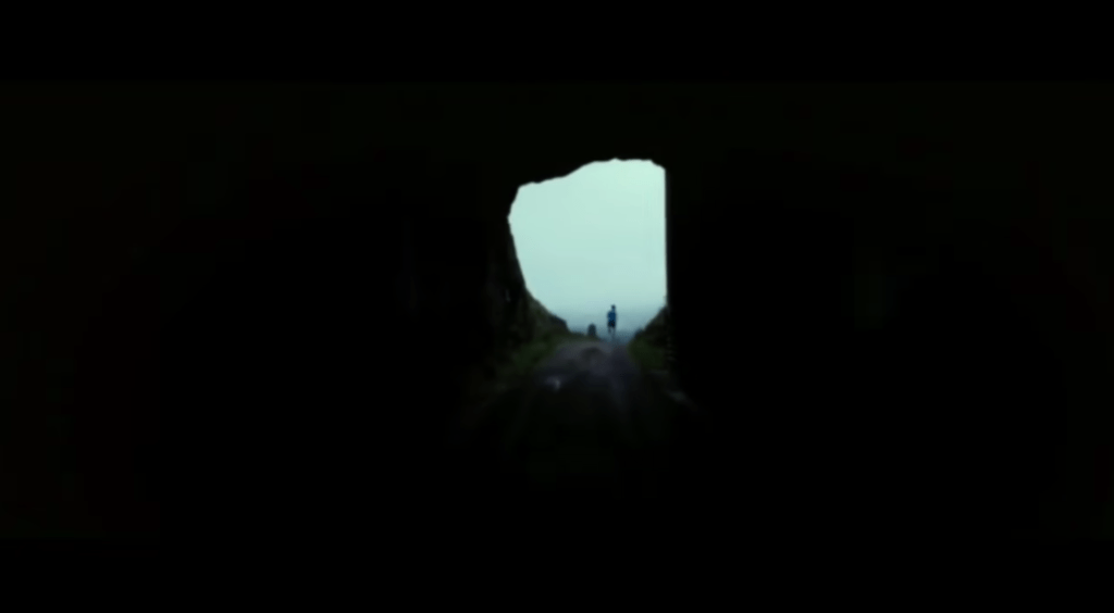
One strong example of visual composition in action comes from the short video “No Human Is Limited.” At the 24-second mark, there’s a striking shot that perfectly demonstrates the use of natural framing. In this scene, a runner emerges from a dark tunnel into the light. The tunnel itself forms a natural frame around the runner, directing the viewer’s attention straight to the subject. The sharp contrast between the dark surroundings and the light on the runner symbolizes determination and possibility, echoing the film’s message that no human is limited. As the shot transitions into a wide, open landscape, it visually reinforces the idea that the world is full of endless opportunities, and that perseverance can carry someone beyond any obstacle.
2.) Hunger Games (District 12 Reaping): Shallow Depth of Field + Close-Up
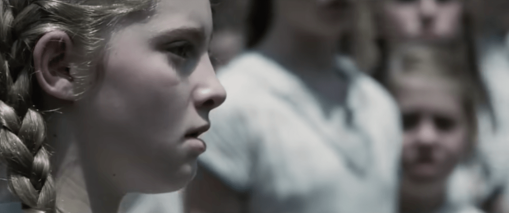
Another strong example of visual composition can be seen in the first Hunger Games movie, during the scene when Primrose Everdeen is chosen to compete in the Games. The filmmakers use a shallow depth of field and a close-up shot of Prim’s face to capture the emotional intensity of the moment. The crowd behind her fades into a blur, drawing all attention to her expression of shock and despair. This visual choice highlights the weight of what’s happening: how one small, personal moment can carry enormous emotional impact. By isolating Prim from the background, the scene makes the audience feel her fear and confusion, almost as if time itself has slowed down to focus on her.
3.) Pirates of the Caribbean – First Scene of Jack Sparrow: Rule of Thirds

A great example of the rule of thirds can be found in the opening scene of Pirates of the Caribbean when Jack Sparrow is introduced for the first time. As the camera pans to the front of him, Jack is positioned along the left vertical line of the rule of thirds grid, rather than in the center of the frame. This placement makes the shot more visually interesting and dynamic. The composition also feels balanced because part of the ship fills the right side of the frame, near the opposite third, creating symmetry and visual appeal. This thoughtful use of framing not only makes the scene engaging but also subtly communicates Jack’s confidence and larger-than-life personality right from the start.
Create
After learning about visual composition, camera techniques, and studying real examples, it was finally time to put what I learned into practice. This week’s creative exercises helped me apply these principles and build confidence behind the camera. I completed a photography scavenger hunt to practice framing, balance, and lighting, and I also worked on a pre-production planning document that included storyboards for my upcoming video montage.
Photo Scavenger Hunt

As part of my preparation for the video montage, I completed a photo scavenger hunt to practice taking still shots in nature, since I plan to film my final project at a national park. This exercise helped me apply visual composition principles such as the rule of thirds, depth of field, and leading lines while experimenting with different angles and natural frames. Taking photos outdoors allowed me to observe how light, shadow, and perspective change depending on the time of day and my camera settings. It was a great hands-on way to strengthen my eye for composition and better understand how each technique can shape the story I tell through visuals. To view my full collection of photos from the scavenger hunt, click here.
Pre-Production Planning Document with Storyboards
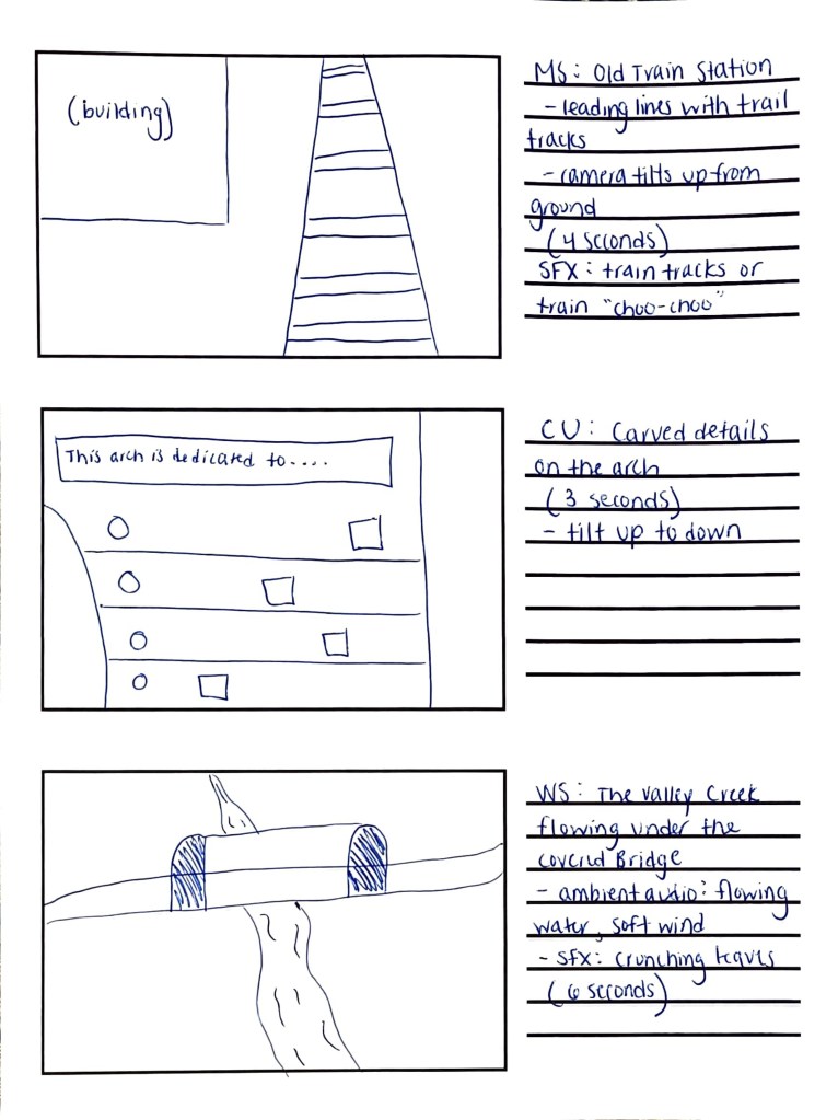
I also completed a pre-production planning document to organize every part of my upcoming Valley Forge National Park video montage. This included writing the script and narration, identifying sound effects, ambient audio, and background music, and planning out what each shot will look like. I created a detailed storyboard to visualize the flow of the montage and make sure the transitions feel smooth and intentional. Going through this process helped me develop a clear plan for filming, so when I visit the park this week, I’ll know exactly what to capture, how to frame it, and how the visuals will connect with the audio to tell a cohesive story. To view my full planning document, click here.