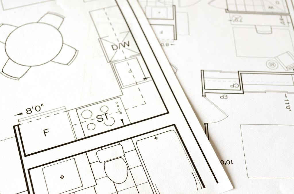
Image of a floor plan from pixabay.com
Imagine building a home. You carefully plan the rooms, decide how they connect, and ensure the layout makes sense. A strong foundation is key – without it, the house won’t function properly. The same applies to websites and apps. Behind every intuitive digital experience lies a well-structured system known as information architecture (IA), the backbone that keeps everything organized and accessible.
What is Information Architecture?
Information architecture is an evolving and ever-changing field that focuses on structuring and organizing content effectively within a website or app. Dan Brown, in his article 8 Principles of Information Architecture, describes key IA concepts:
- Objects: Objects on a site have discrete sets of behaviors. The content on a site is living with a recognizable structure.
- Choices: It is important to offer meaningful choices to users.
- Disclosure: Since the human brain can only process so much information at once, it is essential to practice progressive disclosure, a user interface technique that only shows the needed information first and reveals more as the user interacts with the page.
- Exemplars: Show examples of content in categories.
- Front Doors: It is important to understand that 50 perfect of site visitors will come through a different page than the home page. Take the user where they want to go but also show other related content found on the site.
- Multiple Classification: Utilize classification schemes to label site content. Don’t provide too many classifications, which can easily overwhelm the user.
- Focused Navigation: Use different navigation bars to structure content on a site, including topic navigation, timely navigation, sign post navigation, and marketing navigation.
- Growth: Design a website in anticipation of growth.
These above principles help create logical, user-friendly experiences.
At its core, information architecture defines the relationships between all areas of a site. This week, I explored two essential components of IA: site maps and navigation. While they are related, they serve different purposes:
- Site Maps: A blueprint of a website, listing all pages and their hierarchical structure.
- Navigation: The links and pathways that guide users from one page to another.
Going back to the house analogy: a site map is like a blueprint, outlining all rooms and their connections, while navigation is the hallways and doors that allow movement between them. Both are critical for a seamless user experience.
Analyzing & Reworking a Township Website
With this knowledge in mind, I analyzed the information architecture of my own township’s website – Schuylkill Township. My goal? To evaluate the current structure, identify areas of improvement, and propose a new, streamlined site map.
Step 1: Mapping the Current Site
To start, I explored the main navigation bar, footer, and subpages, taking note of structure, cohesion, and ease of access. I then created a visual site map in Canva, categorizing pages with different colors to denote their role in the hierarchy:
- Home Page
- Sections
- Pages & Subpages
- External Links
- Pages with Internal Links
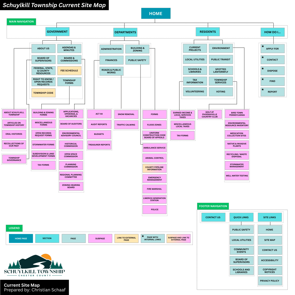
The current site map for Schuylkill Township, Pennsylvania.
Step 2: Identifying Strengths & Areas for Improvement
While analyzing the site, I found aspects that worked well: easily accessible footer links and a secondary navigation bar with quick links.
However, there were also areas that could enhance the user experience:
- Sticky Secondary Navigation Bar: I proposed making the secondary navigation bar a sticky bar, meaning it remains visible as users scroll. This makes important links more accessible without excessive scrolling.
- Reworking the Government Section: The current “Government” section houses both general information about the township and official government-related content. To reduce clutter, I separated “About” into its own category, making both sections clearer.
- Adding a “News & Events” Section: Currently, news is located near the bottom of the home page, requiring users to scroll down to see updates. Many other municipal sites include “News & Events” in the main navigation menu, so I followed this best practice to improve visibility.
- Renaming and Merging Subpages: Some subpages had unclear or overly complex names. For instance, I changed “Recollections of Our Past” to “Historic Resources” to better reflect the page’s content. I also merged pages with minimal content to simplify navigation.
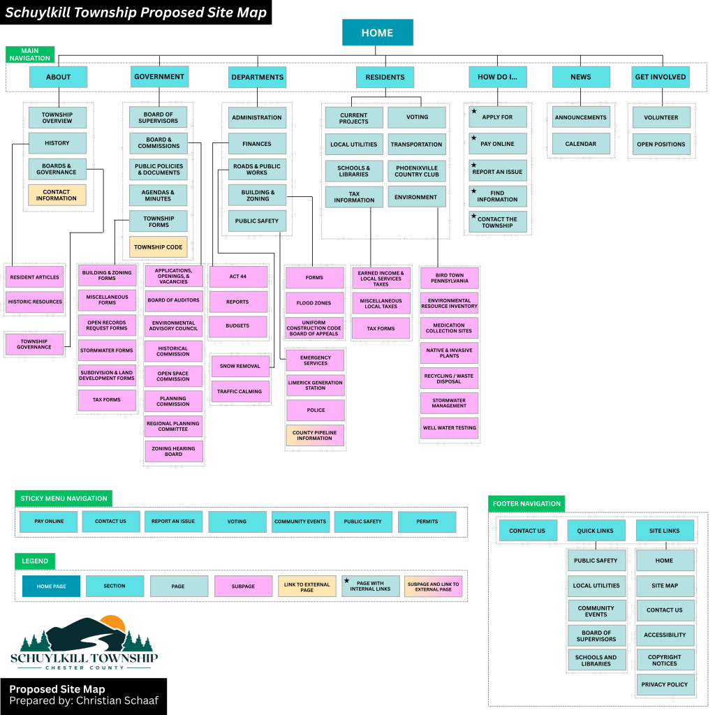
My proposed site map for Schuylkill Township, Pennsylvania.
Click here to see the current site map and proposed site map in more depth.
Lessons Learned from this Experience
Working on this project gave me a newfound appreciation for the complexity of website structure. At first glance, a website might seem straightforward, but behind the scenes, there are countless decisions shaping how users find and interact with content. Here are some of my key takeaways:
- Clear organization enhances usability – A well-structured site helps users find what they need quickly and easily.
- Naming matters – Concise, descriptive labels improve navigation and comprehension.
- Navigation should be intuitive – If users struggle to find information, the design needs rethinking.
- Hierarchy should be logical – Content should be arranged in a way that makes sense, both structurally and contextually.
- Adaptability is crucial – As technology and user needs evolve, websites must be flexible enough to grow and change.
Final Thoughts
This deep dive into information architecture was both exciting and meticulous. Before this project, I had never closely examined a website’s structure or considered how sections, placement, and navigation impact user experience. By researching various municipal websites and reworking Schuylkill Township’s site map, I gained valuable insight into making digital spaces more accessible, navigable, and clear.
A well-structured website is like a well-built house – it needs a strong foundation and a layout that makes sense. By applying the principles of information architecture, we can create digital experiences that are not only functional but also intuitive and user-friendly.
