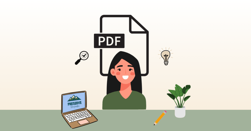
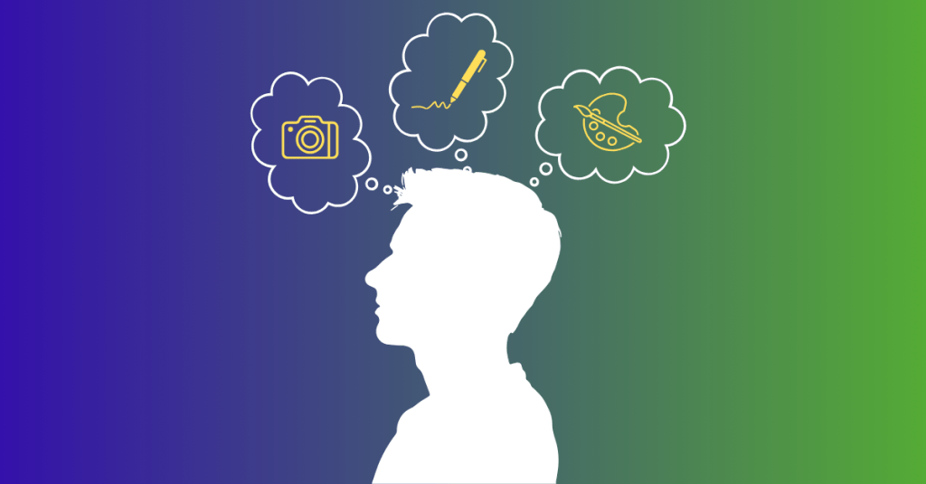
You’re deep into your passion project. The research is done, your ideas are flowing, and the deliverables are taking shape. For my project, Preserve the Peaks, a multimedia campaign about protecting Rocky Mountain National Park and encouraging responsible park visits, I’ve already created infographics, an interactive game, and a clickable poster in Genially.
Now it’s time for my next challenge: building a digital PDF guide that’s both informative and fun to read. The goal? A go-to resource for anyone planning a trip to Rocky Mountain National Park, packed with relatable, easy-to-digest content that inspires visitors to both enjoy and preserve the park.
If you’re ready to create a digital guide that truly connects with its audience, let’s talk best practices.
Start With Planning (and Then Plan Some More)
Here’s the first truth I learned: jumping straight into design without a plan is a one-way ticket to a messy, ineffective PDF.
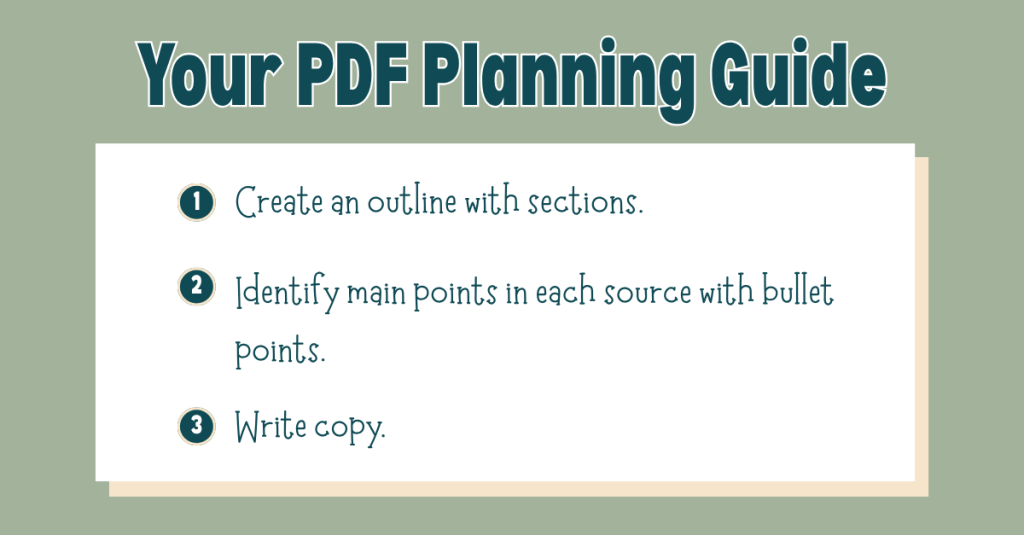
Before I touched a single design element, I built a detailed outline of the sections I wanted to include. I based this outline on my research and my audience’s needs, and then I went through each source in my bibliography, pulling out 5–10 key facts, stats, or tips that could shape the guide’s copy.
This prep work meant that when it came time to write, I wasn’t staring at a blank page; I already had a roadmap.
My biggest takeaway: Give yourself more time for planning than you think you’ll need. That up-front investment will make the writing and design process smoother, faster, and far less stressful.
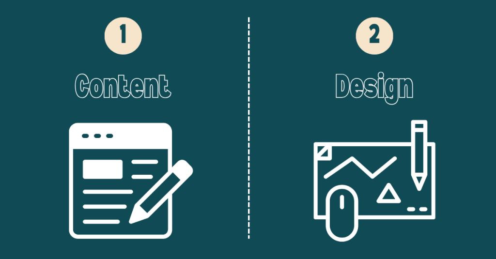
When you’re making something visually appealing, it’s tempting to start with design. But for a PDF guide to be effective, content is the foundation. The design should exist to enhance that content, not overshadow it.
These features aren’t extras; they make sure your content can be enjoyed by everyone. If you wait until the end to think about accessibility, you’ll risk having to redo major portions of your guide.
Findable: Use search-friendly keywords, clear file names, and logical organization so your guide can be easily located online or on a device.
Followable: Keep instructions clear and in the right order so your readers can easily follow along without getting lost.
Scannable: Use headings, bullet points, and concise language so readers can quickly grasp the key points, even if they’re just skimming.
As I build my PDF guide, I will make sure each section is clearly labeled and packed with short paragraphs, bold subheadings, and sidebars for fun facts. That way, whether someone wants to read every word or just grab a quick tip, they’ll get value.
Always Keep Your Audience in Mind
This is the heartbeat of any good project: your audience is everything.
Ask yourself:
What do they need to know?
How do they prefer to read and absorb information?
What tone will resonate with them?
For Preserve the Peaks, my audience is a mix of first-time visitors and returning nature lovers who care about the environment. That means keeping the tone conversational, using accessible language, and sprinkling in excitement about the park’s beauty with practical tips for responsible travel.
To view my progress on my digital PDF guide, click here.
Final Thoughts: Planning Wins Every Time
If you take away one thing from my experience, let it be this: plan first, design second.
A well-planned guide flows naturally, communicates clearly, and invites readers to explore every section. Combine that planning with thoughtful accessibility and design choices, and you’ll have a PDF that’s not only visually appealing but also memorable and easy to use.
Whether your goal is to inspire travel, teach a skill, or share important information, your guide has the power to connect deeply with your audience.
So grab your notes, outline your ideas, and build something worth reading. Your audience is waiting.
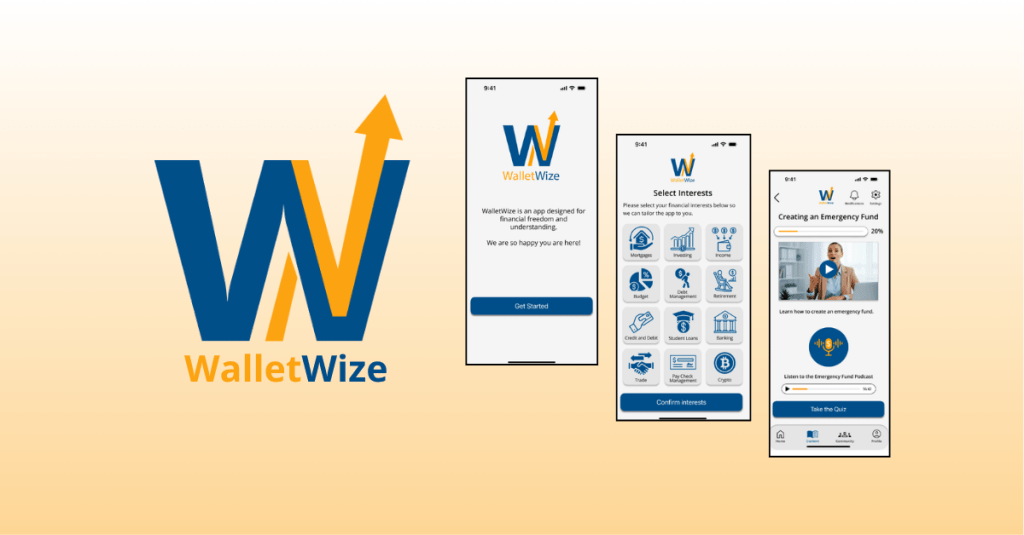
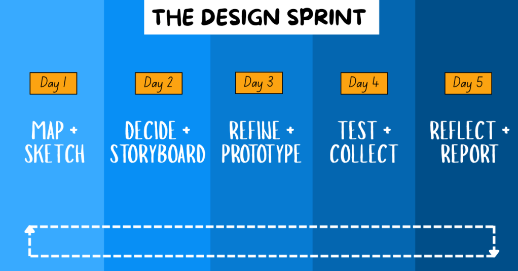
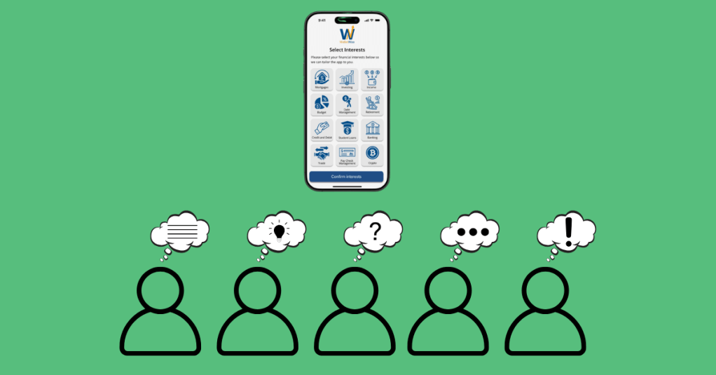
WalletWize is a financial education app designed to help Gen Z users understand and manage their personal finances. The goal of the app is to create a seamless and engaging user experience that makes learning about money feel intuitive, approachable, and empowering. To create WalletWize, our group followed the Design Sprint method developed at Google Ventures. This method is a five-day process that rapidly takes a product from idea to prototype to user testing.
For our project, we stretched the five-day Sprint into a five-week format, dedicating one week to each phase of the process. Our team collaborated virtually via Zoom and used Miro for digital whiteboarding and collaboration. What resulted was not just a prototype, but a deeper understanding of teamwork, design thinking, and problem-solving.
Design Sprint Overview
The Design Sprint is broken into five phases:
1. Map + Sketch: We defined our problem, conducted research on our target audience, set goals, and sketched potential solutions.
2. Decide + Storyboard: We used a series of voting techniques to narrow down our best ideas. From these, we created user flows and a storyboard.
3. Refine + Prototype: With our finalized storyboard, we divided tasks based on our individual strengths and built a functional prototype.
4. Test + Collect: We conducted remote user testing sessions with Gen Z participants. We gathered feedback on functionality, visual design, and user experience to determine what worked well and what could be improved.
5. Reflect + Report: We compiled our findings and insights into a final Design Sprint report and individual case studies, summarizing the project and sharing key takeaways.
Problem Statement and Research
The problem we focused on was the lack of accessible, engaging financial management tools for Gen Z. To guide our ideation process, we created the following “How Might We” questions:
How might we engage Gen Z so they stay on our app instead of switching to another one?
How might we make learning about money feel as addictive as scrolling through social media?
How might we simplify complex financial concepts to make them easier and more engaging to learn?
How might we encourage users to return and build lasting financial habits?
We also defined a long-term goal: In two years, WalletWize should help Gen Z form consistent money habits by making the app a daily or weekly routine.
To better understand our target audience, we conducted background research. We found that Gen Z:
Relies heavily on parents for financial advice
Consumes most content on mobile devices
Faces increasing financial challenges including student debt and housing costs
Spends a significant amount of time on social media
These insights shaped both our design decisions and our content strategy.
Sprint Activities
Phase 1: Map + Sketch
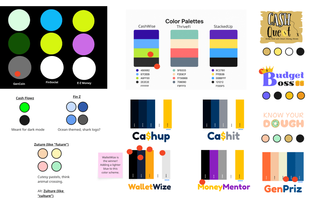
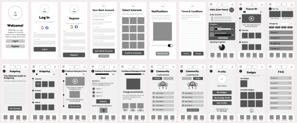
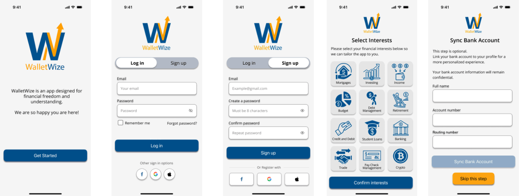
We began by naming the app and selecting a color scheme through voting with red dots. We chose “WalletWize” as our final name and adjusted our palette to include a bold royal blue and bright orange to appeal to Gen Z.
App Names and Color Scheme Ideas.
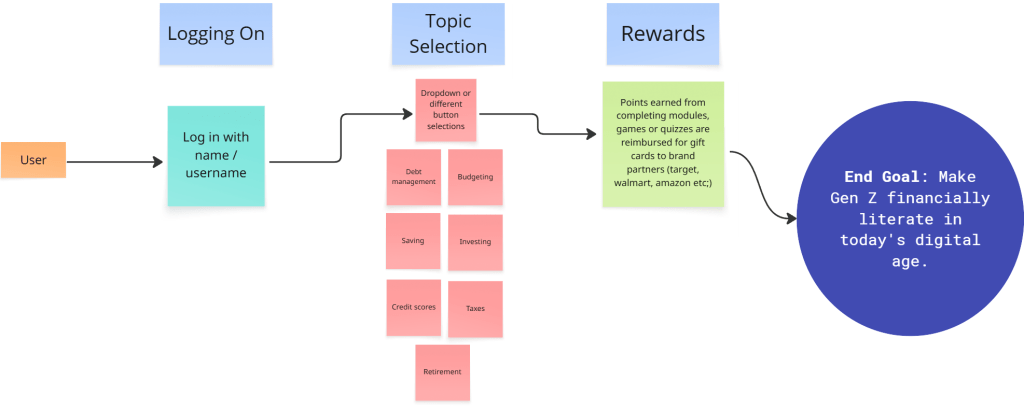
Next, we created a map that began with app onboarding and ended with our goal. The steps in between represented the key features and actions users would take to reach that goal, including navigating through course content, selecting topics, and engaging with rewards.
WalletWize’s User Journey Map.
We then conducted Lightning Demos. Each team member analyzed apps related to finance and education, collecting visual inspiration and discussing which features we might borrow or adapt.
Finally, we worked through the 4-Step Sketch process individually:
Capturing notes and inspiration
Generating quick ideas
Exploring variations in Crazy 8s
Creating refined solution sketches
4-Step Sketch: Part 1 (Notetaking) and Part 2 (Ideas).4-Step Sketch: Part 3 (Crazy 8s) and Part 4 (Solution Sketches).
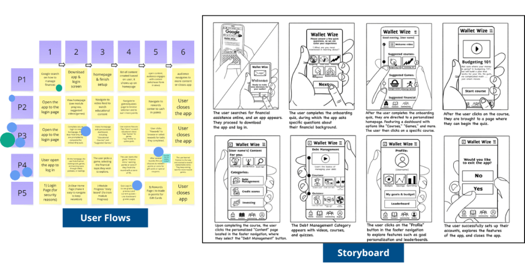
Phase 2: Decide + Storyboard
To narrow down ideas, we used Heat Map Voting to highlight the best elements of our sketches. Then we used Straw Poll and Supervote techniques to select our top concepts.
Each group member created a six-step user flow. We voted on the most promising user journey and then expanded it into an eight-step storyboard that showed the elements of each screen.
WalletWize’s User Flows and Storyboard.
Phase 3: Refine + Prototype
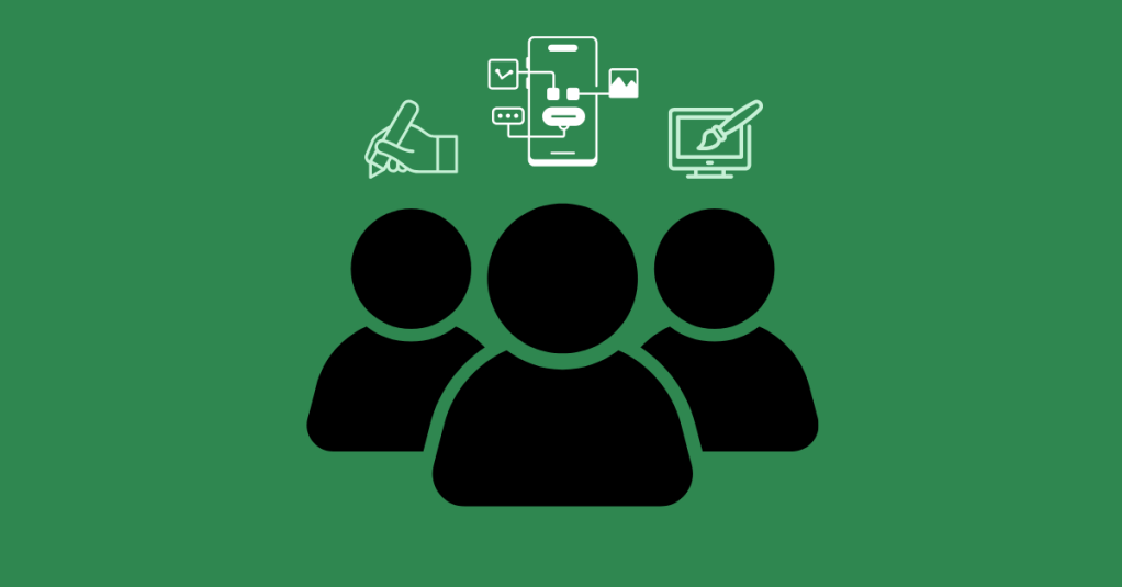
We divided responsibilities based on skillsets. Some focused on wireframes in Canva, while others built out high-fidelity prototypes in Figma. Our illustrator created visual assets, and our Stitcher ensured consistency and flow across the prototype. The prototype included interactive screens for onboarding, budgeting lessons, quizzes, and progress tracking.
WalletWize’s Wireframes created in Canva.Final Prototype screens created in Figma. To view all final screens, click here.
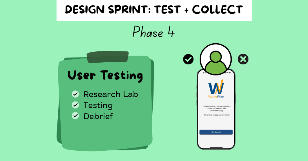
Phase 4: Test + Collect
We prepared a script and conducted five remote user interviews. The sessions were recorded via Zoom. One person led the interview while others took notes.
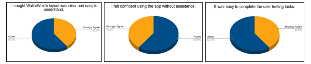
We created pre- and post-surveys to collect demographic and usability feedback. The pre-survey gathered background information, while the post-survey measured user satisfaction and experience.
Phase 5: Reflect + Report
In our final week, we divided responsibilities to create our final Design Sprint report and individual case studies. We reflected on our learning, analyzed our data, and finalized our deliverables.
Our final clickable prototype of WalletWize received positive feedback from users. Participants appreciated the modern design, friendly illustrations, clear navigation, and overall user experience.
One area for improvement identified during testing was the content tab. Several users were unsure how to navigate it. A suggestion to add a FAQ button to the home screen was also noted and would be implemented in future iterations.
Overall, user feedback affirmed that our design choices were intuitive and engaging. The app met its primary goal of helping Gen Z users feel more confident in managing their money.
Pie charts based on user testing feedback.
Learnings and Reflection
The Design Sprint was an exciting challenge. It taught us how to work quickly, think strategically, and communicate clearly. We learned how to facilitate discussions, manage tasks virtually, and design with the user in mind.
Each member of our group brought unique strengths to the project, and we built a workflow that allowed us to support one another and stay organized. Conducting the Sprint virtually had its challenges, but we navigated them well using tools like Miro and Zoom.
Beyond the technical skills, we learned how to stay adaptable. Whether it was a user who couldn’t complete a task or a design that needed to be reworked, we stayed open to change and focused on improvement.
Conclusion and Next Steps
The Design Sprint was more than just a framework; it was a powerful learning experience. From problem definition to user testing, we moved through each phase with purpose and creativity. WalletWize is the result of thoughtful collaboration, honest feedback, and user-centered design.
As we look to the future, we are excited about the potential of WalletWize. With further development, we hope it becomes a trusted tool for Gen Z users who want to improve their financial literacy. The lessons we learned in this Sprint will continue to inform our approach to product design and collaboration in our future careers.
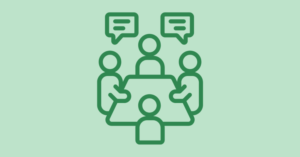
After days of brainstorming, building, and refining, you’re approaching the last stretch of the Design Sprint. Just like the final leg of a race, it’s time to dig deep, make informed decisions, and sprint through the tape. Welcome to Phase 4: Test + Collect, where your prototype meets the real world and real users.
“The ‘Test’ phase is the moment of truth in your Sprint journey. This is where your prototype faces the ultimate test — real-world user interaction and feedback.”
Pattie Belle Hastings
This week, my team entered the user testing phase of our digital prototype. It’s a nerve-wracking but rewarding part of the process. You finally get to see how users interact with the solution you’ve been working hard to create.
Let’s break it all down so you can feel confident as you enter the final stages of your Design Sprint.
Create a recruitment plan: Be clear and transparent. Reach out, explain what’s involved, and ask if they’re open to participating.
Handle the paperwork: If your tests are recorded, especially virtual ones, always send consent forms. Make sure participants understand it’s voluntary.
Schedule wisely: Confirm dates and times with your users. A defined schedule helps everyone feel prepared and respected.
The moral of the story? Communicate, communicate, communicate with your user testers before starting the interviews.
Step 2: Conduct the Interviews
Now that your team is prepared, it’s time for the interviews. This is where the magic happens, and where things can get emotional.
“These interviews are an emotional roller coaster. When customers get confused by your prototype, you’ll be frustrated. If they don’t care about your new ideas, you’ll be disappointed. But when they complete a difficult task…you will be elated.”
Jake Knapp, John Zeratsky, and Braden Kowitz
User Scripts
To keep things on track, follow a user script. This script keeps your team consistent and avoids giving the participants hints. The goal is to observe their authentic reactions and not guide them to the “right” answer.
Knapp and his team suggest to start the user interviews with a friendly welcome to make the participant feel comfortable and at ease. Make sure to tell them that you are testing the prototype and not them. Ask open-ended background questions to learn about their experience and built trust. Introduce the prototype and present the tasks in a clear manner without giving hints. It’s important to end with a debrief and let the users reflect. Ask what they liked, what didn’t work, and how they would improve it. This uncensored feedback is gold.
Tip: Stay Neutral and Curious
Watching users struggle with your prototype can be hard. But that’s the point: your job isn’t to defend your work; it’s to learn from it.
Here are some tips for a productive testing session:
Stay calm, even when users are confused.
Avoid giving explanations or answering questions they might have about completing a task.
Ask open-ended questions like:
“Why did you click there?”
“How did that feature make you feel?”
Encourage participants to think out loud and resist the urge to jump in. Those moments of confusion are not failures; they’re opportunities to make your product even better.
Step 3: Reflect with Your Team
When all user sessions are complete, it’s time to analyze the results. Pattie Belle Hastings puts it best:
“Analyzing the data from user testing in a Design Sprint is critical for deriving meaningful insights, identifying areas for improvement, and determining steps forward after the Sprint.”
Pattie Belle Hastings
During this debrief, your team should identify recurring patterns or problems, highlight areas where users were both confident and confused, review task completion rates and timing, observe users’ body language and facial expressions, and, if possible, collect both quantitative and qualitative feedback.
You can write down observations in a shared document, on sticky notes, or on a digital whiteboard. When the insights are clear, schedule a check-out meeting to decide your next steps. Do you iterate on the prototype? Do you move forward with development? The decision will come from the evidence.
To view my team’s user testing documentation and results, click here.
Final Lap: Celebrate and Reflect
You did it! Your team sprinted through ideation, prototyping, and testing. You gathered real feedback and now have a stronger sense of where your solution stands.
So take a moment. High-five your team. Celebrate the collaboration and your hard work. Whether you nailed it on the first try or have adjustments to make, you’ve completed something meaningful.
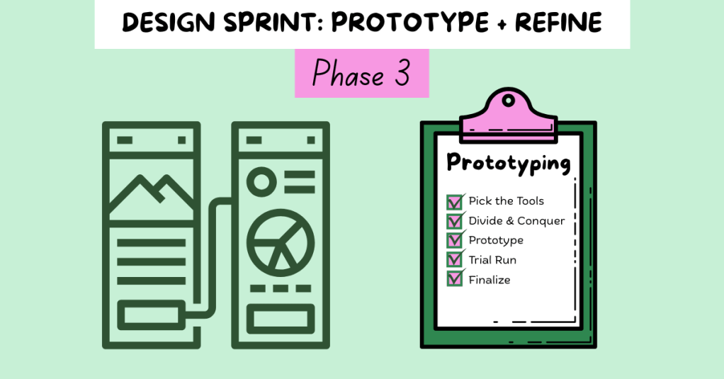
You and your team are mid-race, and the stakes are rising. You’ve hit your stride, picked up steam, and now it’s time to execute. Phase 3 of the Design Sprint, Prototype and Refine, is all about collaboration and showcasing your strengths.
“You’ve got an idea for a great solution. Instead of taking weeks, months, or, heck, even years building that solution, you’re going to fake it…To prototype your solution, you’ll need a temporary change of philosophy: from perfect to just enough, from long-term quality to temporary simulation.”
Knapp, Zeratsky, and Kowitz
That quote stuck with me, especially as someone who tends to chase perfection. The prototype mindset is about learning quickly. The goal is not to create a flawless product; it’s to simulate one realistic enough to gather feedback. So, how do you do that in just one day?
Rapid Realization: Quickly turn ideas into something tangible.
Focus on Critical Elements: Build only what matters most to test.
Prepare for User Testing: Design the prototype to gather useful feedback.
Resource Efficiency: Use the least amount of time and tools to get the job done.
Collaboration: Lean on each team member’s strengths to bring the product to life.
“The prototype phase is the crucible where your ideas are forged into tangible forms, ready for real-world testing…It’s a creative endeavor that requires a blend of ingenuity, skill, and strategic thinking.”
Pattie Belle Hastings
This phase is where your team can shine. Focus on what matters most and continue the Sprint.
Step 1: Pick the Tools
Start by selecting your design tools. Depending on your team’s skills and project goals, you might choose:
Wireframes: Low-fidelity designs that outline structure
Mockups: High-fidelity visuals that simulate a real interface
Clickable Prototypes: Interactive designs that mimic real use
Functional Prototypes: Working products with built-in features
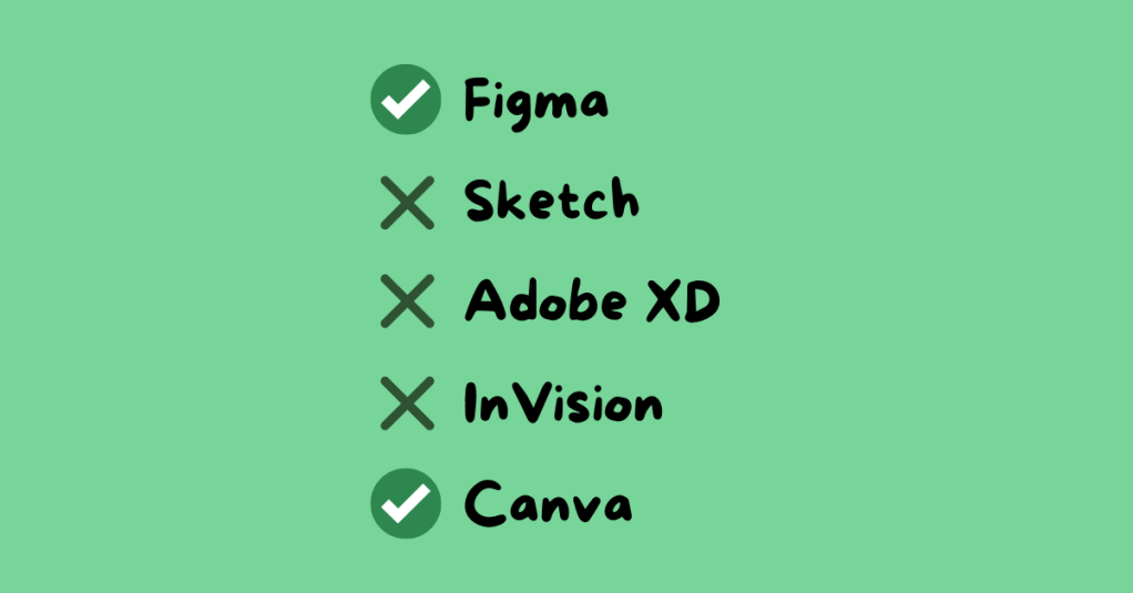
Common tools include Figma, Sketch, Adobe XD, InVision, and Canva. For my team’s Gen Z personal finance app, we used Canva for wireframes and Figma for clickable prototypes. These tools matched our team’s skills and needs.
Step 2: Divide and Conquer
Time is limited, so efficiency is key. Assign roles based on experience and interest. Encourage each person to advocate for the role that best suits them.
For our group, roles included:
Wireframe Creators: Sketched the app’s layout
Writer: Created on-screen text and instructions
Asset Collector: Gathered app content and visuals
Makers: Built the prototype in Figma
Illustrator: Designed custom icons and the app logo
Stitcher: Reviewed the prototype for consistency and flow
I was assigned three roles: wireframing, illustrator, and stitcher. With a design background, I created the app’s logo and visual identity, and I reviewed all aspects of the prototype, including content, spelling, interactivity, and visuals, to ensure the finalized product was polished and ready to go.
Step 3: Build the Prototype
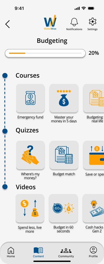
The Budgeting Category screen in my group’s app.
This is the heart of the phase. Using the storyboard from Phase 2, your team starts constructing the prototype. Make sure all team members are designing at the same fidelity level, review the prototype for consistency in design and functionality, ensure interactive elements align with the user flow, revisit Sprint objectives to stay focused, and prepare for user testing. The goal here is clarity, not perfection.
Knapp, Zeratsky, and Kowitz assert that the prototype should look real enough that users believe it’s a functional product. This step will help the team learn about the areas of the product that work well and elements that require editing.
Step 4: Conduct a Trial Run
Before handing your prototype over to testers, test it internally. This gives your team the chance to identify confusing steps or design issues early. It is important to schedule a time for the entire team to conduct a trial run. Assign a group member to play the role of the user, gather feedback, and revise as needed.
“Trial runs help your team fine-tune the prototype, identify potential issues, and ensure a smooth and effective testing session.”
Pattie Belle Hastings
Ask yourself: Does the product feel intuitive? Does the prototype reflect our Sprint goals? This step builds confidence and alignment before entering the final testing phase.
Team Reflection: What Worked for Us
This week, our team focused on communication, task alignment, and preparation. We clearly outlined roles, set deadlines, and checked in frequently. Having designated roles based on individual strengths helped us stay accountable and confident in our contributions.
We also met virtually several times throughout the week, checked in with each other in our text group chat frequently, communicated early and often, and celebrated small wins along the way.
One of the biggest lessons I learned this week? Don’t wait to speak up. If something is unclear, ask. If something’s off, say something. Holding yourself accountable while staying open to feedback makes a big difference in the pace and quality of your work.
This phase of the Sprint felt like the middle miles of a race. You’ve already started strong, and now you need to stay focused and finish strong. The prototype phase requires energy, attention to detail, and trust in your team.
When it’s done right, it’s incredibly rewarding. You’re not just imagining your solution; you’re seeing it come to life.
At this point, your product is ready to be tested. Keep your head up, keep your pace steady, and get ready for the next phase: testing with real users.
Have you ever looked at a mobile app and thought, “How did someone design this?” Behind every polished interface is a long journey of research, ideation, testing, and lots of prototyping. During my recent experience designing a companion app for Schuylkill Township’s website, I discovered how high-fidelity prototyping transforms concepts into tangible, testable designs. Let’s walk through what I learned and why fidelity in prototyping matters more than you might think.
Understanding Prototype Fidelity: Low vs. High
Not all prototypes serve the same purpose. When I first started this project, I didn’t realize that “prototyping” could look so different depending on the stage of design. In her article Low-Fidelity vs. High-Fidelity Prototyping: Key Differences Explained, Iulia Sorodoc describes that fidelity in prototyping is measured across three levels: low, medium, and high.
Low-Fidelity Prototypes
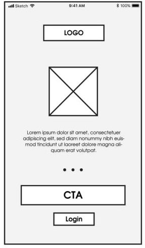
Low-fidelity prototypes are simple, often hand-drawn sketches. They focus on layout and flow rather than visuals or interactivity, making them perfect for early-stage brainstorming. Low-fidelity prototypes are quick and inexpensive to produce, making them ideal for early-stage design. However, they have some drawbacks: they offer limited interactivity, don’t closely resemble the final product, and can make it harder to gather meaningful user feedback.
An example of low-fidelity prototyping from my project.
Medium-Fidelity Prototypes
Medium-fidelity prototypes offer more accurate layouts, include some user interface (UI) elements, and may have basic interactive components. They strike a balance between realism and flexibility.
An example of medium-fidelity prototyping from mentormate.
High-Fidelity Prototypes
High-fidelity prototypes, on the other hand, are polished and realistic. They replicate the final product as closely as possible with detailed visuals, real content, and full interactivity. They take longer to build, but the payoff is in their ability to simulate the real user experience.
An example of a high-fidelity prototype from my project.
The level of fidelity you choose depends on where you are in the process and what kind of feedback you’re looking for. In the early stages, rough sketches suffice. But as you move closer to development, a more refined prototype is key to gathering accurate user feedback.
Prototyping Tools for UX Designers
When it comes to choosing the right prototyping tool, there’s no one-size-fits-all answer. As Fahim Bin Omar outlines in his article Best Prototyping Tools for UI/UX Designers – How to Choose The Right One?, your ideal tool depends on a few important factors, including your design goals, the complexity of the project, the level of fidelity you need, how well the tool supports collaboration and feedback, its compatibility with other software you use, and device support and accessibility.
Popular Prototyping Tools to Consider
There are many programs that UX/UI designers use to create interactive prototypes. Some of the best include:
Figma: A cloud-based favorite among teams for its real-time collaboration features and comprehensive prototyping tools.
Marvel App: Known for its user-friendly interface and ease of turning static designs into interactive prototypes.
Adobe XD: Great for those already in the Adobe ecosystem, offering seamless integration with other Creative Cloud tools.
Sketch: A powerful Mac-based design tool with an intuitive interface and a wide range of plugins.
Proto.io: Lets you create realistic, code-free prototypes right in your browser with a simple drag-and-drop interface.
Webflow: A unique option for those who want to build responsive web prototypes with real HTML, CSS, and JavaScript output.
Whatever you choose, make sure it aligns with your needs. Remember: The user always comes first. The right tool should help you design for clarity, accessibility, and ease of use.
My High-Fidelity Prototypes
For this project, I used Adobe Creative Suite to design the visual elements of my prototype and then brought it to life interactively using the Marvel App. Since I already had a subscription to Adobe and was familiar with both tools, I was able to focus more on creating a seamless and user-centered experience.
While I explored several platforms, Adobe and Marvel gave me the flexibility and control I needed to produce a highly usable and visually engaging prototype. View the video below as I walk through each prototype I created for the Schuylkill Hub app.
Changes from Low- to High-Fidelity Prototypes
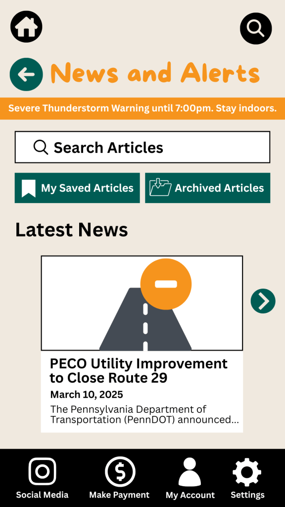
Once I began user testing last week, it became clear that a few areas of my prototypes needed improvement. One of the most notable pieces of feedback was confusion between the “Contact” and “Township Services” sections. Users weren’t sure where to go for help.
To fix this, I combined both into a single, clearly labeled section: Contact Township. This new layout provides an easy-to-navigate overview of township services along with direct contact options for each department, improving both clarity and accessibility.
I also made several updates to the footer navigation based on additional user feedback:
Added “My Account” and “Settings” so users could access personal information and preferences quickly.
Included labels beneath icons to make navigation more intuitive.
In the News & Alerts section, I implemented several new features:
A top bar for urgent alerts.
A personalized “Suggested for You” section.
An “Archived Articles” button for past content.
To make the prototype feel authentic to the township, I included local events and headlines, and built out supporting features such as a search bar, an ‘About’ section, and a ‘My Account’ page.
Click here to view each step of the process of creating the Schuylkill Hub app.
Reflection
If there’s one thing I’ve learned from this project, it’s that prototyping is where ideas truly start to take shape. From low-fidelity sketches to interactive high-fidelity designs, each version helped me refine my app’s user experience through iteration and feedback.
In the early stages, my low-fidelity prototypes were just simple outlines that mapped out the app’s basic structure and flow. These were invaluable for quick brainstorming and helped me think through how users would navigate the app. Because they were easy to change, I could revise layouts based on feedback without feeling too attached to one idea.
As I moved into medium- and high-fidelity prototypes, the process became more detailed and intentional. Visual hierarchy, color palette, typography, and real content began to shape a more complete picture of the app.
Looking back, I now see prototyping as a form of communication — a way to translate abstract ideas into something tangible, testable, and ultimately user-centered. It’s not just about making things look good; it’s about making things work well for the people who use them.
I’m walking away from this project with a much deeper appreciation for prototyping as an essential part of the UX design process. The experience has taught me to approach every project with curiosity, openness to feedback, and a commitment to designing with the user in mind.
An image of a sticky note reading “Run a Usability Test” from Unsplash
What better way to get feedback on your design than from the people who’ll actually use it?
When I first started designing paper prototypes for a township app, I thought I had considered everything. Clean design? Check. Clear navigation? Of course. Useful features? Absolutely. It wasn’t until I sat down – virtually – with my sister and mom that I realized how much more I had to learn. The way users interact with your product can be eye-opening, informative, and one of the most exciting parts of the design process.
This post is a deep dive into my own experience conducting user and usability testing: what these terms mean, how to prepare for testing, and what I learned when I watched real people click through my proposed app.
User testing is a process where real users interact with a product while designers observe and analyze their behavior. It is about understanding people: their needs, expectations, and behaviors. It helps you figure out if your product concept makes sense to your audience. Usability testing, on the other hand, is a specific type of user testing. It evaluates how easily users can navigate your product and accomplish key tasks (Strba, 2024). This will help designers identify hidden opportunities and generate new ideas in a quick and easy fashion.
Both forms of testing are essential. Together, they offer a full picture of what’s working, what’s not, and what could be better.
Tips for Testing Paper Prototypes
An image of testing and comparing paper prototypes from Interaction Design.
When you ask someone to review your prototypes, you’re not just asking them to test your design – you’re inviting them into a conversation.
To make that conversation effective, users need context. In “User Testing Your Paper Prototypes,” Andrew Smyk emphasizes that users must understand the tasks they’re expected to complete. That clarity helps eliminate unnecessary confusion and ensures that any struggles they encounter are due to the design and not a lack of explanation.
One tip that stuck with me is to avoid vague labels and features. If something is labeled “Category 1” or “Button A,” users won’t know what it means. That confusion clouds the testing results.
It’s also worth being mindful of user behavior beyond words. Long pauses, puzzled expressions, or hesitant mouse movements can reveal uncertainty even when users say, “Yeah, I think I get it.”
And lastly, don’t wait until your product is polished to test it. The earlier you gather feedback, the more room you have to fix issues without derailing the whole design process.
Writing Effective Task Scenarios
If usability testing is about watching users complete tasks, then writing those tasks well is key to receiving meaningful feedback.
In “Writing Good Task Scenarios for Usability Testing,” Teng states that scenarios should be written like real-life goals, not instructions. Task scenarios help participants focus on what they need to accomplish, not how to do it. It’s the difference between saying “Find the registration form for your child’s summer camp” versus “Click the registration button.” The former helps users act naturally and reveal how intuitive your design really is.
I tried to follow these principles by using familiar language, staying concise, and giving each scenario a bit of personality so users could imagine themselves in the situation.
Good task scenarios aren’t just technical – they’re human. They give users a reason to care and something to solve.
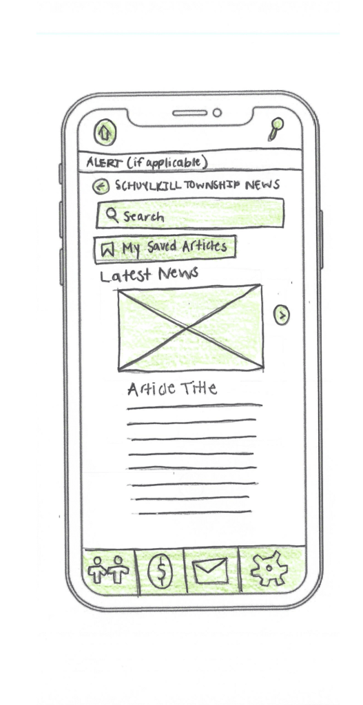
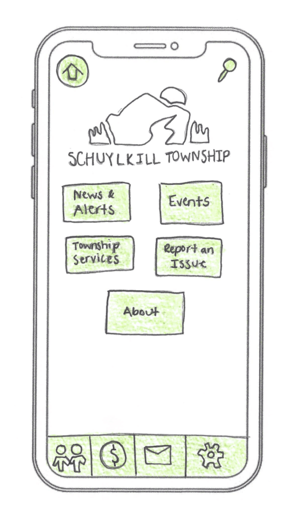
My design of the home screen for the Schuylkill Township companion app.
In preparation for my user testing experience, I used the Prototyping on Paper (POP) app by Marvel to make my designs interactive and share them with the users.
To test my paper prototypes for a companion app for Schuylkill Township, I wanted participants who would find the content relevant. I chose two family members: my sister and my mom. They both represent two different age groups of residents who currently live or have lived in Schuylkill Township. Selecting family members could have drawbacks, such as bias in feedback, but I told them to provide honest, constructive suggestions for my designs.
We conducted our sessions over Zoom. I asked a few warm-up questions to get a sense of how they typically use technology and then guided them through a series of four tasks using screen share. After each task completion, I asked for feedback. This gave me the opportunity to receive suggestions in real-time.
The results? They gave me a lot to think about!
User 1: My Sister
A video of the full user testing experience with my sister.
As a tech-savvy user, it was important to test the app with someone in my sister’s age category to ensure it resonated with a younger audience. View the video above to watch my sister navigate through each proposed task.
User 2: My Mom
A video of the full user testing experience with my mom.
As someone who doesn’t use their phone or technology often, it was essential to test my app with someone like my mom to guarantee that other users who might struggle with technology could successfully and effectively use the app. View the video above to watch my mom navigate through each task.
This was a beneficial experience highlighting both positive design elements and areas of improvement. One unexpected issue? The prototype images I uploaded into POP still had a phone case design around them. When viewed on a real phone, it looked like a phone inside a phone. This threw off both users, and I’ll definitely avoid that visual redundancy next time.
Task 1: Search for, Register, and Pay for an Event
Both participants easily located the “Events” button on the homepage, which was a great sign that the navigation is intuitive. My sister moved through the process quickly – she found the event listings, clicked “Buy Tickets,” completed the payment process, and returned to the home screen with no issues. Her one suggestion was to replace placeholder labels like “Category 1” and “Category 2” with actual event category names to provide better clarity when searching for an event.
My mom also found the “Events” section without issue but got a bit confused when it came to registering. In the task scenario, I had used the word “register” instead of “book,” which led her to hesitate at the “Book Tickets” button. This was a valuable reminder that word choice matters in task descriptions. It’s important to align the language in the scenario with what’s reflected in the interface to avoid confusion.
Task 2: Search for an Article and Download It
My sister again moved through this task seamlessly. She located an article, downloaded it, and suggested a helpful feature idea: adding an “Archives” section alongside “My Saved Articles” so users can revisit older content more easily.
My mom completed the task as well, but paused when she reached the icons for downloading and bookmarking. She wasn’t familiar with what the download or bookmark symbols meant and asked for clarification. This feedback made me realize that relying solely on icons may not be accessible to all users. Moving forward, I may consider adding text labels next to the icons or using tooltips to provide context.
Task 3: Sign Up for an Account and Report a Pothole
This task was structured as “Sign Up for an Account and Report a Pothole.” This may have unintentionally confused my sister and mom because users are prompted to sign up/login after clicking the “Report an Issue” button, not before. They both first looked for a “Sign Up” button before clicking “Report an Issue.” In the future, I’ll adjust the task description, or possibly the app flow itself, to better match user expectations.
That said, both participants successfully navigated to the “Report an Issue” section. My sister completed the steps quickly and suggested adding confirmation text after submission to let users know their request was received and that updates would be provided. My mom took a little longer at the dropdown menu used to categorize the issue, but once she oriented herself, she was able to complete the task as well. The overall takeaway? The flow works, but clarity and reassurance can make the experience smoother.
Task 4: Contact the Police Department
This was the task where both users stumbled, and as a result, it became one of the most valuable tests. I had intended for users to click the envelope icon in the footer navigation, which represents the “Contact Us” section. However, both users initially went a different route.
My sister clicked on “Township Services,” expecting to find police contact information there. When it wasn’t what she expected, she found her way to the envelope icon and completed the task. My mom followed a similar pattern: first trying “Township Services,” then checking “Report an Issue,” and then eventually locating the “Contact Us” section.
This consistent behavior pointed to a larger design issue: the “Contact Us” option isn’t as visible or intuitive as it needs to be. A clearer label or more prominent placement could make all the difference. I’m considering merging “Township Services” and “Contact Us” into a single section, or at least renaming them to better reflect the types of content each one holds. Small changes like these can significantly improve the user experience.
Final Thoughts
Design is a conversation, not a monologue. No matter how good your product looks or how clearly you think you’ve labeled everything, you won’t really know how it works until someone else tries it.
User and usability testing opened my eyes to how people interpret, navigate, and occasionally struggle with a design. It reminded me that great design isn’t just about what we create – it’s about how people experience it.
If you’re working on a prototype, test it early, test it often, and most importantly – listen. Your users will give you valuable feedback to improve your app and enhance each user’s experience.
This week, I read Chapters 5 and 6 in Liz Blazer’s Animated Storytelling: Simple Steps for Creating Animation & Motion Graphics as we prepared to create stop motion animation videos.
Chapter 5: Color Sense
Blazer opens the chapter with explaining color vocabulary, including hue, saturation, and value. Hue refers to the common color name like blue or green. Saturation is the intensity of a color, and value is the lightness or darkness of a color. This chapter explores the power of color in animation and motion graphics, emphasizing how color choices influence mood, storytelling, and audience perception. Blazer explains that color is more than just an aesthetic decision – it’s a psychological tool that can evoke emotions. She discusses the significance of color harmonies, contrast, and saturation in creating a compelling visual narrative. In the chapter, Blazer notes the difference between CMYK (Cyan, Magenta, Yellow, Black) and RGB (red, green, blue) color systems. CMYK is used for print materials and colors are created by mixing pigments on paper. On the other hand, motion uses RGB where light is used to mix color.
Blazer also walks through the steps to create color scripts, a technique used in animation to plan color palettes across an entire sequence. By mapping out color changes over time, artists can reinforce story beats and emotional shifts. Blazer offers the following tips when using color in an animation project: limit color palette, design for movement, use surprise color for punctuation so it stands out, use one thematic and one accent color, and make your own rules.
Chapter 6: Weird Science
In this chapter, Blazer encourages readers to experiment with animation and to not be afraid to try weird, creative rituals. Like Jimi Hendrix made his own weird science, Blazer suggests that animators should experiment, mess around, test limits, and do something new with an animation. This chapter delves into the technical and experimental side of animation, encouraging artists to push creative boundaries by incorporating unexpected elements. Blazer discusses the role of physics, movement, and timing in making animations feel believable yet imaginative. She highlights how exaggeration, squash and stretch, and secondary motion add depth to animated storytelling, making scenes more dynamic and engaging.
The chapter also emphasizes the importance of observation and curiosity in the animation process. Blazer encourages animators to study real-world physics and then bend those rules to create something new. She explores the connection between art and science, stating how technological advancements, such as motion capture and procedural animation, can improve traditional animation techniques. This chapter inspires readers to blend logic with creativity to create unique animations.
Research to Inform
To prepare for the creation of my own stop motion animation, I watched a series of videos that used different techniques to inspire my video.
I thought this was a very unique way to showcase stop motion. The creator cut out pieces of paper to create a scene and moved the pieces with their hands. When their hand touched the screen, a new element would appear.
This was a great example of a nonlinear story line where the fruits and vegetables would transform into other objects. For instance, the creator had a watermelon transform into a globe. Then, the seeds from the watermelon fell off to the ground which then morphed into an egg. I was personally struggling with coming up with an idea for nonlinear stop motion, and I thought this video was very helpful in thinking of an idea.
This video utilized 2500 pictures, and the creator used clay to morph each object into the next. First, the craftsmanship of this video is impeccable, and I aspire to achieve this type of cleanliness and precision in my animations one day. It’s amazing how animators can think of these “out-of-the-box” ideas to create a storyline with just small pieces of clay. I also liked how the creator used sound effects to enhance the video and make it sound more realistic.
In this video, the creators illustrated the idea of “where do ideas come from?” They used pieces of paper and drew elements on each page. I thought this was another create idea with a linear story line. They first introduced the question, answered with through different animations, and then finished with “The End.”
This is another clay animation, and I love how they illustrated a clay elephant coming to life. The sound effects were well placed and enhanced the story. They also used different hand motions to sculpt each part of the elephants. I also like how they created a still background that wasn’t just blank – the nature elements, including the mountains and the trees, help paint the picture of the scene. In my future stop motion animation video for next week, this might be a good idea. I want to strategically think about the background and how it can enhance the animation.
For my two stop motion animation project ideas, I thought I would stick with the same theme of racing and running, similarly to what I created this week. Since Blazer suggested to choose a subject that you are very passionate about, I thought this would be a good topic for me.
When thinking of an idea for my linear storyline, I was inspired by three Hot Wheels cars I found in my basement when I was looking for materials for this week’s stop motion animation project. When I was younger, I was obsessed with all things cars, and I thought it would be a fun idea to create a stop motion animation of the three cars racing each other with car-related sound effects.
For my non-linear storyline (and if I’m honest, I think I prefer this one over the other one), I was inspired by looking at my running shoes. I thought, “what if I could create an animation with a shoelace?” I was thinking I would start with a shot of the shoelaces attached to the shoe, and then it would venture off the shoe, go through a series of animations, and then return to the shoe. This would follow the Book Ending storytelling strategy as discussed in Blazer’s book.
See the link above for my creative briefs and storyboards!
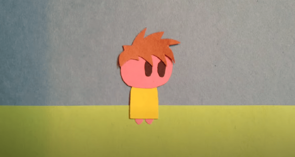
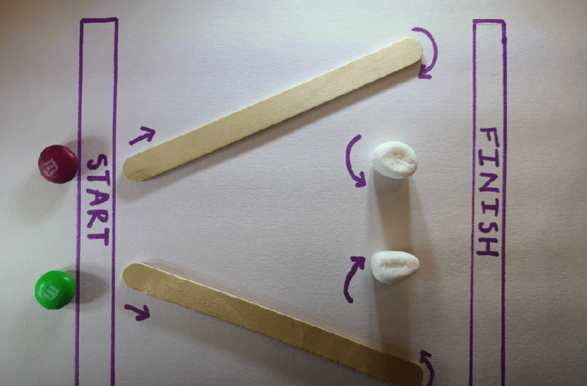
For my first-ever stop motion animation, I decided to create a race with two M&M’s. Since I am a runner, I was inspired to create something involving a race. When I was younger, I would always create obstacle courses in my backyard, so I was inspired to create a little obstacle course race for the M&M’s.
For this project, I used my Samsung Galaxy s20 and took 350 photos. I had a few issues with importing the files, and I had to rename each photo to import the images as an image sequence into Adobe Premiere Pro. I decided to take aerial shots for this project and taped down the marshmallows, popsicle sticks, and paper to the table so there would be no movement besides the M&M’s. This was a fun project to create, and I’m excited to create another stop motion animation video next week.
This week, I read Chapters 2, 3, and 4 in Liz Blazer’s Animated Storytelling: Simple Steps for Creating Animation & Motion Graphics.
Chapter 2: Storytelling
In this chapter, Blazer asserts that storytelling is limitless, where you can take the viewer on a journey simply with shapes and colors. She introduces the idea of story “beats,” and it is important to plot them out to create a unified story with the most emotional impact. Even though there is boundless potential in storytelling, it is essential to approach it with discipline and intentionality. The chapter introduces two storytelling models:
Three-Act Structure:
Act 1: Problem Introduction (The Beginning): Establishes the main character and presents a problem or conflict.
Act 2: Attempt to Solve (The Middle): Depicts the character’s efforts to address the problem.
Act 3: Resolution (The End): Concludes with the problem being solved.
This structure is versatile and can be applied to motion graphics projects. For instance, Act 1 might present a question, Act 2 explores potential answers, and Act 3 provides a solution.
Nonlinear Story Structures: Blazer also explores alternative storytelling methods that don’t follow a traditional linear path. They follow their own set of rules and are often whimsical and unorthodox. These structures offer creative freedom to the animators. Blazer shares some approaches within nonlinear storytelling:
Book Ending: Starting and ending with similar scenes or themes.
The Beaded Necklace: A series of related but distinct segments connected by a common theme.
The Countdown: Establishes the climax and then rhythmically builds towards that climax. The build becomes more intense the closer to the climax.
The Puzzle: Presenting pieces of the story that the audience assembles to form a complete picture. This structure offers a fun interactive element for its audiences.
High Concept: These films have a basic concept that is so strong that it controls all other elements of the film.
These methods encourage creators to think outside traditional frameworks and experiment with the flow of stories.
Chapter 3: Unlocking Your Story
This chapter serves as a bridge between conceptualizing a story and visualizing it through storyboarding. Blazer provides practical exercises to help creators edit their narratives:
Clear Conflict, Reveal it Early: Identify the central conflict of your story and introduce it promptly to engage the audience.
Start Later: Begin the narrative at a compelling point and skip the set up to this point. This is the “rip the Band-Aid off” strategy. The goal of “Start Later” is to hook the audience immediately.
Biggest Secret: Determine what information is withheld from the audience and decide the most impactful moment to reveal it.
Get Graph-y: Visualize the emotional trajectory of your story using graphs.
Blazer also introduces some strategies for experimental animation, including visual music, pure poetry, repetition/evolution, continuity/diversity, anthology, and cut it out & play. These exercises are designed to give the animator freedom to shed the rules of a traditional structure and to hone in on the visions that inspired the film in the first place.
Chapter 4: Storyboarding
Blazer emphasizes the importance of storyboarding as a tool to translate written narratives into visual sequences. She begins by introducing the idea of thumbnailing, which are the first rough sketches of storyboards. Good thumbnail drawings only show the most essential information. She outlines best practices for creating effective storyboards:
Shot Composition: Focus on framing, perspective, and camera angles to convey the desired mood and information in each shot. Some examples include a close-up, wide shot, and panning extreme wide shot.
Framing: Framing is about keeping the eye interested. Using the “rule of thirds” is a good strategy where you break your single frame into nine equally sized quadrants.
Staging: Planning out where to put the subject in space, creating a visual hierarchy.
Continuity: Continuity refers to the natural flow of visual information from one shot to another.
Clarity and Simplicity: Ensure that each frame communicates its intended action or emotion clearly, avoiding unnecessary complexity.
Consistency: Maintain uniformity in character design, proportions, and environments.
Feedback and Iteration: Regularly review storyboards with peers or mentors and be open to making changes.
By planning through storyboards, creators can ensure that they create a compelling visual narrative.
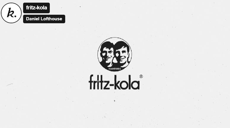
This animated clip describes the creation of fritz-kola’s journey from a startup to one of Europe’s main cola brands. There were a few aspects of the video and choice of animations that piqued my interest:
Color Palette: Throughout the video, Kinisi used black and white colors and halftone textures to illustrate this journey.
Simplicity in the Background: I loved that the illustrations in the background were minimalistic.
I think the hook they used about the creators of Fritz-Kola was very effective and relatable. They are trying to figure out what they wanted to do out of college, and Kinisi utilized a calendar animation to flashback to the beginning of their brand creation. In addition, one audio line about their goal stood out to me: “Make something that makes spending time in their favorite place even better.” Overall, the audio, sound effects, and animations work harmoniously together to whimsically illustrate the beginning of this brand in a concise and eye-catching manner.
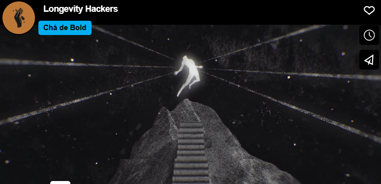
I chose Chá de Bold Estúdio’s animated clip because I was interested in the title: “Longevity Hackers.” I thought this could have multiple meanings, so I was curious to figure out what they meant by this title. This animated clip explores the idea of how humans try to beat death and increase lifespan. To illustrate this, death is made into a character. There were two animations that stood out to me:
They used an escalator to illustrate how humans are trying to catapult human life.
They created a scene of chess where the character “death” was playing a human. In the end, death declares “check-mate” on the human, showing that humans cannot escape death.
The chess scene reminds me of the animated illustration in Harry Potter: Deathly Hallows where they describe the three deathly hallows and how death always wins in the end. I also thought that the tone of voice used in the audio was effective. The voice was serious and almost monotonous, conveying the severity of this idea.
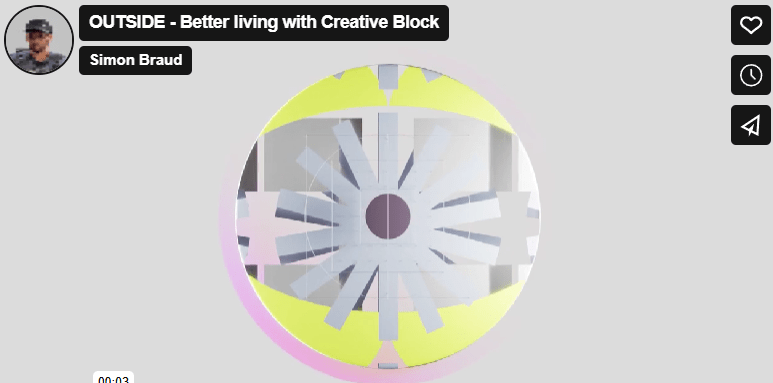
The title “Outside” grabbed my attention to click on this animated video. I first thought, “what could Outside mean? Is this a video about nature?” After watching the video, I realized that “Outside” is the solution presented to the problem in the video.
I like to split this video into three sections. The first section is characterized by a monotonous voice, more geometric animations, and sound effects that create a futuristic feel. Then, the middle section introduces the problem: the creative block. There is a shift in music here that elevates the intensity of this issue, and this builds until reaching the proposed solution.
I also like the simplicity in the first clip. The words appear one at a time, and a simple sans serif font is used. This contrasts with the rest of the more complex animations throughout the rest of the video.
One other element of this video that I thought was effective was the use of pauses in animation and audio. There is a pause after the clip of the trapped human, and this adds to the dramatic effect of the person being “stuck” because of a creative block.
The animations in this clip are phenomenal. I’m curious how long it took to creative this video. I like how the animations seamlessly flowed from one to the next.
This was my first time ever using Adobe After Effects, and I really enjoyed learning this program. I started off with writing my script and planning out the graphics and video clips that I wanted to use. I found all the images that I wanted to use, brought them into Photoshop and/or Canva, and exported them with transparent backgrounds. I also pulled some royalty-free images from pexels.com, one by Cristian Dina and the other from Emic Can Acer. My background music is “Ukelele” by Benjamin Tissot, a copyright-free music track from bensound.com. Following these steps, I got my camera and shot the few video clips that I wanted to include in the video. Once those steps were complete, I started working in After Effects.
Once in After Effects, I wanted to choose a color palette for the graphics and text. I chose two main colors: a light blue and black. To ensure consistency, I wrote down the HEX code for the blue color and used that throughout the project. I had a fun time experimenting with the different text animation presets, trying to choose ones that would work best for each clip. For instance, there is a clip of me running, and the animation I chose for the text in that clip looks like it’s bouncing up and down. I chose this to try to mimic a running motion.
I also enjoyed learning about keyframes and utilizing the scale, opacity, rotate, and position animations within this project. Overall, I had a fun time experimenting in After Effects, and I am excited to learn and practice more features in this program throughout the duration of this course.
From the moment Christian visited The Philadelphia Art Museum as a child, his passion for art was ignited. A trip to the Photography Impressionist Exhibit introduced him to the beauty of landscapes, people, and animals captured through photos, sparking a curiosity that would shape his future interests. He found his love for storytelling and knew that he wanted to pursue a creative career.
Raised in the small town of Phoenixville, Pennsylvania, Christian explored his artistic interests in high school. His passion for creativity led him to courses in Art and English, where he could express himself both visually and in written form. When he was finishing high school, he did not know the exact creative path to pursue, but he knew that he wanted to blend both art and writing in his future studies and career. He was excited to dive into this next chapter, but this was also daunting since he did not know his exact path.
Christian continued to explore these interests at Elizabethtown College, where he pursued a double major in Communications and Graphic Design. Taking courses like Visual Communications, Typography, Graphic Arts, Public Relations, and Marketing solidified his choice in pursuing these majors. Christian’s path started to become clearer, and he was eager to learn and become involved in his college’s Communications and Art Departments. His college experience was filled with unique opportunities, including hosting his own radio show, becoming a Journalism tutor, collaborating with a local business to create a company logo, and working as a tour guide in Elizabethtown’s Admissions Office.
Following graduation, Christian began his professional journey as a Communications Specialist at a special education school and has worked there for the past two years. In this role, he manages the school’s website and social media presence, maintains consistent branding, illustrates student life through photography, and creates promotional materials for the Development Department. Every day presents new opportunities for creativity, whether he’s writing, designing, or photographing moments around campus.
Looking ahead, Christian hopes to continue down this creative path with dreams of becoming a creative director or design manager in the sports industry. His love for running makes this a very exciting path for him, combining his interest in athletics with his passions for branding, communication, and design. Now pursuing a master’s degree in Interactive Media and Communication, Christian is looking forward to expanding his skillset, building connections, and pushing himself to think more innovatively.


 Christian Schaaf's Blog + Portfolio