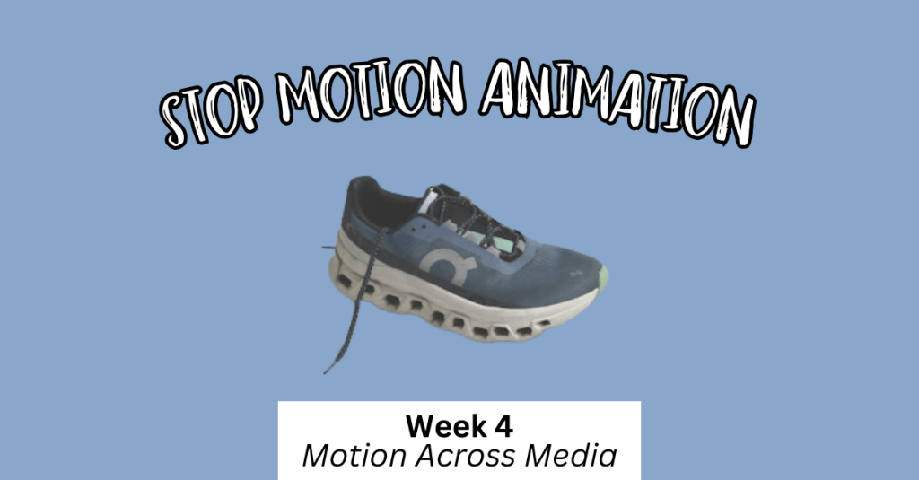
For this last module, I explored advanced animation techniques and worked on the final project for “Motion Across Media.”
Reading & Writing
This week, I read Chapter 11, “Show and Tell,” in Liz Blazer’s Animated Storytelling: Simple Steps for Creating Animation & Motion Graphics. This final chapter focuses on strategies for effectively sharing and promoting animation projects. She provides steps to make your project stand out among others. In prior chapters, Blazer described how to tell a story in an animation project, and now it’s time to tell the story of the animation project.
1.) Package Your Project: Animators must package their project in a professional way. The following steps will ensure that your audience has everything they need to view your project and consider it for awards:
- Upload a password and share a workable link. The favorite service for uploading videos that are password protected is Vimeo.
- Design a clean logo for the title of the project paired with a still photo from the film that captures the essence of the project.
- Write a concise, clear description of the project that is one to two sentences in length. This hook will be used on other publications referring to your project.
- Create a memorable, eye-catching, thought-provoking tagline to make your film stand out.
- Write a director’s bio that is short and sweet. This can include what you want to be known as professionally. It should list your professional title and accomplishments that support that role.
- Write the story of your film: Why did you want to make the film? Why did you feel a need to share this story? What was the process of making this film? Make sure to include both mistakes and triumphs.
2.) Determine Where to Show Your Film: Head back to your creative brief to remind yourself who the film is intended for, and this will help you select your audience and proper film festival for the film.
3.) Consider Skipping the Film Festival Route: Blazer suggests that film festivals are not for everyone. Other alternatives include directly releasing the project on platforms like Vimeo. Releasing it online could help get quicker feedback and inspire ideas for your next animation adventure.
4.) Create Your Network: Having a positive brand on the Internet is essential for filmmakers. Join online communities for designers, filmmakers, and artists. Talk to them. Share your work with them. Be inspired by them. This can form real relationships and help build connections for the future. It is also important to be supportive of other people’s work. Be present and engaged. Be a good audience. Make your brand known, but don’t overdo it. It is important to be selective. Mix up self-promotion and other types of posts. Tease your work, but don’t give away the whole story in the post. This will entice your audience to view your project. Finally, it’s essential to network in person. Establishing these connections are vital for success in the animation/filmmaking industry.
5.) Share and Repeat: Be as professional as possible when sharing your work. Once you share one project, start with the next. Continue to sketch, storyboard, write, and animate new projects. The sky is the limit!
As I reflect on this class, I am so happy with what I learned throughout these seven weeks. Coming into this class, I had no prior knowledge or experience with animation. From reading Liz Blazer’s book, I now know the essential steps in creating animation projects, from research and storyboarding to production to editing and packaging the video. It’s amazing what you can learn over seven weeks.
I learned how to animate in Adobe Photoshop, Animate, and After Effects. I also learned how to design a project in Illustrator and import that project into After Effects. I discovered how to create keyframes in After Effects, create my own animations manipulating the Opacity, Position, Anchor Point, and Scale of an object, and how to import music and sound effects into After Effects.
I also learned how important it is to plan out the project – the script, the music, the visuals, etc. If you are diligent in the pre-production phase, it makes the production and post-production phases much easier. It’s very interesting how each element of a story – the words, the art, the music – can all work together to create a beautiful piece.
I am grateful for the knowledge I have gained, and I hope to continue to experiment with these programs in the future. I want to use After Effects when creating promotional videos at my current job to hopefully elevate the quality and creativity of these creations. I hope that animation will be a part of each step of my career.
Research to Inform
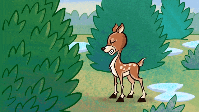
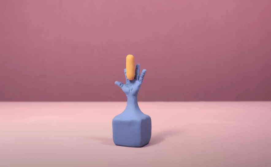
1.) Chroma Keying
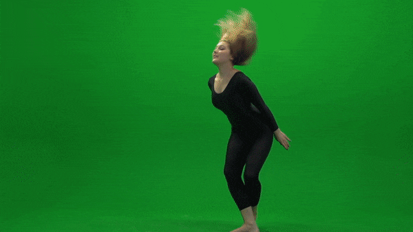
This is an example of Chroma Keying as the green screen is replaced with an image in the background. I thought this was a good example because the picture chosen for the background is relevant to the movement of the subject. It reminds me of someone dancing on Broadway in New York City.
2.) Ken Burns Effect

This YouTube video showcases the Ken Burns effect by adding movement to still photographs of Glacier National Park. I love this effect as it adds realism to the photos. It makes me feel like I am there walking on the trails and hiking the mountains. Adding this movement to still pictures creates a very interesting effect as I feel I am transported to the setting of the photo.
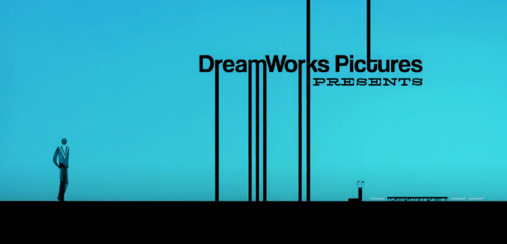
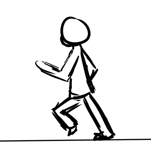
3.) Motion Tracking
Motion Tracking refers to digitally recording and following the movement of an object. In this example, the human’s movements on the left are being tracked by technology to create the animated figure on the right. I thought this was a very accurate example of how motion tracking would look. The movement is very realistic and matches well with the actual movement of the person.
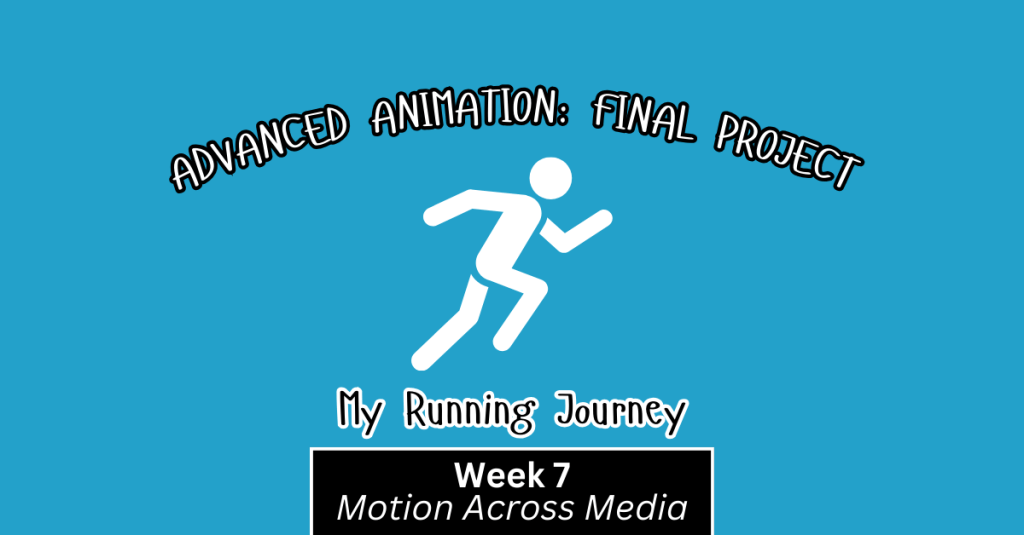
Create
For my final project, I decided to create a video similar to the “Self-Introduction” video format because I really enjoyed creating that project! My goal was to illustrate my running journey from when I started running to the present. In this project, my goal was to incorporate multiple animation techniques that we learned throughout the class, including:
1.) An Advanced Animation Technique: I chose to try out the “3D in After Effects” technique and manipulate a 2D photo. I chose a photo of my dad and I when I first started running. It was a little tricky to do this technique with that photo because his head is somewhat cut off in the photo, and rotating it too much would have revealed that, but I am happy with how it turned out! I definitely want to experiment more with this technique.
2.) Creating shapes/lines with the line tool in After Effects. I utilized this strategy to create the “hill” animation when I talked about the hilly cross country course. I also used this when illustrating the length of a 100 meter race on a track. It was fun to experiment with trimming paths to create these animations.
3.) Classic animations in After Effects, using keyframes to change Opacity, Scale, Rotation, and Position. I feel a lot more comfortable now creating keyframes and working with these animation options.
4.) Using sound effects and background music. I added a typewriter sound effect at the beginning of the video when I chose the typewriter text animation. I also added a heart beat to the heart animation to further showcase that my love for running was expanding in high school.
5.) Using the “squash and stretch” animation principle on the location symbol. I wanted to utilize at least one of the animation principles throughout this project.
I also wanted to create a consistent color palette throughout the video, so I chose a blue/green color, wrote down the HEX and RGB codes, and used those codes throughout the project. I hoped to create a consistent and coherent video that used the same colors and fonts from start to finish.
I have thoroughly enjoyed this class. Coming in with no animation experience, I am so grateful for all of the techniques I learned. I’m excited to continue to experiment in these programs and explore more advanced animation techniques in the future.