Looking for a new job can feel overwhelming. You may be wondering:
Where do I even start? How do I package my work? Do I need to update my projects or start from scratch?
If you’re in this phase right now, I here you and I see you. I am currently rebuilding my portfolio, refining old projects, and shaping my personal brand. There’s a lot that goes into it. It can feel like a full-time job on top of your actual job.
But as I’ve worked through this process, I’ve picked up a few key lessons. If you’re in the same place, I hope these help make things feel a little more clear and a lot more doable.
Let’s dive in.
Your Portfolio Is More Than a Gallery
“Your portfolio is more than just a showcase. It’s your story. It’s a breathing, living document of your story. Who are you? What can you do? Your portfolio is not a dumping ground.”
Evergreen does an excellent job explaining everything a portfolio encompasses. It is not just a collection of your best work.
It’s your story.
Think of it like this: a hiring manager is trying to understand who you are in just a few minutes. Your portfolio is your chance to guide them. This means your portfolio should not be static. It should show:
How you think
How you create
How you solve problems
Don’t just show the final product. Show the journey.
How did you go from idea to outcome? What decisions did you make along the way? Why did you choose one direction over another?
This is where you stand out.
Where Should You Build Your Portfolio?
Before you build, you need a place to host your work. There are plenty of great options, and each one fits different needs.
You don’t need to include everything in your portfolio. Aim for 7–10 strong projects that show:
Your core skills
Your industry experience
Your creative range
Keep your work recent when possible. Quality always beats quantity.
2. Tell the Story Behind the Work
This is where many portfolios fall short. Well-written, compelling descriptions and case studies add incredible knowledge and give the employer a sneak peek into your creative mind.
Don’t skip this part. Each project should include a short case study. They can be structured in different ways, but here are a few questions they should answer:
What was the goal?
Who was the audience?
What was your process?
What was the outcome?
This is your chance to show how you think, not just what you make.
3. Make It Easy to Navigate
Hiring managers are busy. If they can’t find your work quickly, they’ll move on. Keep your layout clean, simple, keep menus clear, and easy to scan. Don’t be afraid to use white space. The main takeaway? Don’t overcomplicate things that distract from your projects.
You can organize your portfolio by:
Relevance (industry or type of work)
Impact (skills or strengths)
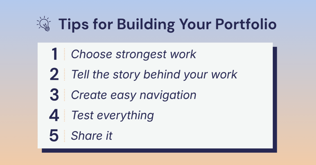
4. Test Everything
Before you share your portfolio, test it. Do images load quickly? Does it work on mobile and desktop? Are there any typos? Better yet, have a friend or mentor review it. Fresh eyes catch things you might miss.
5. Share It With the World
Once your portfolio is ready, don’t keep it hidden. Share it on LinkedIn, add it to your featured section, and talk about your work. You created it: let people see it.
Bring It to Life With Real Work
Want a real example? As I rebuild my own portfolio, I’ve created a branding document that walks through my full process of how I created my brand.
It’s a great example of how to:
Show your thinking
Present your work clearly
Tell a complete story
If you’re just getting started, creating something like this is a great first step. Take a peak below.
Building a portfolio can feel like a lot. Start with what you have. Refine as you go. Keep improving over time. Your portfolio is not a one-time project. It’s something that grows with you.
And remember: you’re not just showing your work. You’re showing what your capable of.
Now go build something you’re proud of. You got this!
In today’s digital world, we are constantly scrolling, clicking, and consuming content. Ads blend together. Posts get skipped. Messages are forgotten almost as quickly as they appear.
So what actually sticks?
Stories.
People don’t remember facts. They remember stories. That’s where brand storytelling comes in.
“Brand storytelling is the strategic practice of using narrative techniques to communicate your brand’s values, mission, and personality across digital channels to create emotional connections with audiences.”
In a world where consumers see thousands of messages every day, storytelling is how you stand out, and more importantly, how you’re remembered.
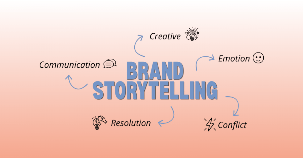
What Is Brand Storytelling (Really)?
At its core, brand storytelling is not about your product. It’s about your people. It’s about the problems they face, the journey’s they’re on, and how your brand fits into that journey.
the problems they face
the journey they’re on
and how your brand fits into that journey
The biggest mindset shift? The audience is the hero. Not the brand.
Your role is to guide them.
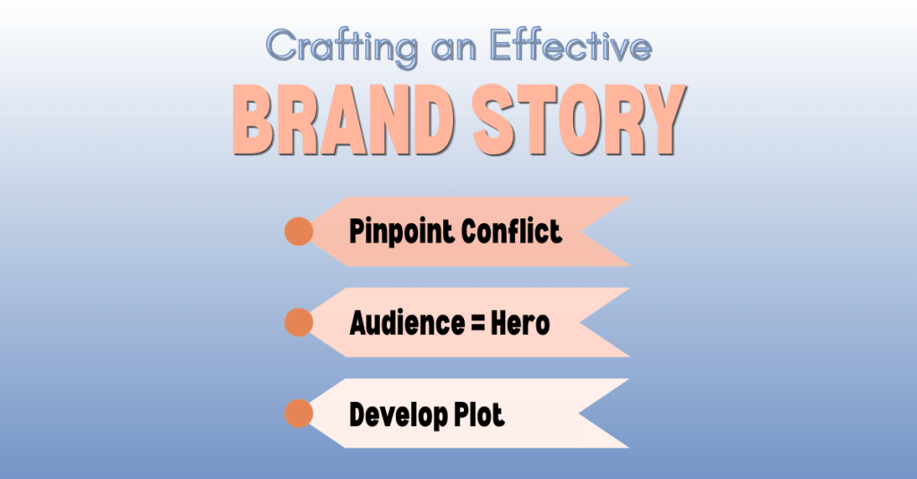
How to Craft an Effective Brand Story
A strong brand story doesn’t happen by accident. It’s built with intention. Drawing from insights by Ally Heinrich, here’s a simple framework:
1. Pinpoint the Conflict
First, identify the conflict. What is your audience struggling with? What problem are they trying to solve? Without a clear challenge, there’s no reason for a story to exist.
2. Make Your Audience the Hero
Next, position your audience as the hero. Your brand is not the center of the story. Your audience is. You are there to support them, guide them, and help them move forward.
3. Develop the Plot
Finally, develop the journey. Think about where your audience starts, what obstacles they face, and how things change by the end. That transformation is what makes your story meaningful.
Great brand stories don’t just inform; they transform.
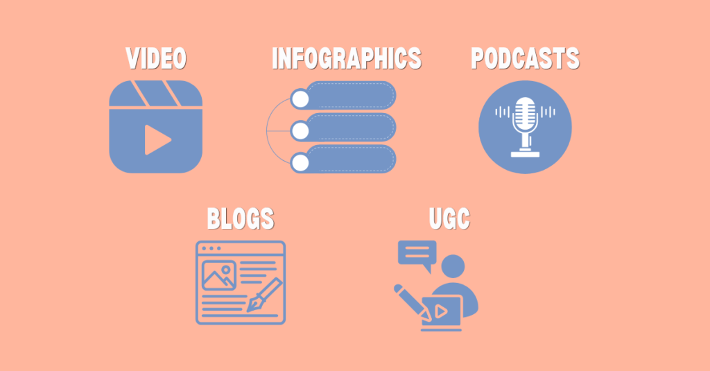
What Content Formats Work Best?
There are many ways to tell a story. What matters most is how clearly and effectively the story is told. The Breezy Company offers some tips on which channels to use to create your brand story:
Video
Video is one of the most powerful formats because it combines visuals, motion, and emotion. Whether it’s a short-form clip or a longer narrative, video can capture attention quickly and hold it.
Infographics & Data Visuals
Visual formats like infographics and data visualizations also play an important role. When done well, they turn information into something engaging and easy to understand.
Podcasts
Audio, such as podcasts, offers a more personal connection. It allows people to engage with your story while they go about their day, making it both accessible and impactful.
Blogs
Written content, like blogs, allows you to go deeper. You can build a narrative, guide the reader step by step, and create a more detailed experience.
UGC
And then there’s user-generated content. When your audience tells their own stories about your brand, it often feels more authentic and trustworthy than anything you could create yourself. UGC can boost conversion rates by up to 4.5%.
What Metrics Actually Matter?
Not all metrics tell the full story. Hughes asserts that it’s important to look at how people are actually engaging with your content instead of focusing only on surface-level numbers.
Story completion rate is one of the most telling indicators. The goal is 70% for video and 60% for written content. If people are watching or reading all the way through, it means your story is holding their attention.
Engagement quality also matters. A thoughtful comment or meaningful interaction is often more valuable than a simple like.
Conversion rates help show whether your storytelling is leading to action. Comparing story-driven content to more traditional, product-focused content can reveal what truly resonates.
Why Brand Storytelling Matters More Than Ever
The digital landscape is louder than ever.
With endless scrolling, constant ads, and the rise of AI-generated content, people are overwhelmed with information. It’s easy for brands to get lost in the noise.
“The brands that stand out are not the loudest. They’re the most relatable.”
People are looking for something real. They want to feel connected, understood, and engaged. Storytelling gives brands a way to create that connection in a way that feels natural and human.
Your Next Steps to Becoming a Brand Storyteller
If you’re looking to become a stronger brand storyteller, start simple.
Focus on your audience first. Think about their challenges, their goals, and what matters to them. From there, build a story that feels clear and intentional.
Experiment with different formats. Pay attention to what connects. Refine your approach over time.
Most importantly, keep practicing. Storytelling is not something you perfect overnight. It’s something you develop by doing.
Bring Your Story to Life
A strong brand story does more than explain what you do. It shows people where they’re going and how you can help them get there.
If you’re ready to start creating more intentional, story-driven content, start with this simple prompt:
Who is your audience, what challenge are they facing, and how does your brand help them move forward?
You don’t need a perfect answer right away. The goal is to begin thinking in terms of story rather than features or products. Focus on the journey, not just the outcome.
From there, you can begin to shape your narrative: what your audience is working toward, what obstacles they encounter, and how your brand plays a role in helping them get there.
Start with the story. The rest will follow. Happy creating!
I’ve always been someone who sees the story first. Growing up, I loved “painting the picture” for friends and family and bringing ideas to life through words, visuals, and creativity. I was especially drawn to commercials, films, and design: the kind of content that makes you stop, watch, and feel something.
That early interest grew into a passion for content creation and brand storytelling. Over the past five years, I’ve refined a process that helps me turn ideas into content that is both intentional and impactful.
If you’re a content creator, marketer, or designer, this is for you.
What Is Content Creation?
Before diving into the process, it’s important to define what content creation actually is.
“Content creation is the process of developing and sharing media in various formats to reach and engage your target audience.”
Alex Lindley
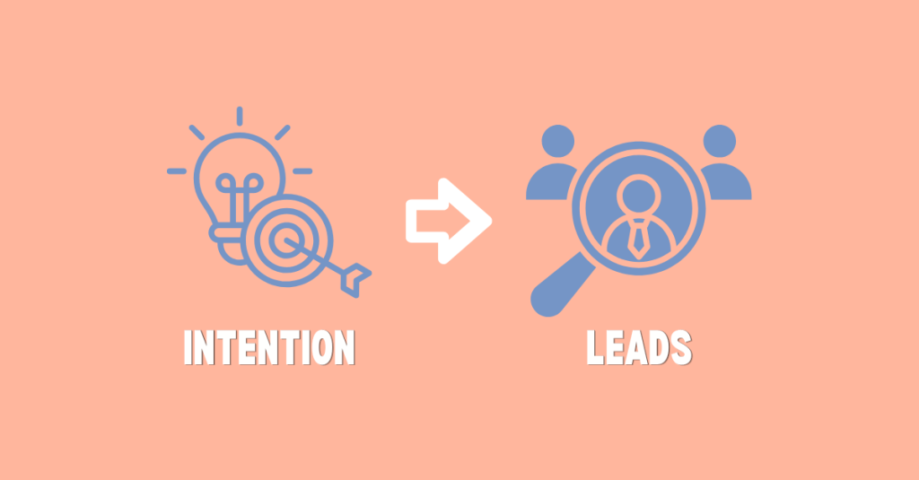
At its core, content creation is about connection. It’s not just about making something look good; it’s about creating something people feel.
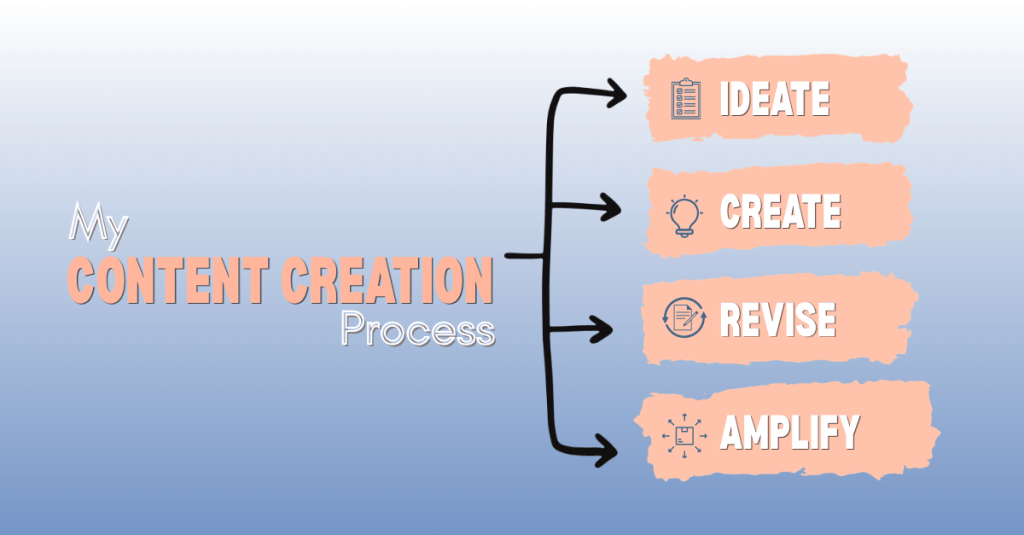
My 4-Phase Content Creation Process
Four-Stage Content Creation Process
I follow a simple four-phase process inspired by Angela Tague’s framework: Ideate, Create, Revise, and Amplify. Each phase builds on the last to ensure the final content is both strategic and engaging.
Phase 1: Ideate
Every piece of content starts with an idea, but strong ideas don’t happen by accident. This phase is all about aligning creativity with strategy. Before I design anything, I take time to understand the audience, explore trends, and organize my thoughts. I create mind maps to generate ideas and tools like Trello to keep everything structured. This step sets the foundation for everything that follows.
Questions to ask:
Who is this content for?
What problem does it solve?
Does this align with my brand or message?
Would I engage with this if I saw it online?
Phase 2: Create
When the idea is clear, it’s time to bring it to life. This is where strategy turns into visuals, copy, and content that people can actually see and interact with. While this phase is more hands-on, I always stay grounded in the original goal to make sure the content stays focused and effective.
Questions to ask:
Does this still align with the core idea or goal?
Has the idea evolved in a way that improves the final outcome?
Is the message clear and easy to understand?
Would I stop and engage with this if I saw it online?
Phase 3: Revise
Content rarely comes out perfect on the first try. The revision phase is where I step back and refine the work to make it stronger. This includes editing for clarity, improving design elements, and getting feedback from others. Even small changes can make a big difference in how the content is understood and received.
Questions to ask:
Is the message as clear as possible?
What can be simplified or improved?
Would someone outside of my field understand this?
Phase 4: Amplify
Creating great content is only half the job. Making sure it reaches the right audience is just as important. In this phase, I focus on distribution and performance. This includes optimizing for SEO, posting across platforms, and thinking about how the content can be repurposed. The goal is to extend the life of each piece of content and maximize its impact.
Questions to ask:
Where will this content perform best?
How can I repurpose this for other platforms?
Is it easy for my audience to find and engage with?
Why This Process Matters
Having a clear content creation process makes everything more consistent and effective. It helps streamline production, keeps messaging aligned, and ensures that each piece of content has a purpose.
“Every piece of content should help build your brand so that you become the first person people think of when they have a need you can fill.”
This idea has stuck with me. Content is not random; it’s intentional.
Tools That Support My Process
The right tools can make a measurable difference, but more importantly, it’s about how you use them. These are a few tools I use to bring ideas to life:
Content creation is more than just making posts; it’s about telling a story with purpose. From idea to execution, every step plays a role in building something meaningful.
When you approach content with both strategy and creativity, you don’t just create: you connect.
Ready to put this process into action? Download my content creation checklist and use it the next time you create.
The digital marketing world is constantly changing. New tools, platforms, and strategies seem to appear every year. As Sharon Thony explains in The Marketing Campaign Playbook, businesses need to adapt to these changes in order to stay competitive. This is especially true as artificial intelligence, chatbots, and automation tools become more common in marketing and communication.
As technology evolves, privacy policies must evolve as well. Companies need to be transparent about how they collect and use consumer data, especially when that data may be used to train AI systems. If users do not understand how their information is being tracked or used, it can damage trust in the platform.
LinkedIn is one of the most widely used professional networking platforms in the world. Its mission is to connect the world’s professionals and help them become more productive and successful. While the platform offers valuable networking and career opportunities, it also collects a large amount of personal and behavioral data from users. By taking a closer look at LinkedIn’s Privacy Policy, we can better understand what information the platform collects, how it is used, what privacy concerns have emerged, and how the company could improve its approach to protecting user data.
What Data Does LinkedIn Collect?
Like most social media platforms, LinkedIn collects a wide range of information from its users. Some of this data is provided directly by users, while other information is collected automatically as people interact with the platform.
The first type of data is the information users provide when creating an account. When someone signs up for LinkedIn, they must provide basic personal information such as their name, email address or phone number, general location, and a password. This information is required in order to create an account, which means users do not have the option to avoid sharing it if they want to use the platform.
After creating an account, users are encouraged to build their LinkedIn profile. Profiles typically include professional information such as education, work experience, skills, certifications, and a profile photo. Users can also add endorsements, volunteer experience, and other professional accomplishments. While adding this information is technically optional, LinkedIn often emphasizes that a more complete profile will lead to better networking opportunities and job recommendations. In many ways, the platform is designed to reward users who share more information about themselves.
LinkedIn also collects data when users post or upload content to the platform. This can include posts, comments, messages, resumes, job applications, survey responses, and other forms of interaction. Any content shared through LinkedIn’s services becomes part of the data that the company collects and stores.
In addition to information that users provide themselves, LinkedIn may collect data about users from other people. For example, if someone uploads their contacts or syncs their calendar, LinkedIn may receive information about individuals who are not even active users on the platform. Employers, recruiters, and partner organizations may also provide data when they use LinkedIn tools for hiring or networking purposes.
Another important category of data is behavioral information. LinkedIn tracks how users interact with the platform by logging actions such as viewing profiles, clicking on content, performing searches, or applying for jobs. The company also collects technical information about devices, including IP addresses, browser types, device identifiers, and operating systems.
Finally, LinkedIn uses cookies and other tracking technologies to gather information about user behavior across websites and devices. These tools help the platform recognize users when they return to LinkedIn and allow the company to track interactions with ads or LinkedIn features on other websites.
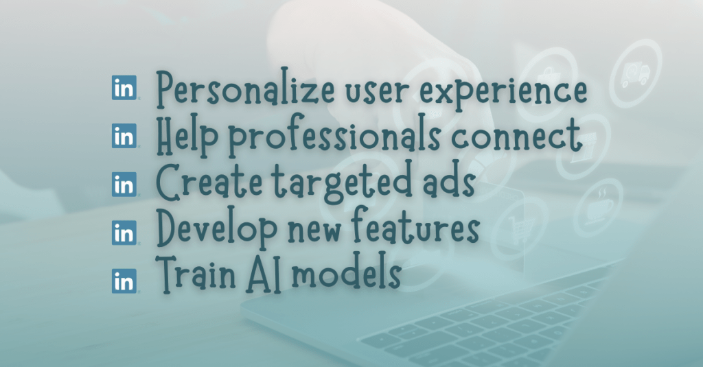
How LinkedIn Uses User Data
When LinkedIn collects this data, it uses the information for several different purposes. The main goal is to personalize the user experience and improve the platform’s services.
One of LinkedIn’s core functions is helping professionals connect with each other. Data from profiles and activity helps LinkedIn suggest new connections, recommend people to follow, and identify potential job opportunities. The platform also uses data to recommend skills, courses, and content that may be relevant to a user’s career interests.
Another major use of data is advertising. LinkedIn serves targeted ads to users based on information from their profiles, activity on the platform, and interactions with content. The company may also make inferences about users, such as estimating their industry, career level, interests, or professional goals. These insights help advertisers reach specific audiences with marketing campaigns.
LinkedIn also uses user data to develop new products and features. For example, data may be analyzed to improve search tools, recommendation systems, and communication features. The company may also use aggregated data to publish insights about workforce trends, job markets, and professional skills.
More recently, LinkedIn has stated that user data may also be used to develop and train artificial intelligence models. This includes improving generative AI tools that appear in features like job searches, content suggestions, or writing assistance tools. While LinkedIn explains that these technologies are designed to make the platform more useful, the use of personal data for AI training has raised important questions about transparency and consent.
Privacy Concerns and Controversies
LinkedIn has faced several privacy concerns over the years. In a Help Net Security article, Sinisa Markovic identifies one of the most recent controversies involved the company’s decision to use member data by default to improve its generative AI models.
Beginning in late 2025, LinkedIn updated its user agreement and privacy policy to state that member data could be used to train AI systems. Under the new policy, users must manually opt out if they do not want their information used for this purpose. This raised concerns with privacy advocates who believe that companies should require users to opt in before using their data for AI training.
The types of data that may be used for AI development are extensive. In “LinkedIn expands AI training to include user data starting November 3,” Luis Rijo states that this data includes profile information, posts, comments, articles, poll responses, and even the prompts or questions users type into AI-powered tools on the platform. While LinkedIn has provided explanations and frequently asked questions about these changes, many users still worry that they may not fully understand how their data is being used.
LinkedIn has also faced regulatory scrutiny related to advertising practices. In 2024, the company received a major fine from Ireland’s Data Protection Commission. Regulators raised concerns about whether LinkedIn had a lawful basis for processing certain types of personal data used for targeted advertising. The investigation focused on whether LinkedIn’s data practices were transparent and fair under European privacy laws.
Although LinkedIn stated that it believed it was complying with the law, the fine highlighted the growing pressure on technology companies to be clearer about how they collect and use personal information.
The GDPR, or General Data Protection Regulation, is one of the most important privacy laws affecting social media platforms today. As Brent Barnhart explains in Sprout Social’s article “GDPR and Social Media: What Marketers Need to Know,” the GDPR is a data protection law created by the European Union that is designed to give users greater control over their personal data. Under this regulation, businesses cannot collect or process personal data without a lawful reason. In many cases, users must clearly agree to how their information will be used before companies can use it for advertising or marketing purposes. Regulations like the GDPR have pushed social media platforms to be more transparent about how they track user behavior and how personal data is used across marketing systems.
Under these laws, users have several important rights related to their personal data. For example, users can request a copy of the information that LinkedIn has collected about them. They can also ask the company to correct inaccurate information or delete certain data from its systems.
Users also have the ability to adjust privacy settings that control how their data is used. LinkedIn allows members to manage advertising preferences, limit certain types of data sharing, and adjust the visibility of profile information and posts.
For users in California, LinkedIn also provides options to opt out of the sharing of personal information with third parties for advertising purposes. Users can request information about how their data has been collected and used over the past year, and they can request that certain personal data be deleted.
While these protections exist, they are often spread across different settings pages, which can make them difficult for users to navigate. As a result, many people may not fully understand what choices they actually have.
Recommendations for Better Privacy Practices
As LinkedIn continues to grow and expand its use of AI, there are several ways the company could improve its privacy practices while still supporting effective marketing.
First, LinkedIn could require users to opt in, rather than opt out, before their data is used to train AI models. This would give users clearer control over how their information is used and would help build trust in the platform.
Second, LinkedIn could simplify its privacy settings. A centralized privacy dashboard that clearly explains how data is collected and used would make it easier for users to manage their preferences.
Third, the company could provide clearer explanations about how data is shared with partners and advertisers. Transparency is one of the most important elements of responsible data use.
Finally, LinkedIn could continue investing in privacy-focused marketing strategies that rely less on broad behavioral tracking and more on contextual information and user consent.
Final Thoughts
LinkedIn provides valuable tools for networking, career development, and professional communication. Its Privacy Policy reveals just how much information the platform collects from its users. From profile details to browsing behavior and AI interactions, LinkedIn gathers a wide range of data in order to power its services and advertising systems.
While the company offers several privacy controls and complies with major privacy regulations, recent controversies around AI data usage and advertising practices show that transparency still needs improvement. As digital marketing technologies continue to evolve, platforms like LinkedIn must ensure users understand how their data is collected and used.
Privacy policies play an important role in protecting users in the digital world. By staying informed and aware of these policies, users can make better decisions about how they share their information online.
Influencer marketing works best when it starts with values. Visibility matters, but alignment matters more. Influencer marketing is a strategy where brands partner with content creators to promote a product, service, or mission. When done intentionally, it can greatly expand reach and build credibility. However, success must be measured with clear goals and strong tracking systems.
In The Marketing Campaign Playbook, Sharon Lee Thony explains that brands should look for influencers who align with their values and connect naturally with their audience. She also stresses the importance of building real relationships before launching campaigns. Brands should clearly define goals, roles, and expectations so both sides understand what success looks like. The below influencer strategy follows that advice by focusing on mission first and metrics second.
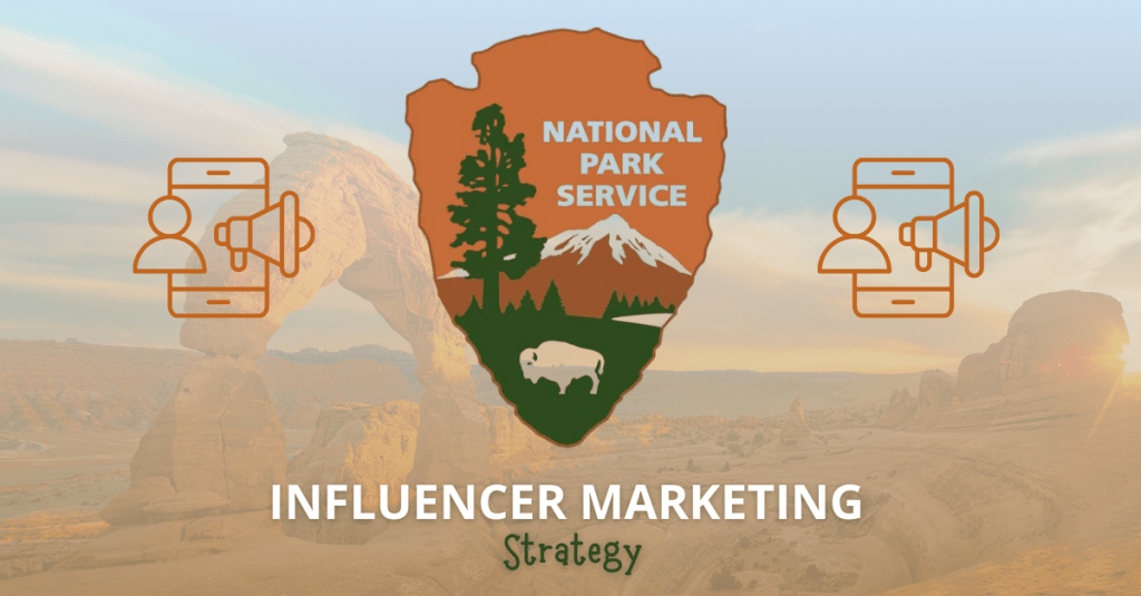
Brand Background: The National Park Service
The brand I chose for this strategy is the National Park Service (NPS). Founded in 1916, the NPS protects national parks, monuments, and historic sites across the United States. Each year, more than 300 million people visit national parks. The mission of the NPS is to preserve natural and cultural resources for future generations.
Because of heavy visitation, education is critical. One of the NPS’s key initiatives is promoting the Leave No Trace principles, which teach visitors how to protect wildlife, respect landscapes, and reduce environmental impact. This influencer campaign will focus on raising awareness and encouraging responsible park behavior.
Audience Research and Influencer Selection
Demographic data for the National Park Service’s website.
Using audience data tools such as SEMrush Traffic Analytics, we can better understand NPS website visitors. The audience is:
89% based in the United States
Primarily ages 25–34, followed by 35–44 and 18–24
52% female and 48% male
Most active on YouTube, TikTok, Instagram, and Facebook
Because of this data, influencers must have strong U.S.-based audiences within these age groups and active followings on those platforms.
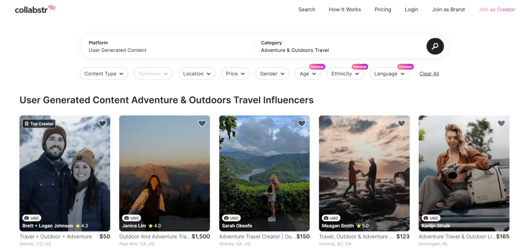
I used Collabstr to research and select two influencers that create outdoor adventure and travel content. When using Collabstr, I selected the “Adventure & Outdoors” and “Travel” categories to find relevant influencers that would align with the goals of the National Park Service.
Home page of Collabstr featuring the selected categories.
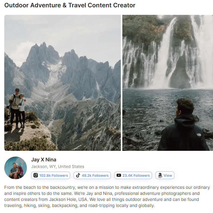
Jay X Nina create hiking and outdoor adventure content. Based in Wyoming, they frequently explore areas near Grand Teton National Park. Their audience demographics align closely with the NPS target audience because of similar age, gender, and location.
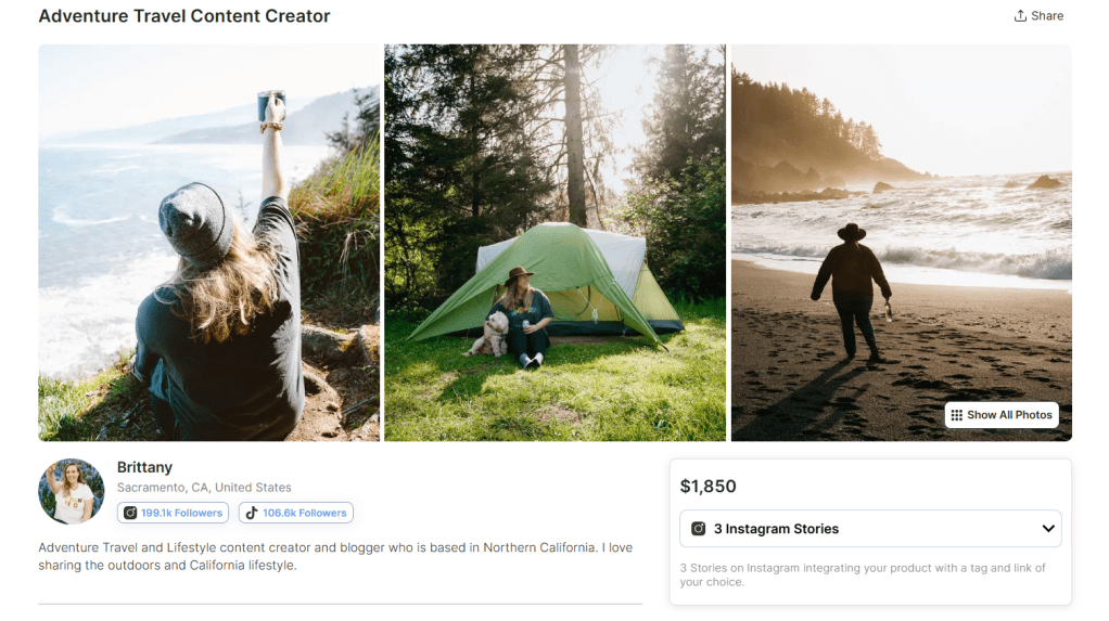
Brittany shares outdoor travel content in California, including visits to Yosemite National Park. Her audience skews female, which helps NPS connect with women interested in travel and outdoor recreation.
These influencers were chosen not only for reach, but for value alignment and audience match.
Campaign Goals
This campaign has three primary goals:
Increase Brand Awareness of Leave No Trace principles.
Boost Engagement with educational conservation content.
Drive Website Traffic to NPS stewardship pages.
Per Thony’s suggestions, establishing clear goals upfront will help choose the correct KPIs when analyzing the success of the campaign.
Type of Collaboration
This campaign will use a three-month ambassador-style partnership instead of a one-time sponsored post. This builds trust and allows repeated exposure to conservation messaging.
Deliverables include:
Sponsored videos
Educational carousel posts
Story content
Long-form YouTube vlog
Content Strategy: Platform-Specific Roles
To maximize impact, each influencer will focus on their strongest platform and create content about national parks that are in their geographic area.
Jay X Nina:YouTube Educational Storytelling
Jay X Nina will create long-form YouTube content focused on deep education and storytelling.
Planned content includes:
An 8–10 minute vlog titled “Exploring Grand Teton Responsibly”
Demonstrations of proper trail use and wildlife safety
Clear explanation of Leave No Trace principles
Direct call-to-action linking to NPS.gov
YouTube is ideal for this format because it allows longer watch time and more detailed education.
Brittany: Instagram & TikTok Awareness
Brittany will focus on short-form Instagram Reels and TikTok content designed for high reach and shareability.
Planned content includes:
“3 Things NOT to Do in Yosemite” short-form video
Quick-tip clips focused on one Leave No Trace principle
Instagram carousel post summarizing all seven principles
Story posts with interactive polls
Short-form video increases reach, shares, and saves.
Performance Measurement: KPIs
Since the main goal of this campaign is to increase awareness and knowledge about the National Park Service (NPS), the selected KPIs focus on visibility, engagement, and learning behavior. These metrics help measure whether people are not only seeing the content, but also interacting with it and seeking more information.
Reach and Impressions
Reach shows how many unique users saw the influencer content. Impressions show how many total times the content was displayed. These metrics help measure how far the NPS message about conservation, park safety, and responsible tourism is spreading.
How platform analytics will be used:
Instagram Insights: Track reach and impressions for posts, Reels, and Stories to see how many users viewed the content.
TikTok Analytics: Monitor total video views and unique viewers to measure exposure.
YouTube Analytics: Track impressions and unique viewers on long-form videos or Shorts to understand overall visibility.
Engagement Rate (Likes, Comments, Saves, Shares)
Engagement shows whether users are interacting with the content instead of just scrolling past it. Saves and shares are especially important because they suggest that users found the information valuable enough to revisit or share with others.
For the NPS, strong engagement may signal that audiences care about conservation tips or park education messages.
How platform analytics will be used:
Instagram Insights: Measure likes, comments, saves, shares, and Story interactions. Saves are particularly important for educational posts.
TikTok Analytics: Track likes, comments, shares, and video completion rate. High completion rates suggest users are paying attention to the message.
YouTube Analytics: Monitor likes, comments, shares, and audience retention. Retention shows how long viewers stayed engaged with educational content.
Website Clicks and Landing Page Traffic (Using UTM Links)
Clicks show that users took action after viewing influencer content. This is important because the NPS campaign may direct users to park planning pages, safety guidelines, or conservation resources.
Using UTM links allows the NPS team to track which influencer drove traffic and how users behaved when they reached the website.
How analytics will be used:
Track link clicks through Instagram Story links, bio links, TikTok profile links, and YouTube description links.
Use Google Analytics to measure sessions, time on page, and conversions from each influencer’s UTM link.
Time on Page and Resource Downloads
If users visit the NPS website but leave quickly, the message may not be fully landing. Time on page helps measure whether visitors are actually reading about conservation or park safety.
Downloads of visitor guides or park maps are even stronger signals that users are preparing responsibly.
How analytics will be used: Google Analytics will track:
Average session duration
Scroll depth
Guide downloads
Visits to educational pages
These behaviors help measure knowledge-building, not just clicks.
Branded Search Growth
Users may not click immediately after seeing influencer content. Instead, they may search for “National Park Service” or specific park names later. An increase in branded searches during the campaign period suggests growing awareness.
How analytics will be used:
Monitor search volume trends using Google Trends.
Compare baseline search data before and during the campaign to help measure long-term awareness.
Challenges and Solutions
Fake Followers and Inauthentic Engagement
One challenge the National Park Service may face when working with influencers is fake followers or bot activity. Some influencers may appear to have large audiences, but not all of those followers are real people. Bots can increase impressions and likes, which makes a post look successful at first glance.
Solution: The NPS can use third-party tools to help confirm whether an influencer’s audience is authentic. Most importantly, the NPS should use trackable links that lead to park guides, safety pages, or conservation resources. This ensures success is measured by real website visits and learning behavior, not just impressions.
Focusing Too Much on Likes and Views
Posts about national parks often receive strong engagement because of beautiful scenery. While this attention is helpful, likes and views do not always mean people understand key messages about safety, sustainability, or Leave No Trace principles. If the goal is to increase knowledge, surface-level metrics are not enough.
Solution: Before launching the campaign, the NPS should record baseline data such as website traffic to park planning pages, downloads of visitor guides, and searches for specific parks. During and after the campaign, they can compare this data to see if there was an increase. Polls or short quizzes on social media can also help measure whether people learned something new about protecting the parks.
Attribution Challenges and Delayed Action
Someone may see a post from an influencer about a national park, feel inspired, and then visit the NPS website days or even weeks later. Because the action does not happen immediately, it can be difficult to connect the website visit or trip planning behavior directly back to the influencer content.
Solution: To better track impact, the NPS should use UTM links that are unique to each influencer. These special links will allow NPS to see exactly how much traffic comes from each post. Even if users return later, tracking tools can help identify patterns in referral traffic and assisted conversions. The NPS can also monitor increases in branded search terms during the campaign period.
Conclusion
Leveraging influencers is a powerful way to expand reach and build credibility. However, success depends on alignment and measurement. By choosing influencers who reflect conservation values and by tracking awareness, engagement, and traffic, the National Park Service can amplify its mission in a measurable way.
Audience segmentation is one of the most powerful tools in paid social media marketing. Instead of sending the same message to everyone, brands divide audiences into smaller groups based on shared characteristics. This allows them to deliver personalized messaging that improves engagement, lowers wasted ad spend, and increases conversions.
In this post, I analyze how Nike uses demographic, geographic, behavioral, and psychographic segmentation to improve paid social performance. Using SEMrush data and competitor comparisons, I translate audience insights into actionable paid social strategies, including Custom Audiences and Lookalike Audiences.
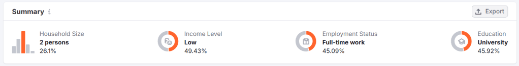
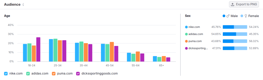
Age: The largest segment is 25–34 (25%), followed by 35–44 and 45–54.
Gender: 54.24% female, 45.76% male.
Top Countries: United States (31.9%), United Kingdom (9.22%), Germany (5.94%).
Device Usage: 71.57% mobile vs. 28.43% desktop.
Income: Primarily low (46.51%) and middle income (39.51%).
Employment: Nearly half work full-time.
Education: Compulsory school and university-level education are nearly equal.
Demographic data generated in SEMrush.
Behavioral & Interest Patterns
Nike users frequently visit retail and fashion sites and consume mass media content. Social platform usage is strongest on YouTube (57.21%), followed by Instagram and Facebook. Competitor overlap suggests consumers compare brands before purchasing.
Turning Research Into Paid Social Segments
Based on this data, Nike could build three primary paid social audience segments:
Lifestyle Athleisure Shoppers (fashion-conscious, cross-shopping with Adidas and ASOS)
Value-Conscious Active Families (low-to-middle income households, 2–4 people)
Segmentation helps Nike tailor messaging, visuals, and offers to each group. A 29-year-old professional scrolling Instagram after work requires different creative than a parent shopping for school athletic gear.
As Sharon Lee Thony explains in The Marketing Campaign Playbook, successful campaigns resonate deeply with the intended audience. Understanding who your customers are, what they want and need, and how they behave is crucial to targeting them correctly and effectively. This data gives Nike the clarity needed to better understand its consumers and strategically reach them.
Buyer Persona: “Driven Dana”
To humanize the data, here is a sample persona following the guidelines outlined in The Marketing Campaign Playbook.
Age: 29 Occupation: Marketing Coordinator Location: United States Income: $60,000 Education: Bachelor’s Degree
Goals
Train for a half marathon
Advance professionally
Maintain work-life balance
Challenges
Limited time to exercise
Finding stylish yet functional gear
Interests
Running
Wellness podcasts
Social media
Values
Inclusivity
Motivation
Authenticity
Buying Behavior
Shops on mobile
Reads reviews
Responds to influencer content
Campaign Idea
“Built for your grind. Just keep going.”
Buyer personas transform traffic data into messaging strategy. Nike is not marketing to “25–34-year-olds.” It is marketing to people like Dana.
How Nike Uses Custom Audiences
Custom audiences allow brands to target users who have already interacted with them. For Nike, this includes:
Website visitors
Cart abandoners
Past purchasers
Nike app users
Email subscribers
Social media engagers
If Dana browses running shoes but does not purchase, Nike can retarget her with dynamic ads showing the exact product she viewed. This is behavioral segmentation at work.
Research consistently shows that retargeted users are significantly more likely to convert than cold audiences because they have already demonstrated purchase intent. Retargeting also tends to lower cost per acquisition compared to broad targeting because ads are shown to high-intent users.
Nike can further segment custom audiences:
Recent buyers: Cross-sell socks or performance gear.
As Olivier Blanchard notes in Social Media ROI, paid social platforms provide measurable performance data. Nike can evaluate click-through rate, cost per action, and return on ad spend by audience segment. This ensures optimization decisions are based on data, not assumptions.
Expanding Reach With Lookalike Audiences
When Nike identifies a high-performing custom audience, it can create a lookalike audience to scale performance.
A strong source audience might include:
High-value repeat purchasers
Nike Training Club app subscribers
Email subscribers with high engagement
Lookalike audiences use machine learning to find new users who share similar characteristics, behaviors, and interests with proven customers.
For example, if Nike builds a lookalike audience from repeat marathon shoe buyers, the algorithm may find users who:
Follow running influencers
Engage with race content
Purchase athletic gear frequently
This allows Nike to expand reach while maintaining relevance.
Segmentation at this stage protects efficiency. Instead of targeting “all sports fans,” Nike targets people who resemble its best customers.
Real-World Example: “You Can’t Stop Us”
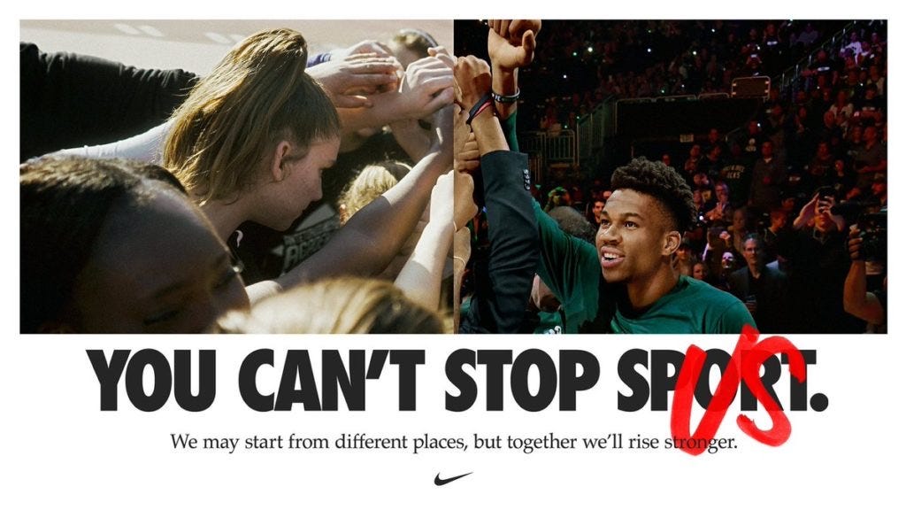
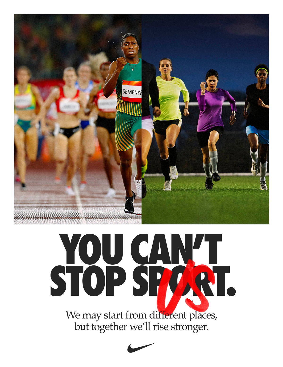
One of Nike’s most powerful segmentation-driven campaigns was the 2020 “You Can’t Stop Us” initiative.
The campaign used a split-screen video composed of thousands of hours of footage. It targeted audiences interested in sports, active lifestyles, and social causes during a time of pandemic disruption and social unrest.
This campaign leaned heavily into psychographic segmentation. Nike aligned with values such as resilience, unity, and inclusivity. The video generated tens of millions of views within days and drove massive social engagement.
The success demonstrates that segmentation goes beyond demographics. It taps into shared identity and belief systems.
Why Audience Segmentation Drives Paid Social Success
Audience segmentation improves paid social performance because it:
Increases message relevance
Improves click-through rates
Lowers cost per acquisition
Boosts return on ad spend
Industry research consistently shows that personalized ads outperform generic messaging in both engagement and conversion rates. When brands layer demographic, behavioral, geographic, and psychographic data, they create campaigns that feel timely and relevant.
Psychographic targeting (motivation, resilience, cultural values)
By translating SEMrush research into segmented paid social audiences, Nike can ensure that its creative, placement, and messaging align with real user behavior.
Paid social success is not about reaching everyone. It is about reaching the right someone with the right message at the right moment.
Nike continues to prove that when segmentation is strategic and data-driven, performance follows.
In today’s digital landscape, data should inform every smart marketing decision. In The Marketing Campaign Playbook, Sharon Lee Thony explains that the right data allows brands to personalize content and adjust campaigns in real time. When ads are tied to clear objectives and measured properly, marketers can improve performance and maximize return on investment.
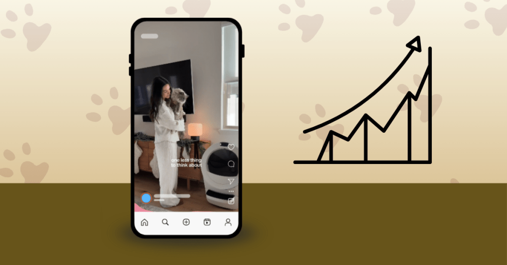
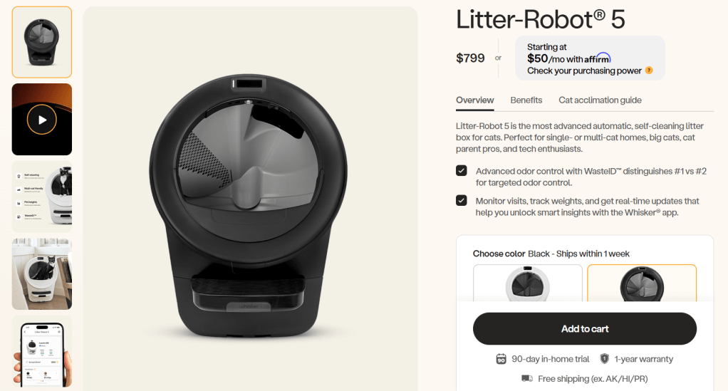
For this audit, I analyzed a TikTok ad from the Pet Household Products industry promoting the Litter-Robot 5, a self-cleaning litter box by Whisker. Below is the ad.
The objective of this ad is conversions. The goal is for users to click the link and purchase the product.
Because this is a conversion-focused campaign, the most important metrics include:
Click-Through Rate (CTR)
Conversion Rate (CVR)
Cost Per Click (CPC)
Cost Per Acquisition (CPA)
In Social Media ROI, Olivier Blanchard examples that measurable business objectives give purpose and direction to campaigns. In this case, success is not just engagement; it is conversions.
Evaluating the Creative Elements
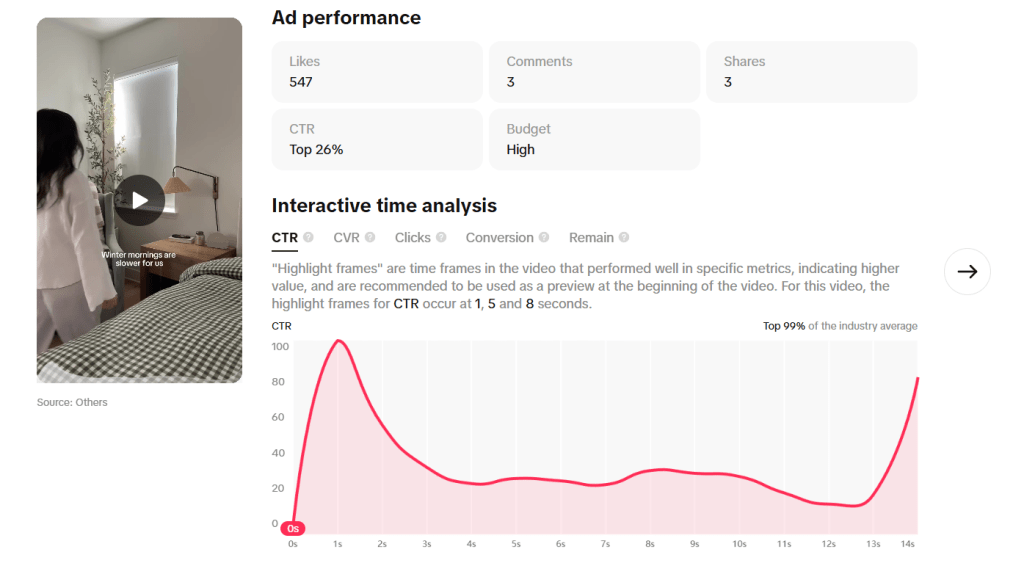
Visuals and Storytelling
The ad is a 14-second short-form TikTok video. It opens with a calm winter morning scene. The woman walks through her home, pours a drink, and sets a peaceful tone. Her cat appears at 6 seconds, and the Litter-Robot 5 appears at 8 seconds.
The setting is warm and relatable. It reflects a slow, quiet morning routine. When the creator says, “When one part of my routine takes care of itself, it makes everything else easier,” she connects the product to convenience and stress reduction. The message is clear: the Litter-Robot simplifies daily life.
Visually, the product is shown in action, which helps viewers imagine how it would fit into their own homes. Showing the product in use is important for a conversion campaign because it reduces uncertainty and builds trust.
This is an example of user-generated content. It feels natural and authentic instead of overly polished or sales-focused. That authenticity likely helps drive the high conversion rate.
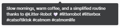
Caption and Copy
The caption reads: “Slow mornings, warm coffee, and a simplified routine thanks to @Litter-Box.”
The caption matches the calm tone of the video. It reinforces the idea of ease and simplicity. However, it does not strongly highlight key product benefits such as:
Self-cleaning technology
Odor control
Time savings
3-year warranty
Because this is a conversion-focused campaign, the caption could include one clear benefit or value statement to strengthen purchase intent.
Call-to-Action (CTA)
The CTA is subtle. It does not directly say “Buy Now.” Instead, it relies on the visual storytelling and the link to the landing page to drive action.
The landing page itself is strong. It includes:
The product name and price
Product images and video
Feature breakdowns
Benefits explanation
A cat acclimation guide
A 3-year warranty
An “Add to Cart” button
Landing page for Litter-Robot 5.
This creates a smooth transition from TikTok to purchase. The page supports the conversion objective well through providing clear information about the product that can be viewed without scrolling. The most important information, like the price, name, description, and “Add to cart” button, are all easy to locate and navigate.
Assessing Targeting Assumptions
The ad likely targets:
Cat owners
Tech-forward pet owners
Busy professionals
Families with limited time
Higher-income households (due to premium pricing)
People who have purchased pet products online
Because this is a higher-priced product, targeting likely focuses on users who are comfortable with online purchases and premium pet care solutions.
Performance Analysis
Overview of ad performance on TikTok’s Creative Center.
The ad performed in the top 99% of the industry average across CTR, CVR, Conversions, and Retention benchmarks.
Click-Through Rate (CTR)
CTR peaked at 100 at 1 second.
It leveled between 20–40 from seconds 3–13.
It spiked again to 81 at 14 seconds.
This tells us that the hook is strong. Users are clicking early. The spike at the end suggests some users wait until they see the product fully before clicking.
However, the steady decline between 3–13 seconds shows the middle portion may lose urgency.
Conversion Rate (CVR)
CVR peaked at 100 at 6 seconds (when the cat appears).
There was also a spike at 1 second.
This performance ranks in the top 99%.
This is extremely strong. The appearance of the cat clearly drives action. Emotion plays a major role in conversion behavior.
Click and Conversion Timing
Clicks peaked at 1 second.
Conversions peaked at 1 second and again at 6 seconds.
There were 33 conversions at 6 seconds (cat appearance).
This suggests two powerful moments:
The opening hook
The moment the cat walks across the screen
Retention
Retention dropped sharply after 1 second and stayed low for the remainder of the video. Even though this ranks high compared to benchmarks, the drop-off suggests viewers could lose interest quickly.
For a conversion campaign, this is important. If most viewers drop off early, the message must deliver product value faster.
Benchmark Context
According to pet industry benchmarks, average CTRs and conversion rates vary based on competition and seasonality. The pet industry often sees strong engagement because pet content is emotional and relatable.
Since this ad ranks in the top 99% across metrics, it is performing exceptionally well compared to industry averages. However, strong performance does not mean it cannot improve.
What Is Working?
Strong early hook
Emotional connection when the cat appears
High CTR and CVR
Clear landing page experience
Relatable storytelling
Areas for Improvement
Sharp retention drop after 1 second
Product appears slightly late (8 seconds into the video)
CTA could be clearer for a conversion campaign
Optimization Plan
1. Move the Cat to the First Second
Data Insight:
CVR peaked at 6 seconds (value of 100) when the cat appeared.
Conversions also spiked to 33 at 6 seconds.
Retention dropped sharply after the first second.
This tells us that the cat drives emotional engagement and purchase behavior.
However, many viewers are dropping off before reaching the 6-second mark. That means a portion of the audience never sees the moment that drives conversions.
Optimization Strategy: Place the cat in the first second of the video or in the thumbnail.
Why This Matters: If the emotional trigger happens earlier, more viewers may stay engaged and convert before scrolling away. This aligns with the conversion objective because it increases the likelihood that users experience the highest-performing moment.
2. Introduce the Product Earlier in the Video
Data Insight:
Clicks peaked at 1 second.
The product does not appear until 8 seconds.
Retention remains low after the first second.
This means users are deciding whether to click before fully seeing the product benefits.
Optimization Strategy: Test a version where:
The Litter-Robot appears within the first 2–3 seconds
The value proposition (“one less thing to think about”) is stated earlier
Run this as an A/B test against the current version.
Why This Matters: For a conversion campaign, viewers need to quickly understand what is being sold and why it matters. If retention is low, the message must be delivered faster.
3. Strengthen the Call-to-Action for Conversions
Data Insight:
CTR and CVR are strong.
The CTA is subtle and does not create urgency.
Because the objective is conversions, the ad could push slightly harder toward action.
Optimization Strategy: Test stronger but still tone-aligned CTAs such as:
“Upgrade your cat care today.”
“Simplify your mornings now.”
“Tap to see how it works.”
This can be tested through caption variations or on-screen text.
Why This Matters: According to Social Media ROI, measurable business objectives require purposeful messaging. If the goal is purchase, the CTA should clearly support that action. The current CTA fits the calm tone, but adding light urgency may increase conversion volume without sacrificing brand voice.
Final Thoughts
This ad is already performing at a high level. It ranks in the top 99% across key metrics and aligns well with its conversion objective.
Optimization is an ongoing process. By aligning metrics with objectives, monitoring performance data, testing creative variations, and refining targeting, brands can continue to improve ROI.
Data does not just tell us if an ad is good. It tells us how to make it better.
Designing a paid social media ad is never just about creating something visually compelling; it’s about developing a strategy that aligns creative decisions, targeting, and budget with a clearly defined business objective. When organizations invest in paid advertising, effective targeting is everything. Who the business targets and how they reach them will ultimately determine whether the campaign achieves its goals.
So how did I approach designing a paid social media ad and the strategy behind it?
To guide my planning process, I followed Sharon Thony’s framework outlined in The Marketing Campaign Playbook, which emphasizes intentional campaign design rooted in clear objectives, audience understanding, and measurable outcomes. Using this framework helped ensure that every decision made during the planning phase directly supports the campaign’s primary goal.
Campaign Framework: Strategy First, Creative Second
Before building the ad itself, I grounded the campaign in six strategic steps inspired by Thony’s guidelines:
Define campaign objectives – Clearly establish what success looks like.
Identify the target audience – Understand who the campaign is designed to reach.
Develop a content strategy – Align messaging and creative with campaign goals.
Set timelines and budgets – Establish realistic constraints for execution.
Define key performance indicators (KPIs) – Determine how success will be measured.
Prepare for execution and optimization – Plan how performance will be monitored and refined once the campaign is live.
This framework ensured the campaign was built strategically from the start.
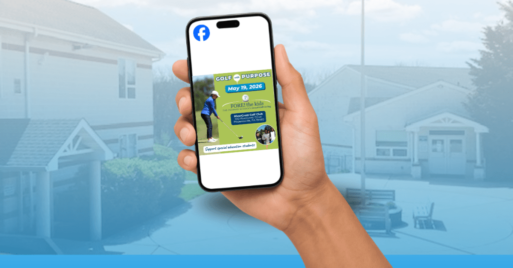
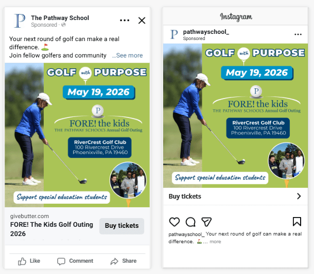
Business & Campaign Overview
For this campaign, I designed a paid social media ad for The Pathway School, a nonprofit special education school where I work. The campaign promotes the school’s annual spring golf fundraiser, FORE! The Kids Golf Outing, taking place on May 19.
This event is one of the school’s key fundraising initiatives, supporting programs and resources for students. Historically, the outing sells approximately 100 golfer spots out of a maximum of 120. This campaign is designed to help close that gap and move the event toward a sellout.
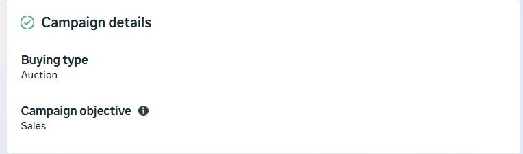
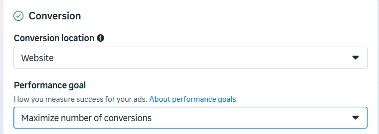
Campaign Objective: Driving Conversions
The primary objective of this paid social campaign is to increase golfer registrations (sales) through Facebook and Instagram advertising.
Specifically, the campaign is designed to:
Drive at least 10 additional golfer registrations
Increase golfer participation by 10%
Generate registrations through link clicks leading to completed sign-ups
Rather than focusing on awareness or engagement, the campaign is intentionally structured around conversion-driven outcomes, ensuring that budget and targeting decisions support measurable revenue growth.
Campaign Optimization Goal
The ad’s performance goal is to maximize number of conversions, with completed golfer registrations serving as the key action.
Optimizing for conversions allows the advertising platform to prioritize users most likely to complete the registration process, rather than users who may only view or click on the ad. This approach aligns directly with the campaign’s revenue-focused objective.
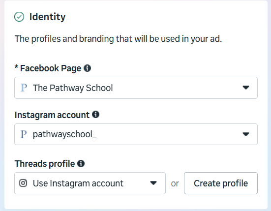
Platforms & Ad Placements
Ads will run on Facebook and Instagram, where The Pathway School already has an established presence and strong engagement with donors and community supporters.
Placements are intentionally selected to appear in high-visibility feed and story environments, ensuring the ad reaches users in spaces where they are most likely to engage and take action.
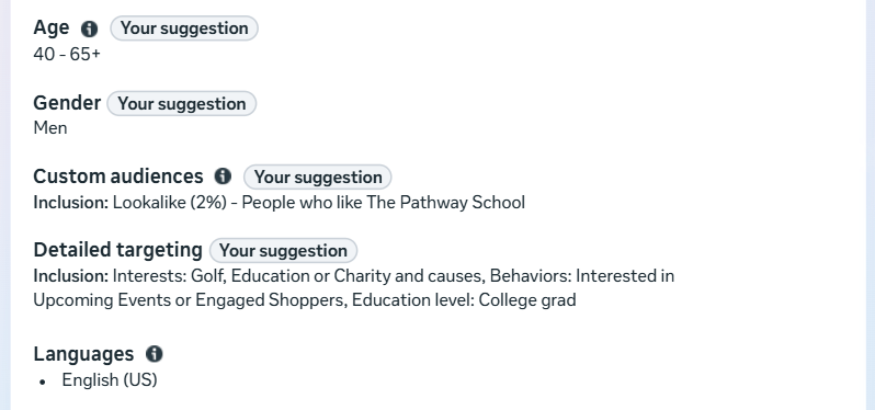
Target Audience Strategy
The targeting strategy combines demographic targeting, interest and behavior-based targeting, and first-party data to reach both existing supporters and high-quality new prospects.
Core Demographics
Gender: Male
Age: 40–69
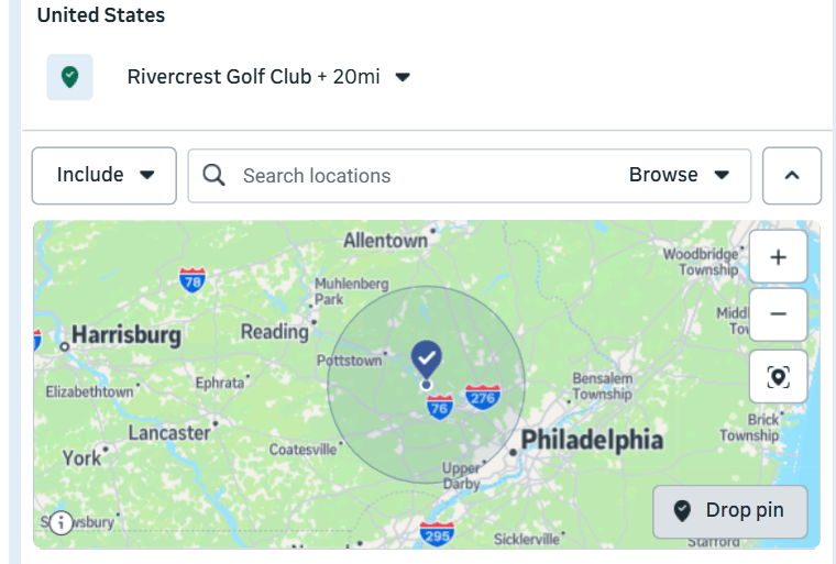
Location: Within a 20-mile radius of the golf course (which includes the school)
Education Level: College Grad
This demographic profile closely aligns with past golf outing participants and typical charity golf event audiences.
Interests & Behaviors
The campaign targets users with demonstrated interest in:
Golf and golf-related activities
Community involvement and charitable causes
Education advocacy
Behavioral targeting prioritizes individuals who:
Interested in upcoming events
Engage with nonprofit or fundraising content
Interact with Facebook Events and local organizations
Click on or engage with sponsored content
These behaviors indicate a higher likelihood of completing an online registration, supporting the campaign’s conversion-focused goal.
Lookalike Audience
To strengthen targeting efficiency, the campaign leverages first-party data from previous golf outings:
Lookalike Audience: New users who share similar characteristics and behaviors
Using a lookalike audience will attract new golfers to the outing that have the same interests as current golf attendees.
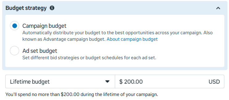
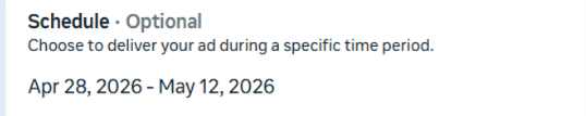
Budget & Timeline
The total campaign budget is set at $200, consistent with prior years’ promotional spending for the event. The budget will be distributed over a 2 week period leading up to May 12, the registration deadline, allowing time for optimization and sustained visibility.
Given the focused audience and conversion-driven objective, this budget is expected to contribute meaningfully toward the goal of selling out the event.
Success Metrics & KPIs
Success metrics are intentionally aligned with the campaign’s primary objective.
Primary Metric
Cost Per Acquisition (CPA): Measures the cost of each golfer registration and serves as the primary indicator of success.
Secondary Metrics
Conversion Rate: Evaluates how effectively ad traffic converts into completed registrations.
Cost Per Mille (CPM): Assesses audience efficiency and helps identify opportunities to reduce wasted impressions.
While click-through rate (CTR) will be monitored as an indicator of creative relevance, overall success will be evaluated based on completed registrations rather than engagement alone.
Planned Monitoring & Optimization
When the campaign launches, performance will be monitored regularly to ensure it is reaching the intended audience and driving conversions efficiently. If CPA or CPM trends higher than anticipated, targeting parameters and creative elements will be adjusted to improve performance and maximize budget efficiency.
Final Takeaway
This campaign planning process highlights the importance of grounding paid social media advertising in clear objectives and intentional strategy. By aligning targeting, placements, budget, and success metrics with a single conversion goal, the campaign is designed to move beyond visibility and drive meaningful action.
Having a social media presence is often treated as a box to check. Many organizations post consistently and share updates but struggle to connect those efforts to meaningful outcomes. In Social Media ROI, Olivier Blanchard argues that simply being present on social media is ineffective unless organizations use those platforms to achieve business objectives. This is where organic social media content becomes critical. Organic content includes any unpaid posts, photos, videos, Stories, or Reels shared on social platforms. While it does not require an advertising budget, it does require strategy, intention, and measurement.
When used effectively, organic social media can build awareness, foster community, and drive meaningful actions. However, success depends on aligning content with clear goals and understanding audience behavior. This post analyzes the organic social media performance of The Pathway School and proposes a data-driven strategy to improve engagement, reach, and conversions.
Setting the Foundation: SMART Goals and Audience Understanding
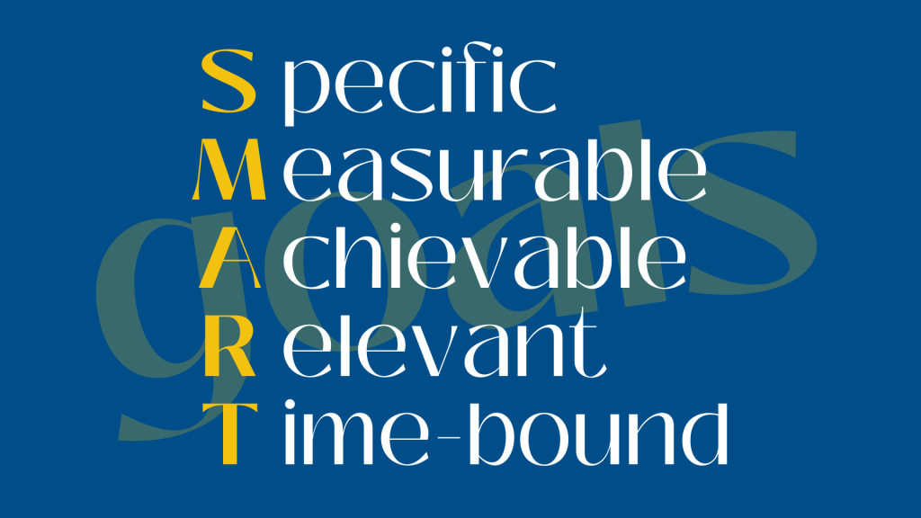
In The Marketing Campaign Playbook, Sharon Lee Thony emphasizes the importance of setting SMART objectives when developing a marketing strategy. SMART goals are specific, measurable, achievable, relevant, and time-bound. These types of goals create a roadmap for content creation and measurement.
Thony also stresses that understanding the audience is essential. Organizations must know who their audience is, what platforms they use, when they are active, and what type of content resonates with them. Without this understanding, even consistent posting can fall flat.
Brand Background: The Pathway School
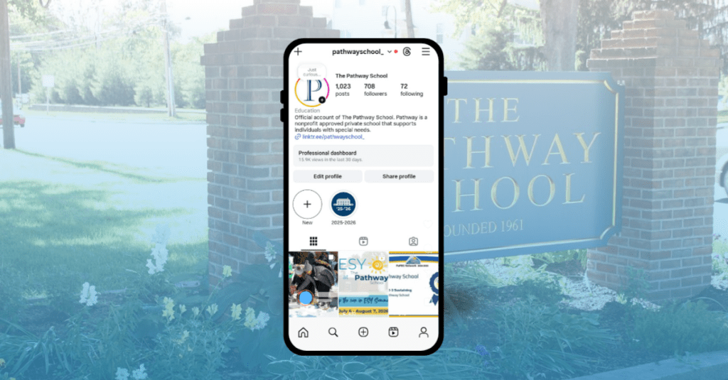
The Pathway School is a nonprofit K–12 special education school whose mission is to support students with special education needs. The school maintains an active presence on Instagram and Facebook to reach families, donors, alumni, and community supporters. These platforms are used to share school news, highlight student successes, promote fundraising efforts, and showcase programs across campus.
To evaluate organic performance, I used Instagram Insights, Facebook’s Professional Dashboard, and Sprout Social to analyze content performance over the past 90 days.
Instagram Performance Analysis
The Pathway School’s Instagram account currently has 708 followers. Over the past four months, content received 90,431 views, with 59.1% coming from followers and 40.9% from non-followers. This indicates that content is reaching beyond the existing audience, which is a strong signal for organic growth. Accounts reached increased by 61% compared to the previous 90-day period, reaching 1,573 accounts. Profile activity also rose significantly, with 2,437 actions, representing a 53.7% increase.
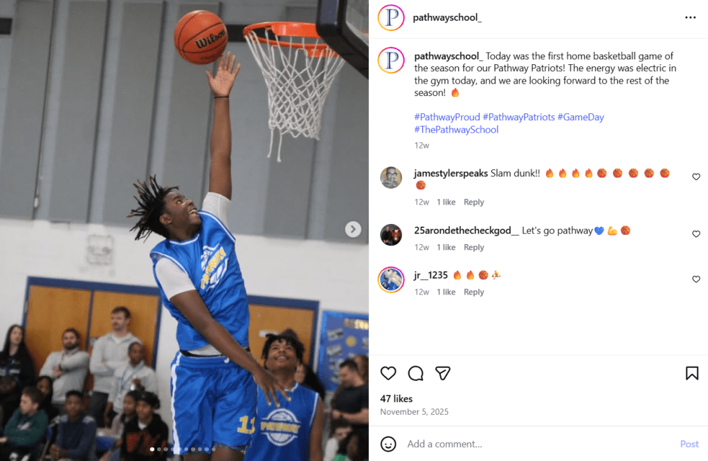
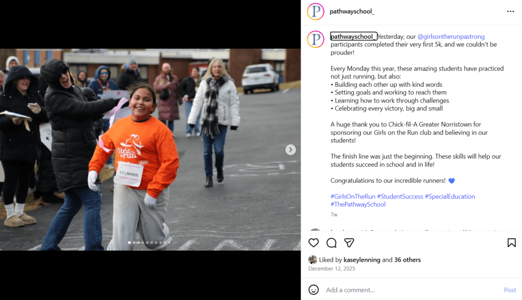
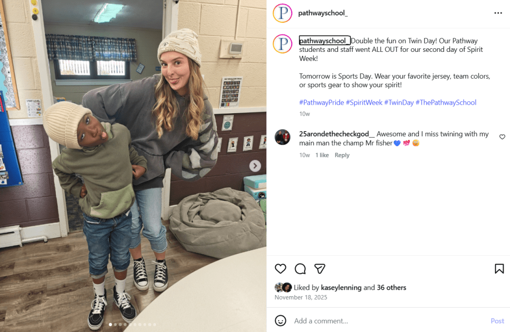
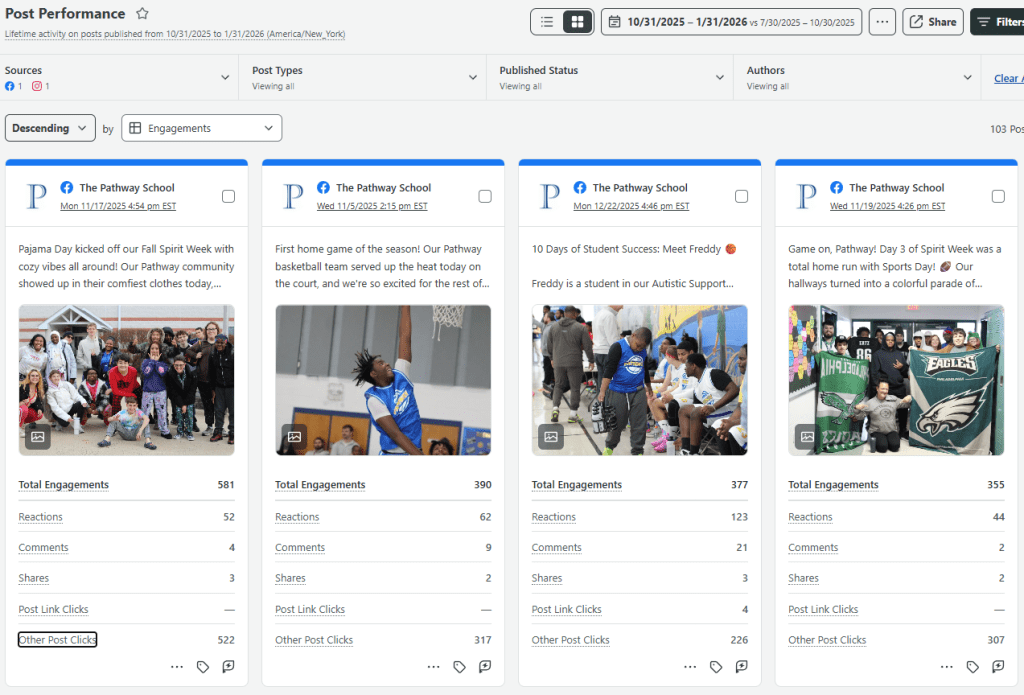
In terms of interactions, Instagram content generated 1,423 total interactions over the past 90 days. These included 875 likes, 41 comments, 37 saves, 197 shares, and 41 reposts. The content that performed best in terms of views and likes consisted of still-photo posts highlighting student-centered stories, including a basketball team win, Spirit Week celebrations, and the first Girls on the Run 5K hosted on campus. These posts used storytelling to showcase student achievements and community pride. The posts can be viewed below.
Basketball Team Win, the post with the most engagementGirls on the Run 5k Finish, second highest engagement“Twin Day” Spirit Week Recap, third highest engagement
Follower growth increased by 3.1%, adding 21 new followers. Audience demographics show that the largest age groups are 35–44 (28.1%), 25–34 (24.4%), and 45–54 (18.2%), with women representing 64% of followers. Most followers are located in the Philadelphia area, aligning well with the school’s geographic focus.
However, posts related to upcoming fundraisers were among the lowest-performing content in terms of likes, comments, and saves. This suggests that purely promotional content struggles to gain engagement without a strong storytelling component.
Facebook Performance Analysis
Facebook analytics reveal a larger but slightly older audience. The Pathway School’s Facebook has 2,142 Facebook followers, a 1% increase over the past 90 days. Content received 70,719 views during this period, representing a 52% increase from the previous quarter. Total engagement reached 7,340 interactions.
Multi-photo posts performed the strongest, accounting for 53.1% of engagement, followed by Reels at 25.2% and single-photo posts at 18.1%. Reactions were the most common form of engagement at 1,800, followed by 150 comments and 58 shares. The top age group on Facebook was 45–54 (26%), followed by 35–44 (21.9%) and 55–64 (18.9%). This older demographic aligns well with donors, alumni, and family members.
Cross-Platform Insights from Sprout Social
My Sprout Social Dashboard, featuring the posts with the highest number of engagements.
Using Sprout Social to compare organic posts across Instagram and Facebook revealed several key trends. Posts with the highest total engagement were consistently on Facebook, likely due to the platform’s larger follower base. The top-performing posts across both platforms featured student successes and campus-wide events, particularly basketball games and Spirit Week celebrations.
These posts featured multiple images highlighting a variety of students and activities, which contributed to higher reactions and comments. Their primary goal was to drive engagement through storytelling and community connection.
In contrast, the post with the highest number of post link clicks was tied to a fundraising effort for the school’s year-end appeal. This post was part of the “10 Days of Student Success” campaign, which highlighted a different student story each day with a clear call-to-action to donate. Compared to fundraising posts that did not include photos of students, these campaign posts generated more shares and higher conversion activity. This reinforces that storytelling-driven fundraising content is more effective than promotion-only posts.
Strengths, Trends, and Opportunities
This data highlights key strengths, trends, and opportunities that can further strengthen The Pathway School’s organic social media strategy.
Strengths
A primary strength across both platforms is authentic storytelling. Posts featuring real students, real moments, and real outcomes consistently outperform graphic-only or announcement-based content. This approach not only drives higher engagement but also builds trust, which is critical for a nonprofit organization.
Consistent posting frequency is another strength. Posting two to four times per week maintains visibility without overwhelming followers and supports algorithmic reach, as platforms favor accounts that post regularly within a defined niche.
Visual variety also contributes to performance. Multi-photo posts and carousels perform especially well on Facebook, while Instagram benefits from a mix of still images and video. This variety allows the school to showcase diverse students and activities, reinforcing inclusivity across campus.
Finally, active community management strengthens relationships. Liking and responding to comments signals that the school values conversation and connection with its audience.
Trends
Engagement is highest when posts highlight shared campus experiences. Events such as Spirit Week, athletics, and school celebrations generate more reactions and comments than individual announcements by fostering collective pride.
Another clear trend is that story-driven fundraising outperforms promotion-driven fundraising. Posts that feature student stories and photos receive more shares and engagement than graphic-only fundraising posts, indicating that emotional connection motivates action.
Audience demographics reveal a platform split. Instagram skews younger (35–44), while Facebook skews older (45–54), suggesting that families may be more active on Instagram, while donors and long-term supporters are more reachable on Facebook.
Opportunities for Improvement
One major opportunity is to better balance engagement and conversion content by pairing clear calls-to-action with emotional storytelling, especially during fundraising campaigns.
There is also an opportunity to expand storytelling beyond current students by regularly featuring alumni success stories, reinforcing long-term impact for donors and families.
Increasing behind-the-scenes classroom content would showcase learning in action, helping move audiences from awareness to consideration by demonstrating how the school fulfills its mission daily.
These types of content could be shared as short-form video. Although Reels already generate meaningful engagement, they are not yet used to their full potential. Because algorithms prioritize watch time and completion rates, expanding this format presents an opportunity for growth.
Proposed Organic Social Media Strategy
Using the strengths, trends, and opportunities identified above, the following organic social media strategy is designed to intentionally balance engagement and conversions for The Pathway School.
1. Clearly Defined Goals
To move from posting consistently to posting strategically, The Pathway School’s goals include:
Increase brand awareness and reach by showcasing student success, campus life, and inclusive education practices. Increased reach by 10% over the next three months.
Strengthen engagement and community trust through storytelling, conversation, and two-way interaction. Increase engagement rates by 5% over the next three months.
Support conversions by developing fundraising content that features real student stories rather than graphic-only promotions. Increase conversion rates by 10% over the next three months.
2. Target Audience Persona
The data reveals a primary persona across platforms:
Primary Persona: “The Pathway Supporter”
Age: 35–54
Gender: Primarily women
Location: Greater Philadelphia area
Relationship to Pathway: Parent, caregiver, donor, alum, or community advocate
Motivations: Supporting student success, inclusion, long-term impact, and community well-being
Platform Behavior: Engages most with student stories, campus-wide events, and impact-driven content
This persona explains why storytelling posts perform well and why donor-focused content is more successful when it features students rather than graphics.
3. Tailored Content
Content includes the following categories:
Student & Alumni Success Stories (Engagement + Conversion): These posts generate the highest likes, comments, and shares, especially when tied to fundraising campaigns.
Campus Life & Community Moments (Engagement): Events like Spirit Week and athletics consistently drive reactions and comments by highlighting shared experiences.
Learning in Action (Engagement): Behind-the-scenes classroom content addresses an opportunity to better showcase academic and therapeutic impact.
Donor & Supporter Voices (Conversion): Testimonials can humanize fundraising efforts and strengthen emotional motivation to donate.
Fundraising & Calls-to-Action (Conversion): Data shows fundraising posts perform best when paired with student stories rather than standalone graphics.
4. Consistent Posting Schedule and Content Calendar
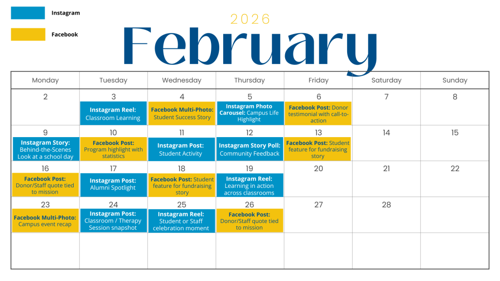
Based on current posting success and algorithm best practices, I recommend three to five posts per week across Instagram and Facebook. Consistency supports algorithmic reach while reinforcing the school’s niche and brand voice. Below is an example content calendar. The posts are during the week because that is when The Pathway School’s audience is most active on Instagram and Facebook.
5. Active Community Engagement
Data shows that engagement increases when the school actively participates in conversation. The school should:
Reply to comments with thoughtful responses, not just likes
Ask questions in captions to invite dialogue
Acknowledge donors, families, and supporters in comments when appropriate
Re-share tagged content from families, staff, or supporters
This approach reinforces trust and aligns with the goal of strengthening community engagement.
6. Performance Tracking and Optimization
To ensure accountability and improvement, performance should be tracked monthly using platform analytics and Sprout Social. Key metrics should include:
Reach metrics: accounts reached, non-follower reach, video views
Conversion indicators: link clicks, shares on fundraising posts, profile actions
Posts should be reviewed by goal category (engagement vs. conversion) to evaluate success appropriately, and tracking performance with these metrics ensures that organic social media efforts are aligned with organizational objectives.
Conclusion
Organic social media content is most effective when it is intentional, measured, and aligned with organizational goals. The Pathway School’s current strategy successfully builds engagement through storytelling and community-focused content. By strengthening short-form video, expanding storytelling into fundraising efforts, and setting clear objectives for each post, the school can better balance engagement and conversions. Grounded in data and guided by strategic frameworks, organic social media can move from simple presence to purposeful impact.
Social media has transformed how brands communicate with their audiences. In Social Media ROI: Managing and Measuring Social Media Efforts in Your Organization, Olivier Blanchard explains that communication has shifted from a monologue to a dialogue. Before social media, brands relied on one-way messaging. Organizations pushed out ideas through ads, and audiences either accepted or ignored them. There was little opportunity for response or interaction.
Today, social media platforms allow consumers to share opinions, react to content, and engage directly with brands. Consumers can also communicate with each other, which Blanchard refers to as lateral engagement. This shift helps audiences feel included in the brand’s story rather than simply receiving a message.
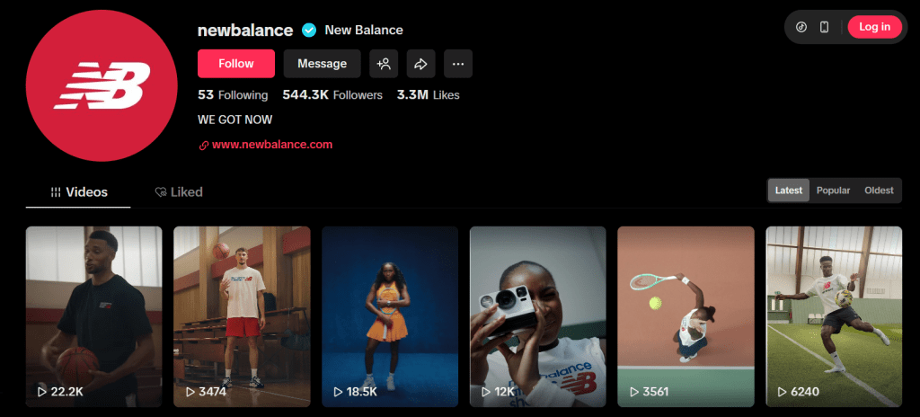
New Balance is an American athletic footwear and apparel company with deep roots in running and performance sports. As a runner and fitness enthusiast, I have been a long-time supporter and consumer of the brand, making their social media strategy especially interesting to analyze. I researched two of their platforms: Instagram and TikTok.
Instagram: Athlete Stories and Brand Identity
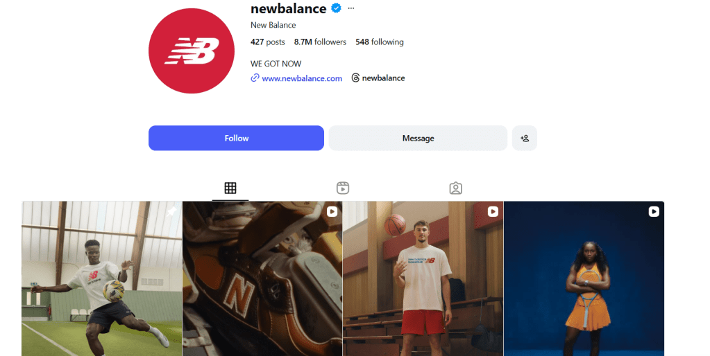
New Balance’s Instagram account has 8.7 million followers and features a mix of organic and paid content. A majority of their organic content focuses on athlete and community storytelling. Many posts highlight sponsored athletes and their accomplishments, helping build an emotional connection with followers.
One example is a post featuring Sydney McLaughlin after she broke the American record in the 400 meters at the Track and Field World Championships. The image shows her holding the American flag and gold medal, celebrating both personal and national success. Posts like this show how New Balance supports athletes beyond products and helps consumers feel like part of the journey.
These organic posts typically receive between 10,000 and 20,000 likes, with some reaching over 200,000. Paid posts on Instagram tend to focus more on product launches, such as Cooper Flagg’s signature sneaker, and often receive higher shares. This suggests that New Balance prioritizes storytelling for connection and paid content for reach.
TikTok: Energy, Authenticity, and Interaction
New Balance’s TikTok account has over 544,000 followers and more than 3.3 million likes. Much of the content overlaps with Instagram, but TikTok places greater emphasis on movement, behind-the-scenes moments, and high-energy visuals.
The brand’s “We Got Now” campaign features athletes like Coco Gauff and Kawhi Leonard and focuses on living in the present and chasing goals with confidence. These videos give viewers a closer look at athletes’ training and daily routines, making the content feel more personal. The campaign has a balance between organic and paid posts, where organic posts show the athletes in action, and the paid posts promote the athletes’ specific products.
New Balance also uses user-generated content on TikTok, such as reviews and product showcases from everyday runners. These posts rely heavily on likes and saves, allowing users to bookmark content and return to it later. This reflects Blanchard’s idea of lateral engagement, where consumers influence each other through shared experiences and opinions.
Opportunities to Strengthen Engagement
While New Balance has a strong social media presence, there are some opportunities to further improve engagement. One noticeable area is direct interaction in the comments section. When reviewing Instagram and TikTok posts, there were very few replies from the brand, even on posts that sparked conversation. Responding to comments could help strengthen the sense of community and reinforce the idea of social media as a dialogue rather than a monologue.
New Balance could also encourage more participation through interactive features. Instagram tools like polls or question stickers could invite fans to engage with athletes, while TikTok challenges or branded hashtags could inspire more user-generated content.
Finding the Balance: We Got Now
Overall, New Balance does an effective job balancing organic and paid social media content. Organic posts build trust and connection through storytelling, while paid campaigns help amplify reach and product awareness. Engagement metrics such as likes, shares, and saves reveal how the brand tailors content for each platform.
In the spirit of their campaign, New Balance doesn’t just say “We Got Now.” They show it by creating content that builds community and meets consumers where they are. The question now is: We Got Now…will you get New Balance today?