An image of a sticky note reading “Run a Usability Test” from Unsplash
What better way to get feedback on your design than from the people who’ll actually use it?
When I first started designing paper prototypes for a township app, I thought I had considered everything. Clean design? Check. Clear navigation? Of course. Useful features? Absolutely. It wasn’t until I sat down – virtually – with my sister and mom that I realized how much more I had to learn. The way users interact with your product can be eye-opening, informative, and one of the most exciting parts of the design process.
This post is a deep dive into my own experience conducting user and usability testing: what these terms mean, how to prepare for testing, and what I learned when I watched real people click through my proposed app.
What are User and Usability Testing?
At first glance, “user testing” and “usability testing” sound interchangeable, but they have distinct goals.
User testing is a process where real users interact with a product while designers observe and analyze their behavior. It is about understanding people: their needs, expectations, and behaviors. It helps you figure out if your product concept makes sense to your audience. Usability testing, on the other hand, is a specific type of user testing. It evaluates how easily users can navigate your product and accomplish key tasks (Strba, 2024). This will help designers identify hidden opportunities and generate new ideas in a quick and easy fashion.
Both forms of testing are essential. Together, they offer a full picture of what’s working, what’s not, and what could be better.
Tips for Testing Paper Prototypes
An image of testing and comparing paper prototypes from Interaction Design.
When you ask someone to review your prototypes, you’re not just asking them to test your design – you’re inviting them into a conversation.
To make that conversation effective, users need context. In “User Testing Your Paper Prototypes,” Andrew Smyk emphasizes that users must understand the tasks they’re expected to complete. That clarity helps eliminate unnecessary confusion and ensures that any struggles they encounter are due to the design and not a lack of explanation.
One tip that stuck with me is to avoid vague labels and features. If something is labeled “Category 1” or “Button A,” users won’t know what it means. That confusion clouds the testing results.
It’s also worth being mindful of user behavior beyond words. Long pauses, puzzled expressions, or hesitant mouse movements can reveal uncertainty even when users say, “Yeah, I think I get it.”
And lastly, don’t wait until your product is polished to test it. The earlier you gather feedback, the more room you have to fix issues without derailing the whole design process.
Writing Effective Task Scenarios
If usability testing is about watching users complete tasks, then writing those tasks well is key to receiving meaningful feedback.
In “Writing Good Task Scenarios for Usability Testing,” Teng states that scenarios should be written like real-life goals, not instructions. Task scenarios help participants focus on what they need to accomplish, not how to do it. It’s the difference between saying “Find the registration form for your child’s summer camp” versus “Click the registration button.” The former helps users act naturally and reveal how intuitive your design really is.
I tried to follow these principles by using familiar language, staying concise, and giving each scenario a bit of personality so users could imagine themselves in the situation.
Good task scenarios aren’t just technical – they’re human. They give users a reason to care and something to solve.
My User Testing Experience
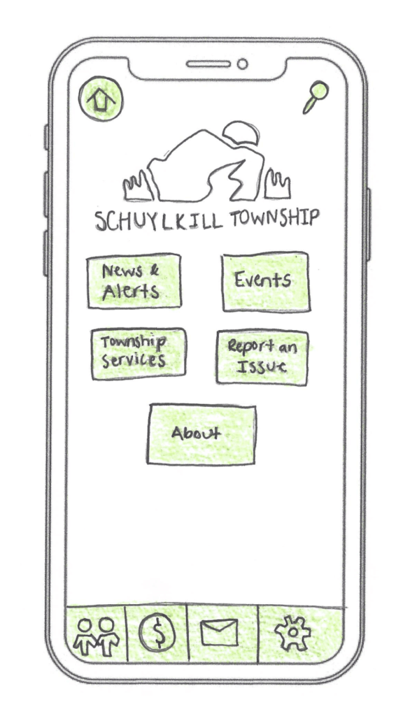
My design of the home screen for the Schuylkill Township companion app.
In preparation for my user testing experience, I used the Prototyping on Paper (POP) app by Marvel to make my designs interactive and share them with the users.
To test my paper prototypes for a companion app for Schuylkill Township, I wanted participants who would find the content relevant. I chose two family members: my sister and my mom. They both represent two different age groups of residents who currently live or have lived in Schuylkill Township. Selecting family members could have drawbacks, such as bias in feedback, but I told them to provide honest, constructive suggestions for my designs.
We conducted our sessions over Zoom. I asked a few warm-up questions to get a sense of how they typically use technology and then guided them through a series of four tasks using screen share. After each task completion, I asked for feedback. This gave me the opportunity to receive suggestions in real-time.
The results? They gave me a lot to think about!
User 1: My Sister
A video of the full user testing experience with my sister.
As a tech-savvy user, it was important to test the app with someone in my sister’s age category to ensure it resonated with a younger audience. View the video above to watch my sister navigate through each proposed task.
User 2: My Mom
A video of the full user testing experience with my mom.
As someone who doesn’t use their phone or technology often, it was essential to test my app with someone like my mom to guarantee that other users who might struggle with technology could successfully and effectively use the app. View the video above to watch my mom navigate through each task.
My Insights from Testing
This was a beneficial experience highlighting both positive design elements and areas of improvement. One unexpected issue? The prototype images I uploaded into POP still had a phone case design around them. When viewed on a real phone, it looked like a phone inside a phone. This threw off both users, and I’ll definitely avoid that visual redundancy next time.
Task 1: Search for, Register, and Pay for an Event
Both participants easily located the “Events” button on the homepage, which was a great sign that the navigation is intuitive. My sister moved through the process quickly – she found the event listings, clicked “Buy Tickets,” completed the payment process, and returned to the home screen with no issues. Her one suggestion was to replace placeholder labels like “Category 1” and “Category 2” with actual event category names to provide better clarity when searching for an event.
My mom also found the “Events” section without issue but got a bit confused when it came to registering. In the task scenario, I had used the word “register” instead of “book,” which led her to hesitate at the “Book Tickets” button. This was a valuable reminder that word choice matters in task descriptions. It’s important to align the language in the scenario with what’s reflected in the interface to avoid confusion.
Task 2: Search for an Article and Download It
My sister again moved through this task seamlessly. She located an article, downloaded it, and suggested a helpful feature idea: adding an “Archives” section alongside “My Saved Articles” so users can revisit older content more easily.
My mom completed the task as well, but paused when she reached the icons for downloading and bookmarking. She wasn’t familiar with what the download or bookmark symbols meant and asked for clarification. This feedback made me realize that relying solely on icons may not be accessible to all users. Moving forward, I may consider adding text labels next to the icons or using tooltips to provide context.
Task 3: Sign Up for an Account and Report a Pothole
This task was structured as “Sign Up for an Account and Report a Pothole.” This may have unintentionally confused my sister and mom because users are prompted to sign up/login after clicking the “Report an Issue” button, not before. They both first looked for a “Sign Up” button before clicking “Report an Issue.” In the future, I’ll adjust the task description, or possibly the app flow itself, to better match user expectations.
That said, both participants successfully navigated to the “Report an Issue” section. My sister completed the steps quickly and suggested adding confirmation text after submission to let users know their request was received and that updates would be provided. My mom took a little longer at the dropdown menu used to categorize the issue, but once she oriented herself, she was able to complete the task as well. The overall takeaway? The flow works, but clarity and reassurance can make the experience smoother.
Task 4: Contact the Police Department
This was the task where both users stumbled, and as a result, it became one of the most valuable tests. I had intended for users to click the envelope icon in the footer navigation, which represents the “Contact Us” section. However, both users initially went a different route.
My sister clicked on “Township Services,” expecting to find police contact information there. When it wasn’t what she expected, she found her way to the envelope icon and completed the task. My mom followed a similar pattern: first trying “Township Services,” then checking “Report an Issue,” and then eventually locating the “Contact Us” section.
This consistent behavior pointed to a larger design issue: the “Contact Us” option isn’t as visible or intuitive as it needs to be. A clearer label or more prominent placement could make all the difference. I’m considering merging “Township Services” and “Contact Us” into a single section, or at least renaming them to better reflect the types of content each one holds. Small changes like these can significantly improve the user experience.
Final Thoughts
Design is a conversation, not a monologue. No matter how good your product looks or how clearly you think you’ve labeled everything, you won’t really know how it works until someone else tries it.
User and usability testing opened my eyes to how people interpret, navigate, and occasionally struggle with a design. It reminded me that great design isn’t just about what we create – it’s about how people experience it.
If you’re working on a prototype, test it early, test it often, and most importantly – listen. Your users will give you valuable feedback to improve your app and enhance each user’s experience.

Leave a comment