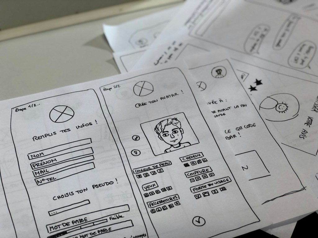
An image of paper prototyping from unsplash.com.
In a world dominated by cutting-edge tools, sleek interfaces, and ever-evolving technology, it might sound odd to say this – but sometimes, the best ideas start with nothing more than a pencil and a piece of paper. Before Figma and Adobe XD, before clickable mockups and developer handoff tools, designers relied on sketching to bring their visions to life. And even now, when the digital world changes at the speed of light, there’s something refreshing, even powerful, about going back to the basics.
That’s where paper prototyping comes in. It’s low-tech, low-cost, and surprisingly high-impact. Whether you’re a seasoned designer or someone exploring UX for the first time, paper prototyping can help you unlock creative ideas and map out user experiences – without ever touching a screen.
What is Paper Prototyping?

An image of a designer creating prototypes from pixabay.com.
“Paper Prototyping: The 10-Minute Practical Guide” offers a great introduction to the concept. At its core, paper prototyping is the process of sketching out user interfaces and workflows by hand, often using simple materials like printer paper, sticky notes, and markers. Each sketch represents a screen or interaction in your digital project, giving you a clear, tangible way to map out how a user might move through your app or website.
These prototypes are considered low fidelity, meaning they aren’t functional or polished. But that’s the beauty of it – they’re fast, flexible, and easy to change. A single screen might take just five to ten minutes to draw, making it easy to explore different layouts or user flows without committing to any one direction too early. They’re also cost-effective, spark creativity, and come with a minimal learning curve, making them accessible to anyone, not just seasoned designers.
Ultimately, paper prototypes help you plan before you build. And the more solid your plan, the faster and more effectively you can move on to wireframes, digital mockups, and functional prototypes.
How to Prototype on Paper
Getting started is simple. All you need are a few household materials – paper, pens, markers, sticky notes, scissors – and your imagination.
Begin by sketching your key screens. These could include your home page, menu, or contact form. Each piece of paper becomes a screen, and you can arrange them in sequence to visualize the user journey. Think about how someone would move from screen to screen, and simulate that flow by swapping one sketch for the next, just as a user would tap through an app.
Ben Coleman’s “How to Make Paper Prototypes” suggests thinking intentionally about a few key areas:
Devices
Before sketching, identify what device you’re designing for. For my project, I focused on smartphones, which meant my sketches had a portrait orientation and dimensions that mimicked a mobile screen. It’s important to design within the constraints of your chosen device to ensure your prototypes feel realistic.
Elements
Think about how users interact with your screen elements – buttons, links, search bars, etc. In my prototypes, I highlighted all interactive elements in green colored pencil. This made it easy to identify what was tappable and where users might go next, even if the prototype wasn’t interactive in the digital sense.
Messages and Pop-up Boxes
Sometimes, your app might show a confirmation message or a pop-up. Sticky notes work great here and can be easily added or removed based on user actions. For example, when simulating a report submission, you could use a sticky note that reads “Thank you! Your issue has been submitted,” which you could place over the screen to represent the interaction.
Mobile Navigation Techniques

An example of mobile navigation from dribbble.com.
When designing for mobile, navigation is everything. It’s not just about helping users move from one page to another; it’s about making that movement feel intuitive. According to “Mobile Navigation: Patterns and Examples,” great navigation reduces friction and helps users find what they need without feeling lost.
Here are some common mobile navigation approaches:
- Top-Level Navigation: This includes hamburger menus (those three horizontal lines hiding a larger menu), floating action buttons, or tab menus at the top or bottom of the screen. Tabs are great for organizing equally important sections of your app. Top tabs are typically used for swiping between sections, while bottom tabs are often fixed and include icons for quick access.
- Card-Based Navigation: Cards display main content areas right on the home screen. They’re touch-friendly and help prioritize information visually.
- Sub-navigation: This includes dropdowns or sequential menus. When a user selects a main category, they see a submenu in its place. Good sub-navigation includes clearly labeled buttons, consistent iconography, and an easily accessible “back” option. Legible fonts and thoughtful spacing also make a big difference in usability.
All of these patterns aim to strike the right balance between simplicity and functionality, getting users where they want to go without overwhelming them.
My Project: Designing for Schuylkill Township
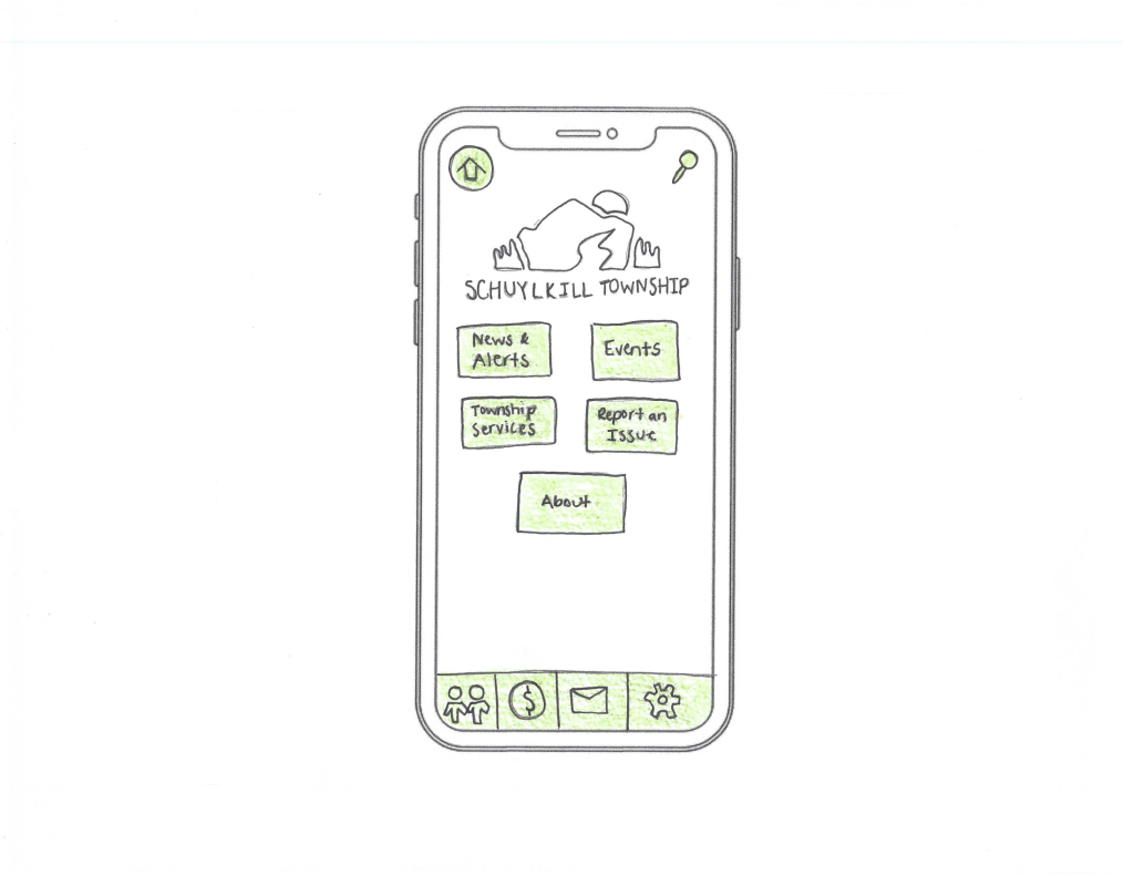
My paper prototype for the home screen of Schuylkill Township’s app.
For the past few weeks, I’ve been developing a companion mobile app for Schuylkill Township’s website. The goal? Make township information and services easier to access for residents on the go.
I began by creating a site map to define the app’s structure, which I updated weekly based on feedback and user needs. From there, I mapped user flows – how a person might go from opening the app to reporting a streetlight outage, checking upcoming events, or finding township contact info.
Paper prototyping was my next step. As I started sketching, I considered how users would navigate through the app and chose the following strategies:
- At the top of every screen, I included a navigation bar with two options: Home and Search. These appear consistently to help users reset or find content at any time.
- The main card-based navigation includes five core buttons: News & Alerts, Events, Township Services, Report an Issue, and About. These act as the backbone of the app, giving users direct access to essential information.
- A footer navigation offers quick access to social media, online payments, contact details, and settings.
To bring it all together, I identified four common tasks a user might complete in the app, and then created full sets of screens to show how each task unfolds – from start to finish – using nothing but pencil, paper, and a little green colored pencil.
Here’s an example of three screens for a user wanting to search for an upcoming event:
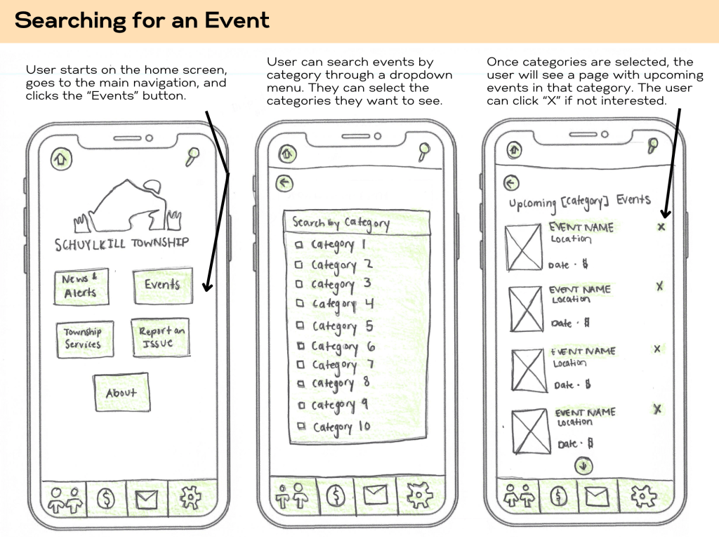
Prototypes representing the first three steps of searching for an event.
You can view my full set of paper prototypes here.
Final Thoughts
Paper prototyping may seem simple, but its power lies in that simplicity. It allows you to think deeply about user experience without the distractions of pixel-perfect design or technical constraints. By mapping out screens and interactions on paper, you’re building the foundation for a thoughtful, user-first app experience.
So, if you’ve got an idea brewing, don’t wait for the perfect tool or software update. Grab a pencil, some paper, and just start sketching. It’s easy, fun, and one of the most effective ways to bring your ideas to life.
 Christian Schaaf's Blog + Portfolio
Leave a comment