For Week 6 of Motion Across Media, I am reading about the animation process in Liz Blazer’s Animated Storytelling: Simple Steps for Creating Animation & Motion Graphics.
Reading & Writing
Chapter 10: Animate! in Liz Blazer’s Animated Storytelling focuses on bringing a story to life through movement, emphasizing the importance of intentional animation choices. In this chapter, Blazer brings together all the tips that were taught throughout the beginning sections of her book: storyboards, color scripts, soundtracks, and more. Before starting to piece together your animation, she suggests to create a production calendar to track progress and ensure deadlines are met. She states to print out a calendar, fill it in backwards starting with the final delivery date, and then work back through post-production, production, and pre-production. This will help create a realistic timeline for the project. Once this is created, the information can be easily transferred to a digital calendar that can be shared with creative partners.
Blazer highlights a few more important steps when starting an animation project, including making sure your tech equipment is up-to-date, creating simple file names to stay organized, and backing up your work consistently. Once these steps are complete, she suggests to start with the easy shots to gain confidence with the project. Since animation is a time-consuming endeavor, it is important to strategically plan out all shots before starting to avoid cutting any shots during the production phase.
Blazer also stresses the importance of strategic movement in animation. She asserts to always anticipate and follow through to help illustrate the physics of gravity on weight and movement. Composing directional movement, such as horizontal, vertical, diagonal, or circular movement, will create consistency throughout an animation. In addition, Blazer offers tips to create a visually compelling animation:
- Don’t put the subject in the center of the frame too often.
- Mix up shot lengths. Use a mix of close-up shots, medium shots, and long shots.
- Mix up shot timing. This will create different paces in your animation.
- Add blur and grain, grunge, or vignettes.
- Be flexible with the soundtrack. This could change during the production phase.
- Mute the soundtrack to check that your animation is expressive without the music or sound effects.
By reinforcing the idea that animation is storytelling in motion, Blazer guides animators to make thoughtful, impactful choices that enhance their projects.
Research to Inform
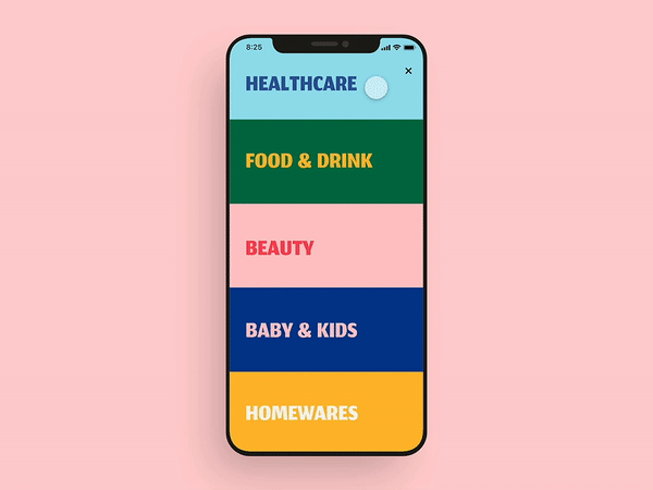
This UI GIF caught my attention because of the bright colors used in the design. I also think this showcases excellent UI design because as one section opens, the other closes. This allows the user to view the entirety of each section on the screen without scrolling.
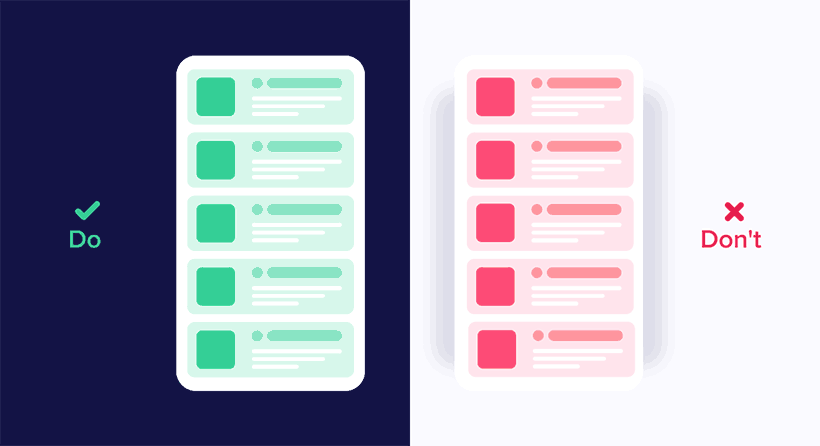
I liked that this graphic showcases good and bad UI design. Being a beginner in UI design, it was interesting to see how little changes in movement can impact user experience. The panel on the left shows different elements moving in the same direction, while the one on the right depicts movements from many directions. It is important to be consistent in movements and not overcomplicate user interface designs.

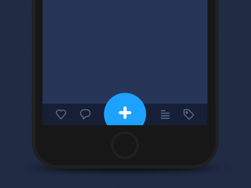
I chose this GIF because I like the switch from blue to black. I also like the simplicity of this design. I also like that the “X” is fully animated when the blue object passes through it. This is a very intentional UI design.
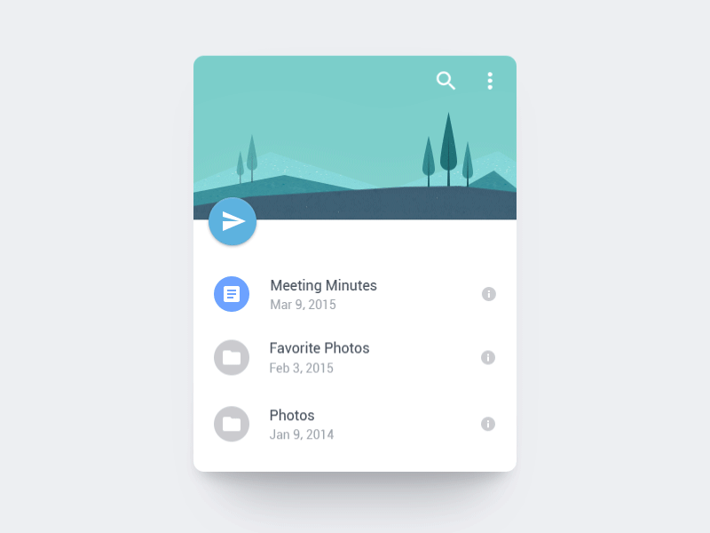
I love how the paper airplane is shot off into the distance. This animation also uses the “anticipation” principle of animation by the page dragging down and then flinging up to release the paper airplane. I also like the bounce that is created after the paper airplane flies. This adds to the realism of this animation.
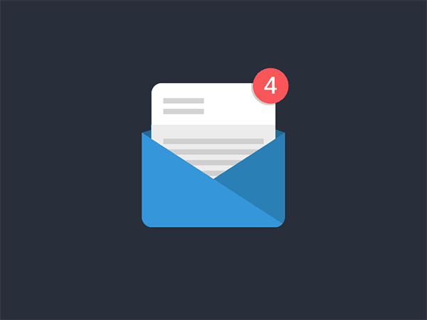
This animation inspired the one that I created this week. I liked the animation switching from 4 to 5 and how the 5 started upside down until the new page appeared. I also like that the envelope is static. With the paper and number both animating, adding another animation would maybe make this GIF a little too busy. The still envelope contrasts well with the movement in the rest of the GIF.
I love the morphing of the circle in this GIF. It almost creates a water-like animation where droplets of water are breaking off the big circle. I also think using the blue color adds to this effect. I also like that the three smaller circles go back into the larger circle in reverse order. This creates a nice loop in the design.

This one is definitely a more complex UI design. but I enjoyed the flow from screen to screen. I like how the animations are consistent from screen to screen, creating a cohesive user interface design. I also like the contrast of the still elements with the moving screens.

I think this UI animation does a great job of capturing a geometric theme. Each animation created in this design morphs into some geometric shape – circles, hexagons, lines, etc. Creating consistency and a theme are both important elements of UI design.
Create
User Interface Animation: Notification Bell
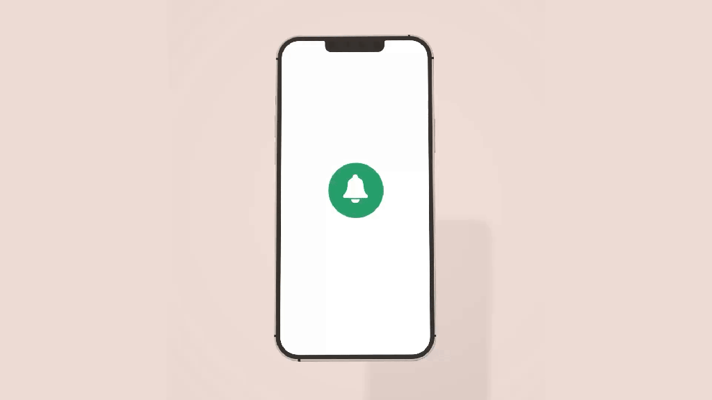
Above are my User Interface Animation video and GIF. I first started in Adobe Illustrator and used the pen tool to design a bell. I imported the design into Adobe After Effects and then used the ellipse tool to create the circles. I wanted to change the size of the circle for when the person “clicked” on it and used the scale tool to achieve this.
I then worked on animating the bell, and I moved the Anchor Point to the top of the bell to hopefully create a realistic back-and-forth motion of a bell. When changing the size of the bell with the scale tool, I copied the layer and moved the anchor point to the center of the bell to ensure that the size of it changed from that anchor point. It was a little tricky having two different anchor points, but with some experimentation, I think we figured it out!
For the blue notification circle, I wanted the “1” to mimic the motion of the bell to create a cohesive design. I matched the angles that the bell was moving with the “1” to achieve this effect. I also wanted to practice creating a mockup, so I grabbed an image from unsplash.com and put the animation on a phone screen.
In terms of sound effects, I used a click noise to emulate the person clicking on the icon, a ringing bell sound to showcase the bell moving back-and-forth, and a “pop” sound for when the “1” disappears. These sound effects are from pixabay.com. I also added in some happy and higher-energy background music to illustrate the excitement of getting a notification.
Overall, I thought this was a challenging project. I don’t have any prior experience with UI design, and I think I have to train my mind to think like a UI Designer. The hardest part for me was coming up with an idea for the project. I was inspired to choose this notification animation because I was looking through all the notifications on my phone, and I thought it would be a fun animation to design. I am happy with how it turned out and I’m looking forward to practicing more user interface animations in the future.

Leave a comment