
This module explored the 12 principles of animation and how to apply them to a personal logo creation.
Readings & Writings
This week, I read Chapter 9: “Technique” in Liz Blazer’s Animated Storytelling: Simple Steps for Creating Animation & Motion Graphics. This chapter explores the different animation techniques and how choosing the right one enhances the story’s impact. When choosing an animation technique, the first tip Blazer offers is to consider the format and how the animation will be viewed. Animation technique should be chosen based on the story – it must stay true to the message and the tone of the project. She emphasizes that technique should serve the story rather than dictate it. Blazer offers a list of animation techniques that can be used for a project:
- Hand Drawn: Created with pencil, paint, ink, and charcoal.
- Stop Motion: With 2D and 3D versions, this technique is captured by taking frame-by-frame photos as objects move slightly in each frame.
- 2D CGI: Animation created in a flat/2D software.
- 3D CGI: Animation created in a 3D software.
She also discusses animation styles to use within a project:
- Fluid Transitions: Animations flow from one scene to the next without any cuts.
- 2D/Vector: Flat designs with scalable colors. Created in Illustrator or other vector programs.
- Handmade: Create a DIY look by using real materials.
- Collage: Incorporates mixed media drawings with photos and video footage.
- Film & Type: Combines video footage with type.
- 3D: Created with stop motion or CGI and includes elements like “real” light, shadows, and gravity.
Blazer also notes that animators should consider constraints, such as budget, time, and technical skill, when selecting a method, as these factors can impact the creative process.
Another key takeaway is that technique isn’t just about aesthetics – it plays an important role in how an audience connects with a story. Blazer suggests that animators should focus on their strengths while remaining open to new tools and techniques. Finally, she encourages animators to develop their own visual voice by embracing imperfection and exploring unique artistic choices.
Research to Inform
1.) Squash and Stretch
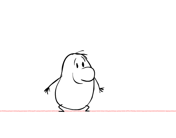
This GIF showcases the animation principle “Squash and Stretch.” As the potato jumps, when it reaches its highest point, it is fully stretched out. When it touches the ground, it squashes down. This creates a more realistic animation.
2.) Anticipation

In this GIF, the frog leans back and moves its arms to gain momentum to jump forward. Moving in the opposite direction before jumping creates “anticipation.” I chose this GIF because I love frogs and thought it accurately depicted the anticipation animation technique.
3.) Squash and Stretch, Anticipation, and Appeal
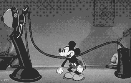
I chose this GIF because it showcases multiple principles of animation. First, it depicts “squash and stretch” through Mickey jumping up and down. The bending and straightening of his knees creates this effect. In addition, “anticipation” is created by Mickey bending down before jumping in the air. “Appeal” refers to the charisma of a character, and in this scene, Mickey has a big smile on his face, creating a fun and energetic clip.
4.) Exaggeration
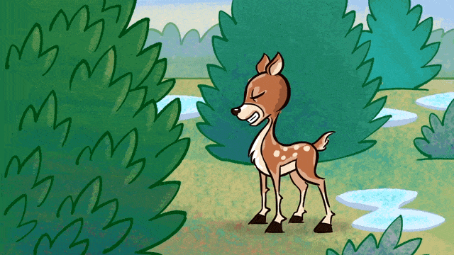
“Exaggeration” is illustrated in this clip when the deer turns into a tornado to destroy the yard. It is further created with the overly shocked faces of the people in the window. This depiction of the deer destroying the yard is extravagant and alters the physical features of the deer, creating a more dynamic scene.
5.) Arc
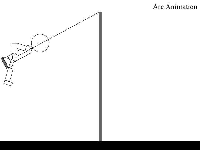
I chose this GIF because I thought it perfectly demonstrated the “arc” animation principle. The person on the swing follows the laws of gravity: what goes up must come back down. The realistic depiction of the swing’s trajectory illustrates the “arc” technique.
6.) Secondary Action
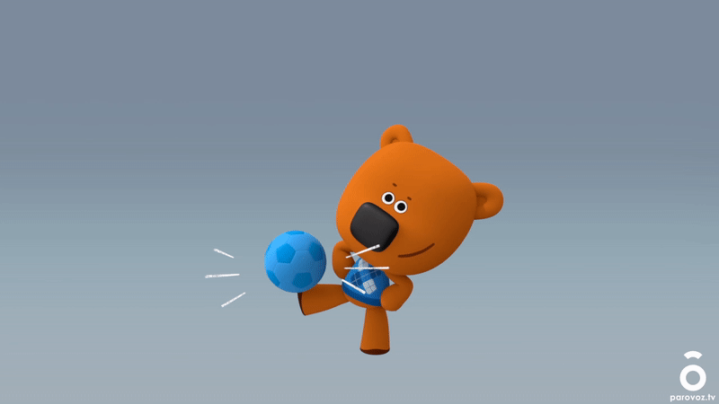
This GIF showcases “secondary action” as the bear bounces the ball on its feet, bounces it on its head, and then slides it across its arms. The secondary actions with the ball gives the scene more life and creates a more interesting GIF rather than just moving the ball once.
7.) Slow in and Slow Out

This GIF depicts “slow in and slow out” through the car accelerating and slowing down at the beginning and end of the clip. The change from going slower in the start, to faster in the middle, to slower again at the end illustrates this animation technique and creates a more realistic depiction of a moving car.
Create
This week, I created a personal logo in Illustrator. I first started off by sketching some ideas for the logo. I already had a previous personal logo, but I wanted to update it for this project. I wanted to keep my initials, C and S, in the logo and add some element that showcases that I am a designer. To illustrate this, I decided to go with a pencil.
When in Illustrator, I chose a sans serif font and manipulated each letter of text. I used the pen tool to create more anchor points and make changes to the shape of the text. I made a small indent into the C for the top of the pencil, and then I changed the one side of the S to make it more narrow. I also included the word “studio” beneath the letters because I am hoping to use this logo for my online portfolio that showcases all of my prior work.
After making some alterations to the logo, I separated each part of the logo into separate layers and exported it to bring into After Effects. I wanted to create a fun, simplistic, and peaceful logo, so I decided to go with a green color and add some fun animations. I first added animations to the C and S, both moving into frames from opposite sides and using the “squash and stretch” animation principle. I added a “doink” sound effect when each letter switched directions to further add to this animation. I then animated the line behind the S, moving its position from the top of the screen to the center. I then used the “create a shape from vector art” feature from the pencil line and used the “trim paths at layer in” preset to create a drawing effect. To match this effect, I used a position animation for the pencil to make it look like it was drawing the line. I added a pencil sound effect to this part of the animation. I then finished the animation with changing the opacity of the word “studio.” I also selected a calm and happy soundtrack to further add to the peaceful feeling of the logo.
All sound effects for this project are from pixabay.com, and the background music is from bensound.com. Overall, I really enjoyed this project and working within Illustrator, After Effects, and Premiere Pro.

Leave a comment